Asset Details
To access the details of a data asset, navigate to Reliability > Data Discovery and select an asset. If the asset is a table, it will lead you to the Overview tab; otherwise, you will be directed to the Structure tab, where you can explore specific tables or columns within the asset.
To monitor data freshness and detect anomalies for an asset, enable data freshness in the settings window. For more information, see Data Freshness Policy.
Overview Tab
The following table explains the properties of the asset displayed in the asset details Overview tab:
| Details | Description |
|---|---|
| Overall Reliability | Displays the total reliability score (a combination of all four policy scores). |
| Data Freshness | Displays the total data freshness score. |
| Data Anomaly | Identifies dataset abnormalities that may indicate abnormal behavior or trends. |
| Quality | Displays the total score for Data Quality policies. |
| Reconciliation | Displays the total score for Reconciliation policies. |
| Data Drift | Displays the total score for Data Drift policies. |
| Schema Drift | Displays the total score for Schema Drift policies. |
| Last Profiled | Displays the date and time at which the most recent asset profile occurred. |
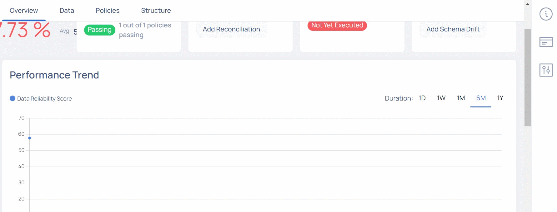
Performance Trend
The Performance Trend graph displays the Data Reliability score over a period of time. You can choose the period to be either one day, one week, one month, last six months, or last one year.
Data Cadence
This chart display the data gaps for the selected time period. For more information, see Cadence.
Data
The data tab allows you to view the following tabs:
- Cadence
- SQL View
- Profile
- Sample Data
- Reports
Cadence
The Data Cadence tab displays key metrics related to your assets like freshness, difference in data sizes and so on. You can compare how your asset has increased or decreased over a period of time. You can also view the average value of increase or decrease in asset size per hour.
This tab is applicable only for Snowflake, Databricks, MySQL, PostgreSQL, BigQuery, S3, ADLS, Azure Data Lake, GCS, HDFS, and Redshift data assets.
To view the Data Cadence tab:
- Open the asset detail view of either a Snowflake, Databricks, MySQL, PostgreSQL, BigQuery, S3, ADLS, Azure Data Lake, GCS, HDFS, or Redshift asset.
- Click the Data Cadence tab.
This tab has two visualizations, described as follows:
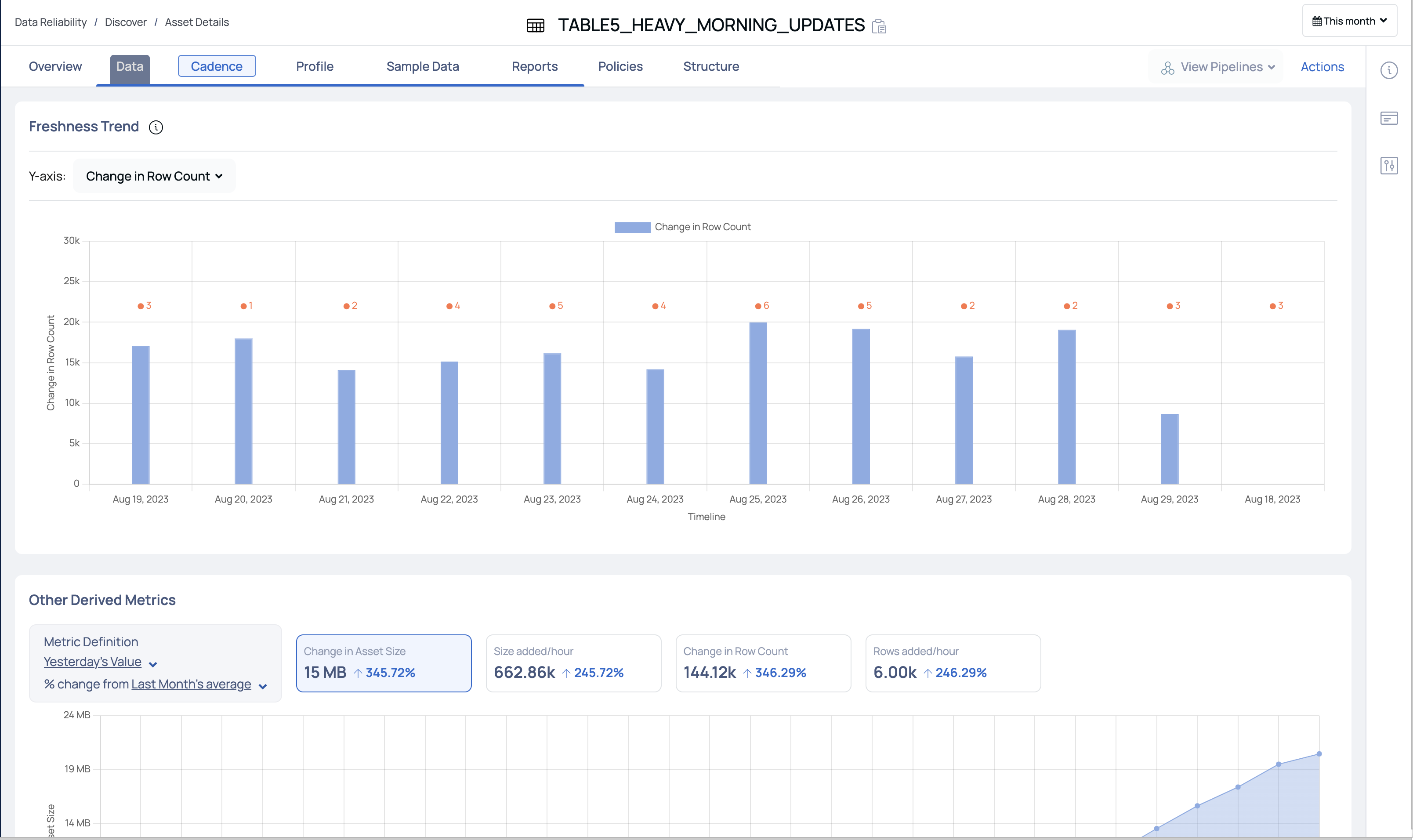
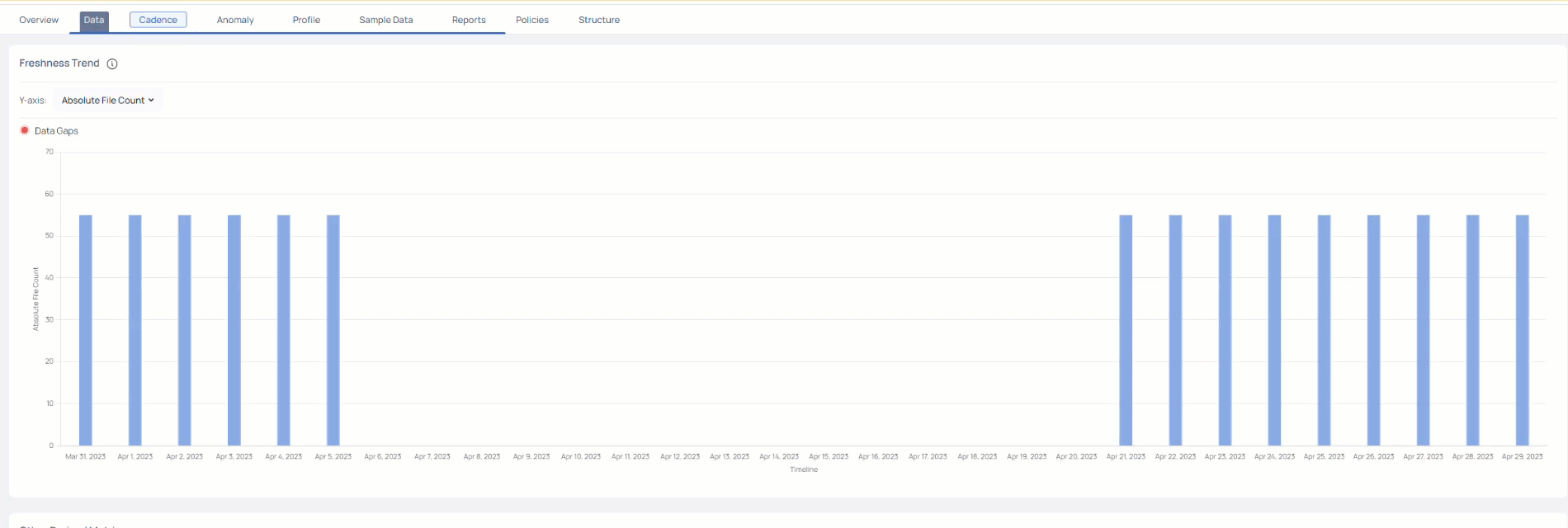
Freshness Trend
This section displays a bar graph of change in asset rows/asset size during the selected duration. The y-axis represents either Data Freshness, Absolute File Count, Change in File Count, Absolute File Size, or Change in File Size. and the x-axis represents the timeline.
You can choose to view the change in either the Absolute File count, Change in File Count, Absolute File Size, or Change in File Size on the y-axis. You can select the duration to either be 1 day, 1 week, 1 month, 6 months, or 1 year as the timeline on the x-axis.
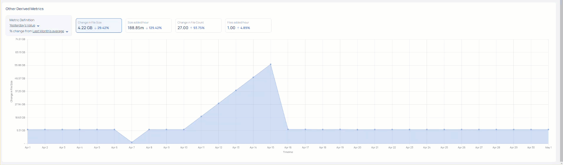
Other Derived Metrics
This section allows you to compare the asset metrics during different time periods. You can view the percentage change in asset metrics during the selected time period.
You can select the first duration metric to be either the Yesterday, Last Week, or Last Month. You can then select the second duration metric to be either Last Week, Last Month or Last Year.
- If you select Last Week as the first duration metric, then you can only select either Last Month or Last Year as the second duration metric.
- If you select Last Month as the first duration metric, then you can only select Last Year as the second duration metric.
ADOC compares the first duration metric's value with the second duration metric's value and displays the percentile change and also the absolute value change on the widgets. The widgets available are Change in File Size, Size added/hour, Change in File Count, and Rows added/hour.
In the following image, the first comparison metric is Yesterday, and the second comparison metric is Last Month. The widgets display the percentile change and absolute change in values from last yesterday to last month.
Data Cadence Reports
The data Cadence reports features notifies you about the changes in your assets. To receive the notifications for an asset, you must enable asset watch for the required assets.
To enable asset watch:
- Navigate to Data Reliability and select Data Discovery.
- Click the ellipsis menu for the required asset and select Watch Asset.
Alternatively, you can also enable asset watch from the Data Assets tab on the ADOC Discovery page.
Once you enable asset watch, ADOC notifies you about the changes to your asset, through an Email notification. The Email notifications are sent to the Email ID used to login to ADOC. If you have logged in to ADOC through SSO, the Email notifications are sent to the Email ID used to login to SSO. The Email notifications are sent every hour, even though there are no changes to the watched assets.
The following image displays the Notification Email you receive from ADOC.
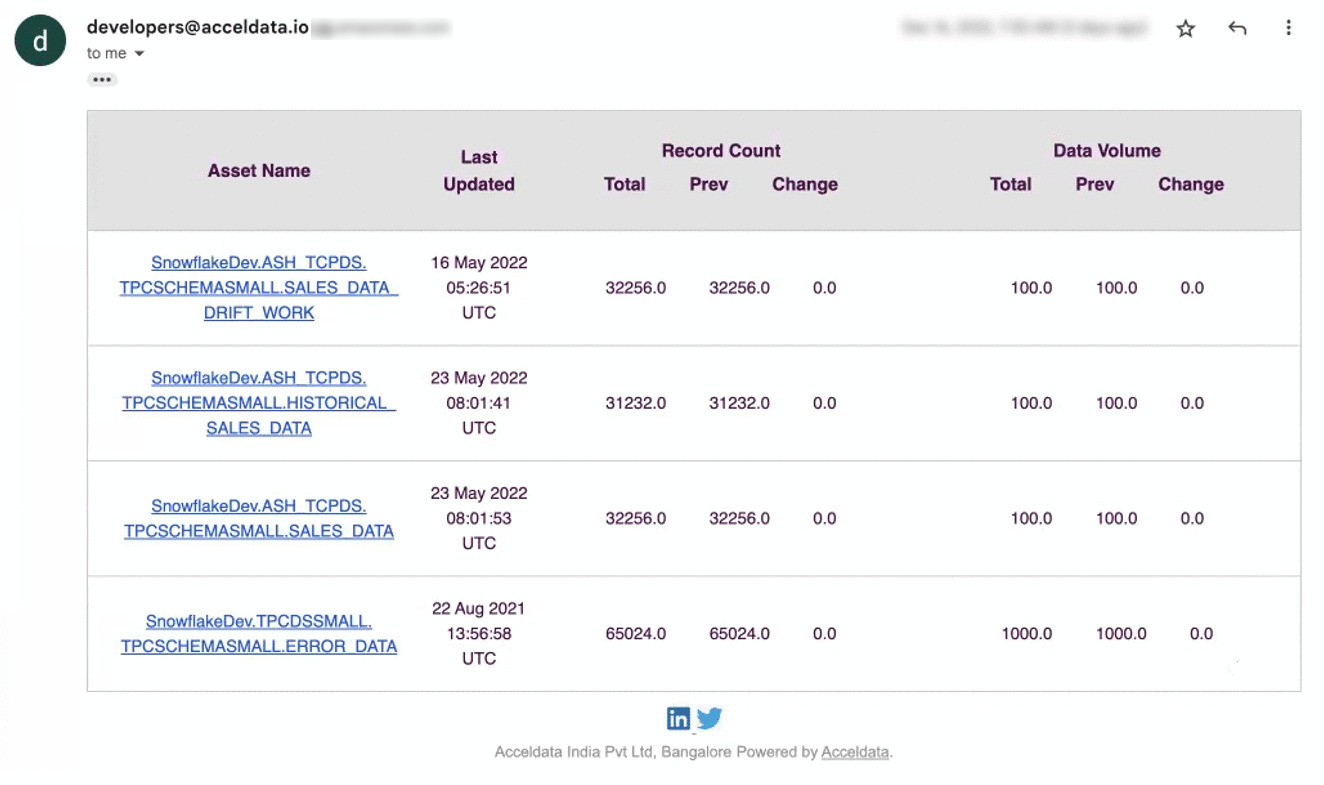
The contents of the email are described in the following table:
| Component Name | Description |
|---|---|
| Asset Name | The name of the asset. All the assets for which you have enabled asset watch, are listed here. |
| Last Updated | The date and time when the asset was last updated. |
| Record Count | The details of the changes in asset records. You can view the total number of records that are currently present, the total number of records that were previously present, and the change in the number of records. |
| Volume Count | The details of the changes in asset volume. You can view the current volume of asset, the previous volume of asset, and the change in the asset volume. |
SQL View
The SQL View allows you to change the name and other properties of a custom asset. This allows you to easily update and adjust the asset's information without having to change the underlying database structure. You may also use the SQL View to design and apply complicated filters or queries to extract specific subsets of data from the asset.
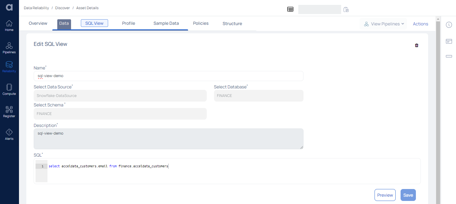
In terms of behavior, a custom asset is essentially similar to a standard asset. It is supported by a custom SQL, and whenever this custom asset is processed, the underlying SQL is used. This is useful for giving custom logic to describe data.
For example, if you wish to connect multiple tables or aggregate data from one or more tables, write that logic in custom SQL and use this SQL View in the same way that you would a regular data asset for data quality and profiling activities.
| Field | Description |
|---|---|
| Name | Displays the Asset's name as well as the option to edit it. |
| Select Data Source | Displays the name of the Data Source. |
| Select Database | Displays the selected Database. |
| Select Schema | Displays the schema |
| Description | Displays the description |
| SQL | Displays the SQL view of the data |
After making the changes, click the Preview button to display the preview.
To save the changes, click the Save button.
Profile
Asset profiling serves as an essential precursor to any data quality enhancement initiative, as it enables organizations to better understand the current state of their data, recognize vulnerabilities, and take informed actions to rectify issues and optimize their data assets for more accurate and reliable analytics and decision-making.
ADOC provides the capability to perform data profiling not only for structured data but also for semi-structured data, enabling you to gain valuable insights from both types of data assets.
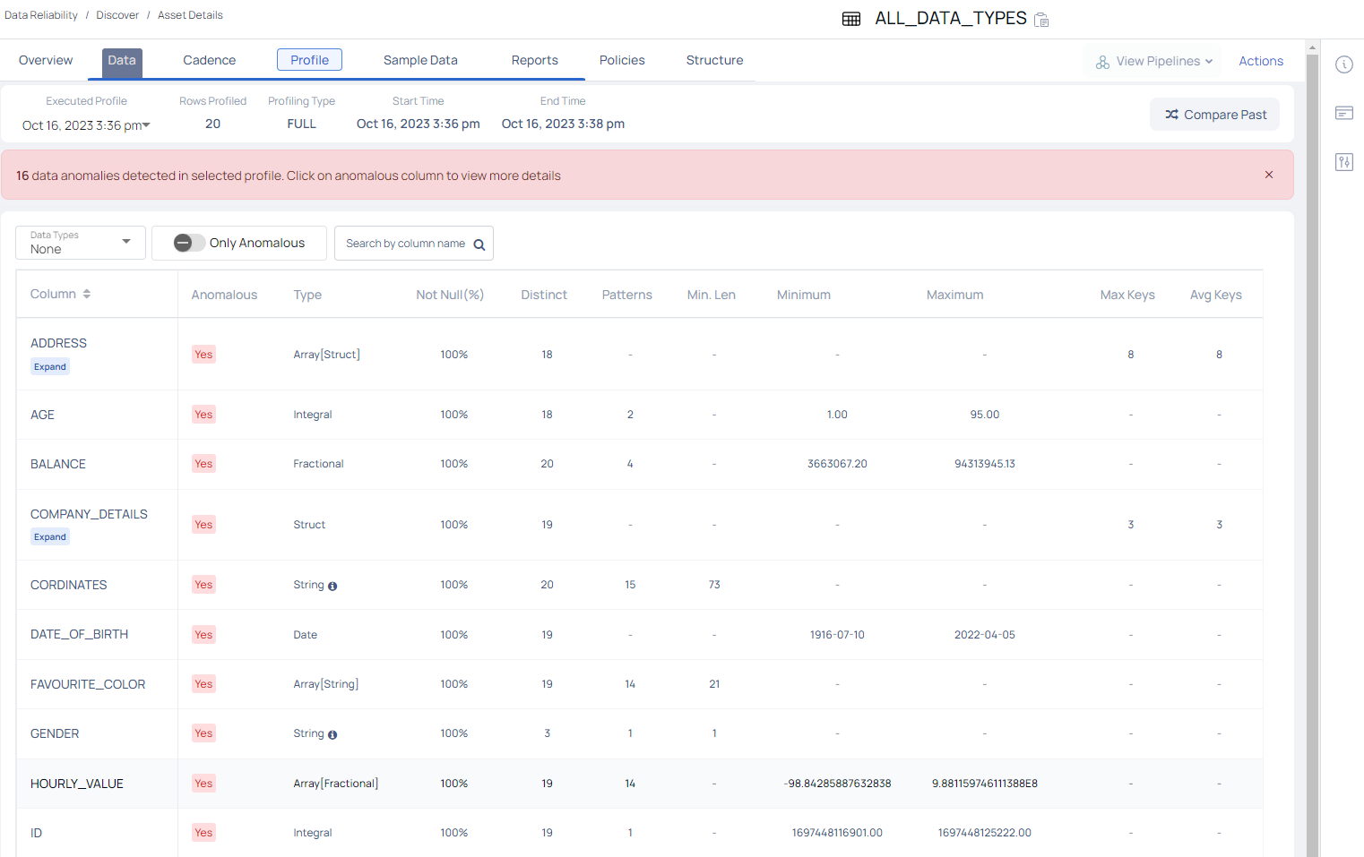
The Profile tab displays the following information about the assets profiled within the selected table, for a selected date and time.
| Property Name | Definition | Example |
|---|---|---|
| Executed Profile | Defines the most recent date and time at which the profiling of asset occurred. Click the drop-down and select a date and time to view previous profile executions details. | Aug 24, 2023 8:26pm |
| Rows Profiled | Number of rows profiled. | 2976508 |
| Profiling Type | Full or Sample type of asset profiling? | FULL |
| Start Time | Defines the date and time at which the profiling of the asset started. | Aug 24, 2023 8:26pm |
| End Time | Defines the date and time at which the profiling has ended. | Aug 24, 2023 8:27pm |
| Start Value | Defines the value with which the profiling began. | 169271...114824 |
| End Value | Defines the value with which the profiling completed. | 169288...763048 |
- Compare Profiles: Click on the shuffle icon to compare the current profiled data of an asset with previously profiled data.

Profiling an Asset
To start profiling, click the Action button and then select either Full Profile, Incremental, or Selective from under Profile.
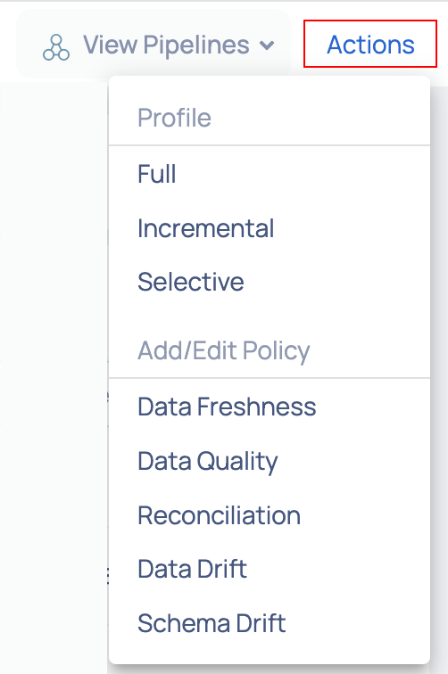
Action Button
Once the profiling is completed, a table is generated with names of each of the columns present in the table. Various metrics are calculated for each column. Each column contains one data type and the metrics generated for a structured column data types are as follows:
| Data Type | Statistical Measures |
|---|---|
| String |
|
| Integral |
|
| Fractional |
|
| Time Stamp |
|
| Boolean |
|
Similarly, the metrics generated for semi-structured column data types are as follows:
| Data Type | Statistical Measures |
|---|---|
| Struct |
|
| Array[String] |
|
| Array[Integral/Fractional] |
|
| Array[Boolean] |
|
| Array[Struct] |
|
Viewing Column Data Insights
To gain deeper insights into any column type, whether structured or not, simply click on the column name. This action will open a modal window presenting the following details:
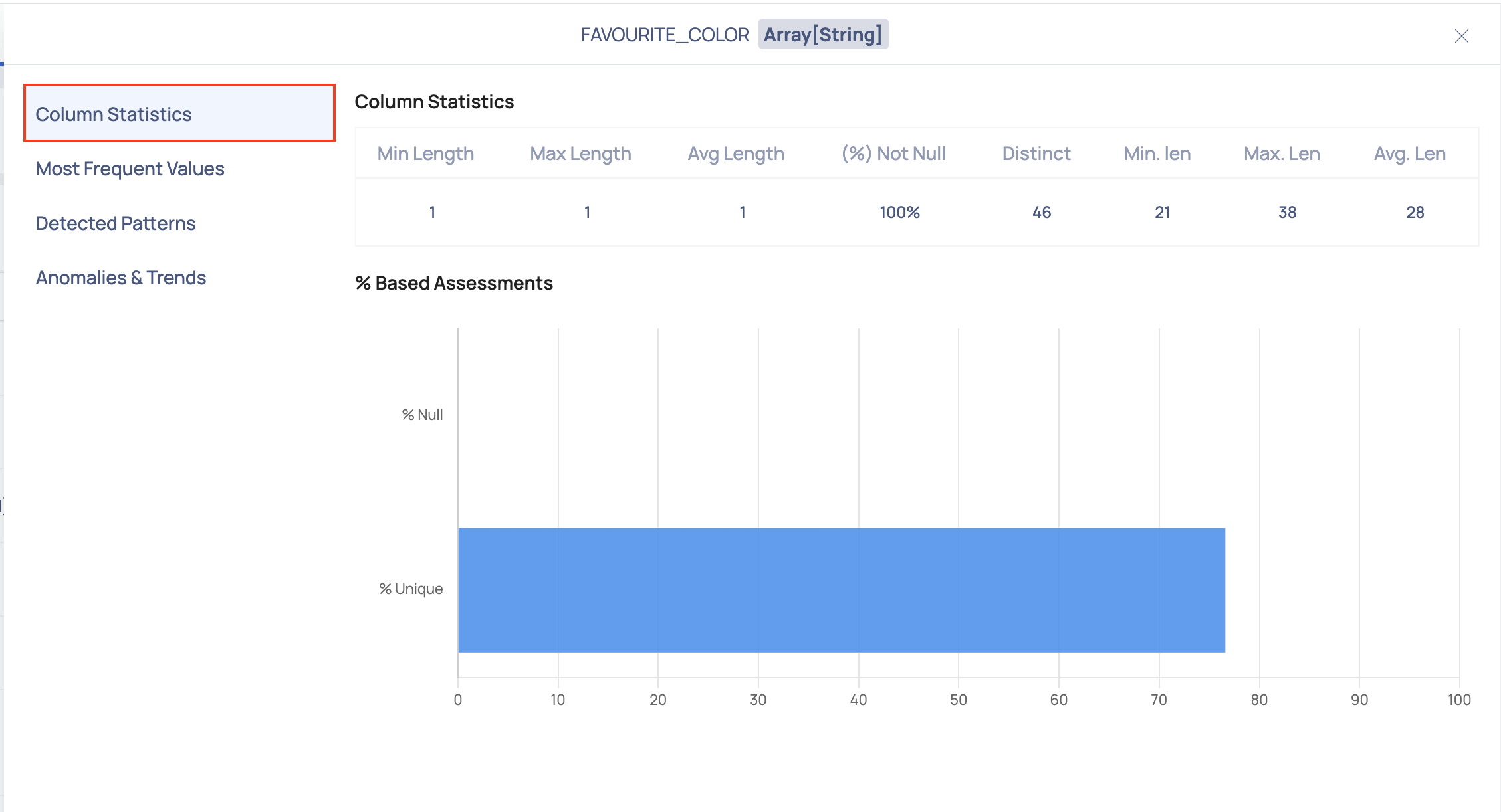
Column Statistics
This section provides a table showcasing statistics for the selected column, accompanied by a bar graph illustrating percentage-based evaluations like % Null values and % Unique values.
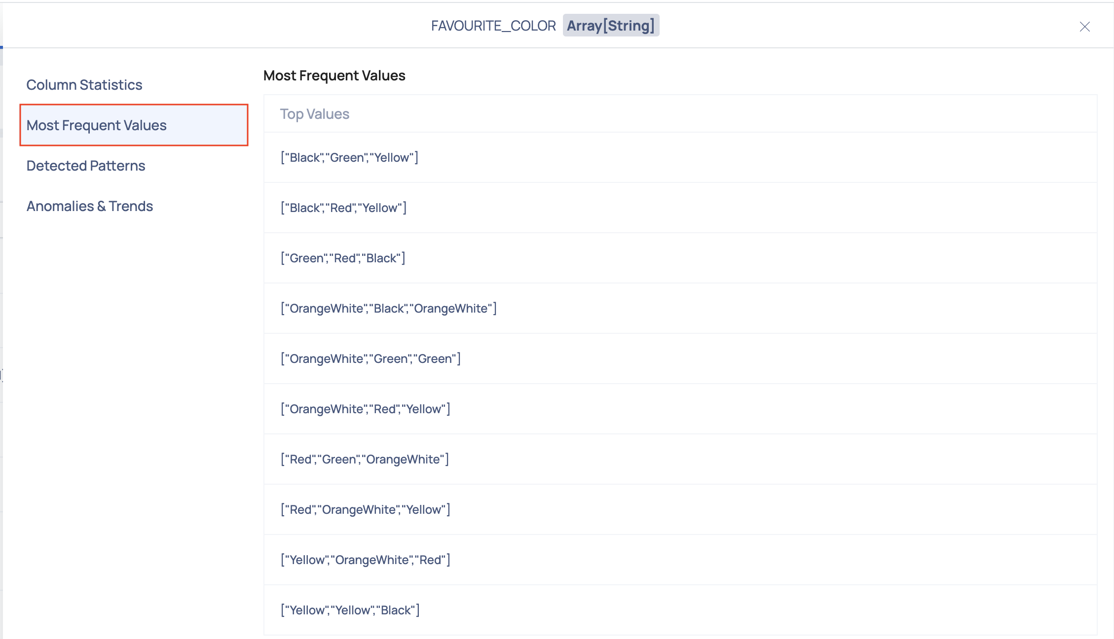
Most Frequent Values
This section provides a list of the most frequent values found for the selected column.
Detected Patterns
This section provides a list of common patterns found for the selected column.
Anomalies & Trends
Within this section, you'll find a variety of charts that offer valuable insights into your data. These visualizations present key metrics such as skewness, distinct count, completeness, and kurtosis. Using the historical data, upper bound for the current value and lower bound for the current value is calculated and plotted over the graph as shown in the following image:
These charts help you understand the distribution and patterns within your data, enabling you to identify potential anomalies and trends that may influence your analysis and decision-making processes.
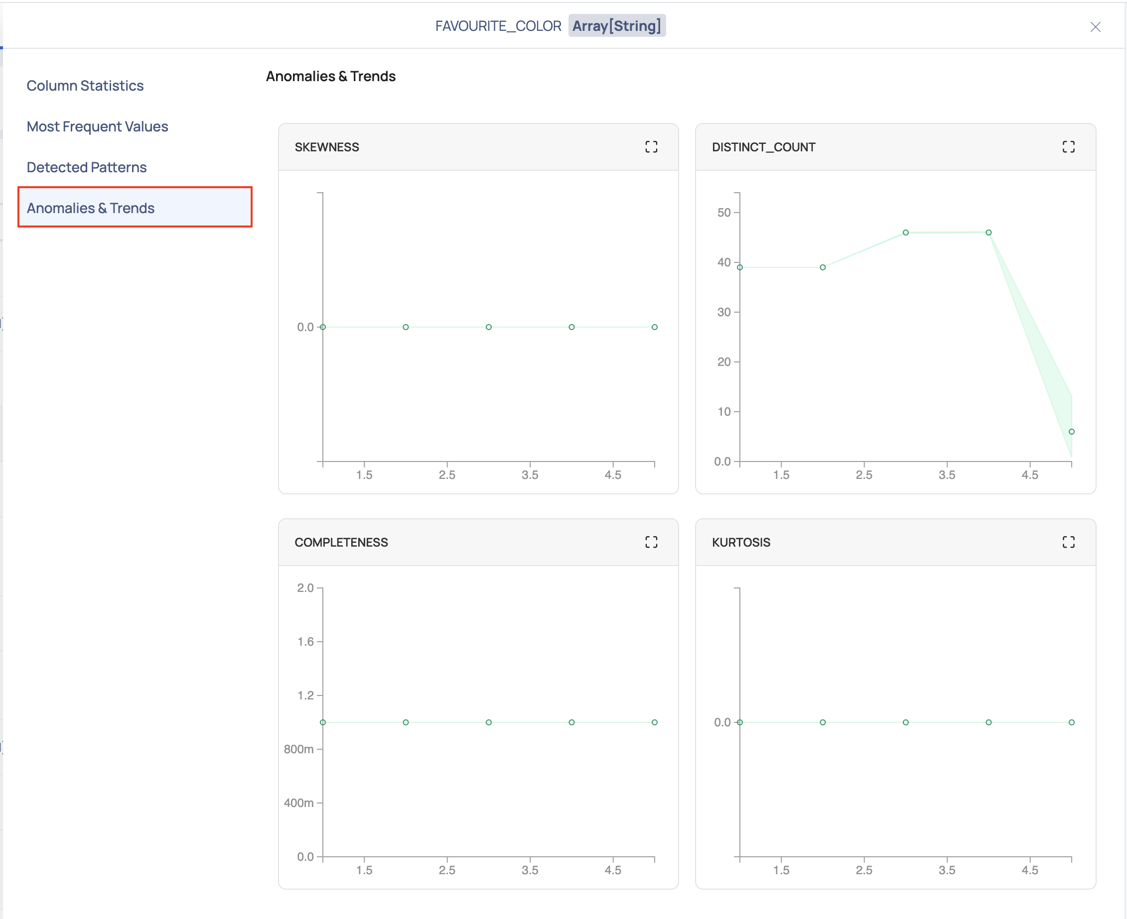
Every time a table is profiled, a data point is recorded. Overtime, n number of data points is recorded for each metric of every column of the table. The following observations can be made from the graph:
- If the data point lies between the upper bound curve and the lower bound curve, then the data point is non-anomalous.
- If the data point lies beyond the upper bound curve and the lower bound curve, then the data point is anomalous.
The following fields must be configured for anomaly detection in the Data Retention window:
- Historical Metrics Interval for Anomaly Detection
- Minimum Required Historical Metrics For Anomaly Detection
- For a column of complex data type including array, map, and struct, sub-columns of other datatype other than string, numeric and Boolean data type will be treated as string.
- For column with array type, pattern profile and top values will have values only and the count will not be displayed
- For column with array type, total non null count will not be displayed.
- Anomaly detection is not supported for nested column of an asset in the current version of ADOC.
- By default ADOC can profile up to five levels of a complex data structure. This can be updated with an environment variable PROFILE_DATATYPE_COMPLEX_SUPPORTED_LEVEL in the analysis service deployment in the data plane.
Sample Data
The Sample Data tab displays the complete data of an asset. The complete table, along with all the columns, rows, and the data in each cell is displayed. The user gets a quick insight into the data of the asset.
To view only selected columns, filter the data according to the Column Data Types and Column Names. Click the
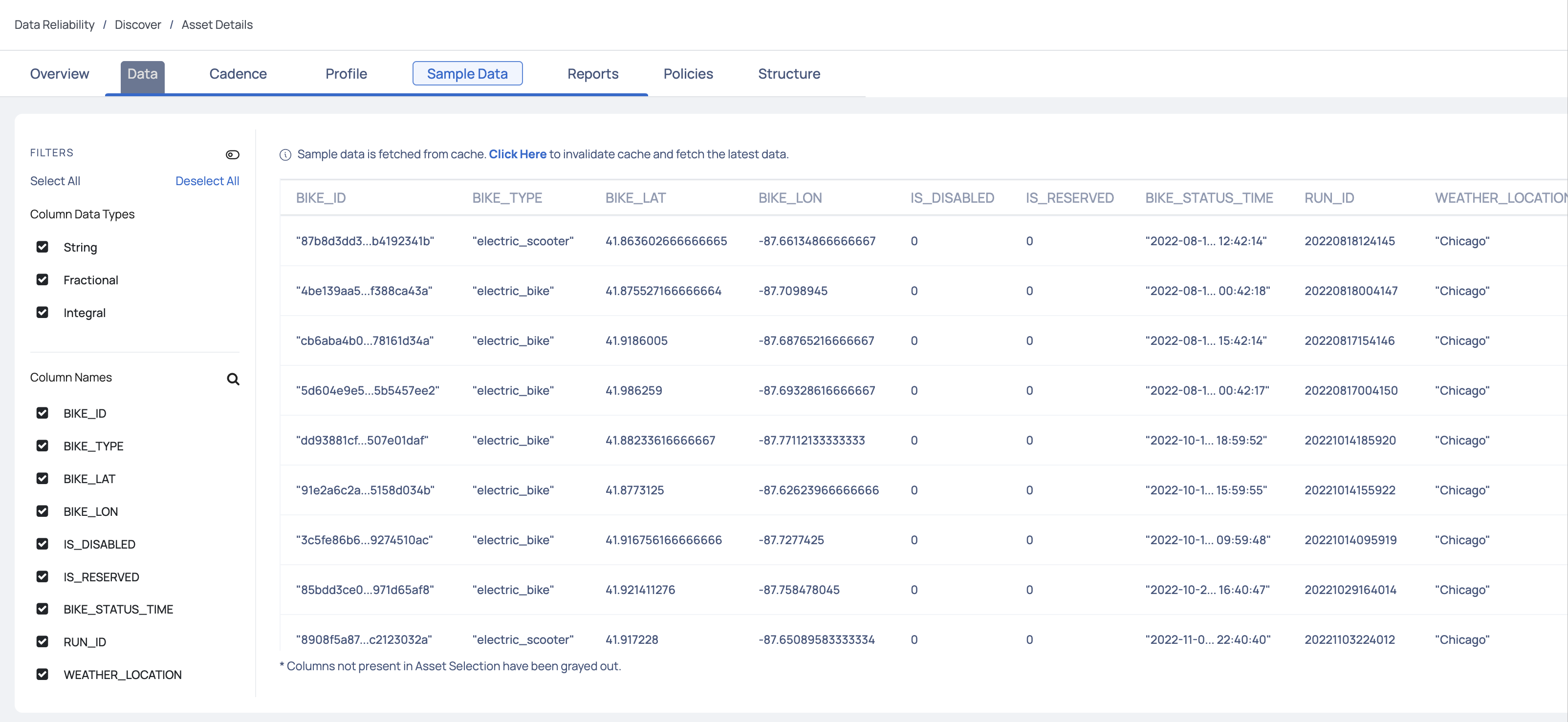
Asset Selection
If columns are selected at the asset level, then the columns not present in the Asset Selection are grayed out.
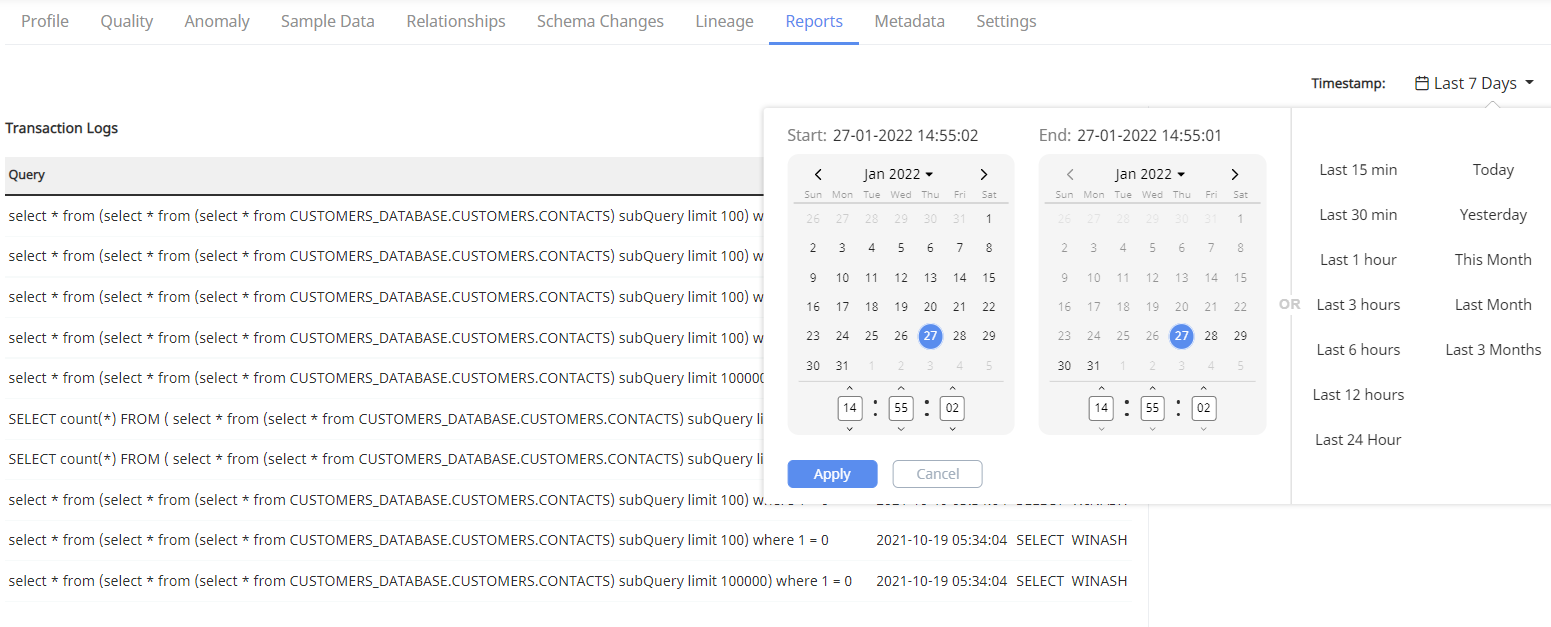
Reports
The Reports tab displays different types of reports associated with an asset. The following information is displayed in the Reports tab:
- Transaction Logs: Displays recent queries fired on the asset.
- Access Info: Displays the number of times a table has been accessed and the most frequent user of the table in the selected time duration.
- Most Joined Table: Displays the tables frequently being joined with the selected table.
To view reports for a selected time duration, click on Timestamp. Select the date range from the drop-down and click the Apply button.
Policies
The Policies tab displays the policy score and other details for all the policies applied on the selected asset.
- Data Reliability Score: This section displays the Data Reliability score. You can also view the highest, lowest, and average value of the reliability score.
- Policy Score: This section displays the policy scores for each type of policy in ADOC.
The below graph displays the overall score for data reliability and also scores of all the policies. You can choose to view the scores for the last one day, the last one week, last one month, last six months, or last one year. When you hover over a bar, you can view the policy type and the score.
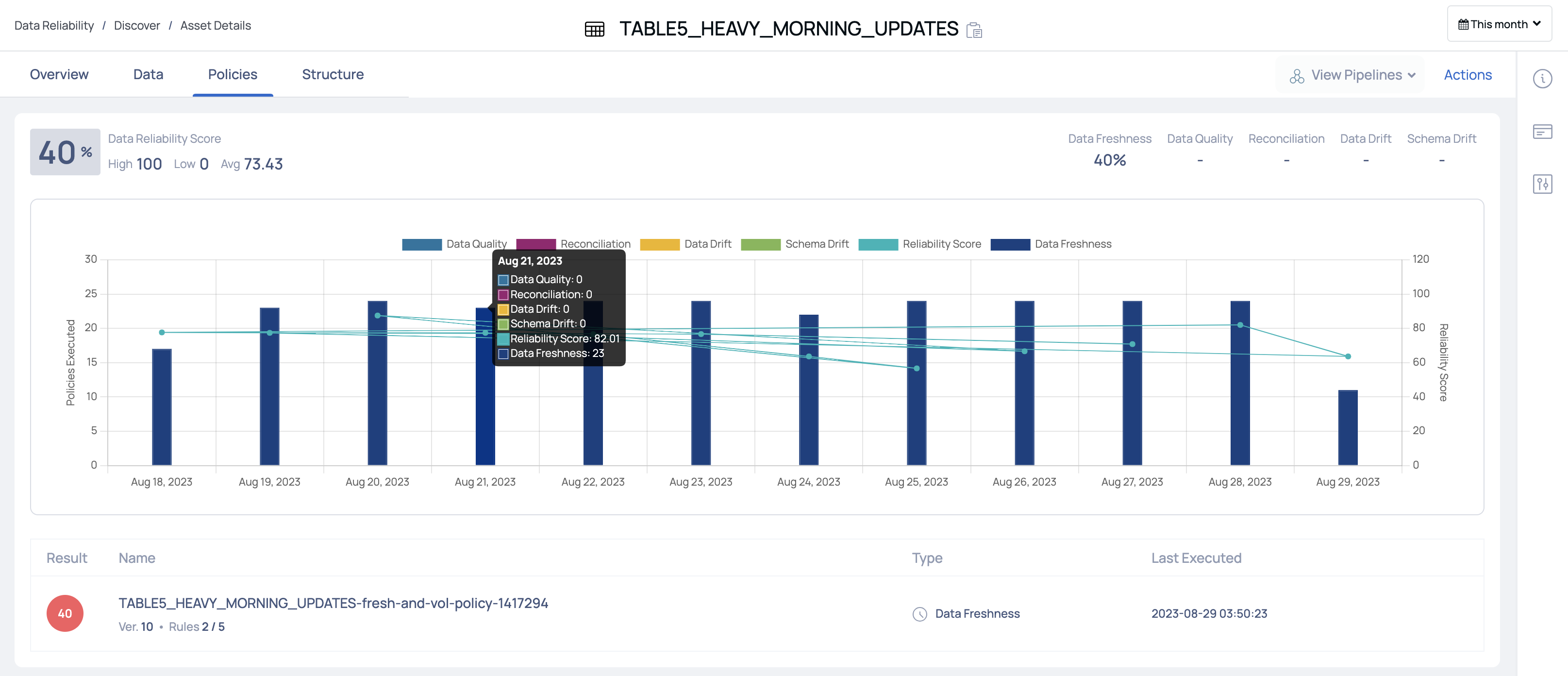
The policy table displays the following columns:
| Column Name | Description |
|---|---|
| Result | Displays the score of the policy. |
| Name | Displays the name of the policy. |
| Type | The type of the policy. This can either be data quality, reconciliation, data drift, or schema drift policy. |
| Last Executed | The date and time when the policy was last executed. |
Structure
The Structure tab allows you to view the following tabs:
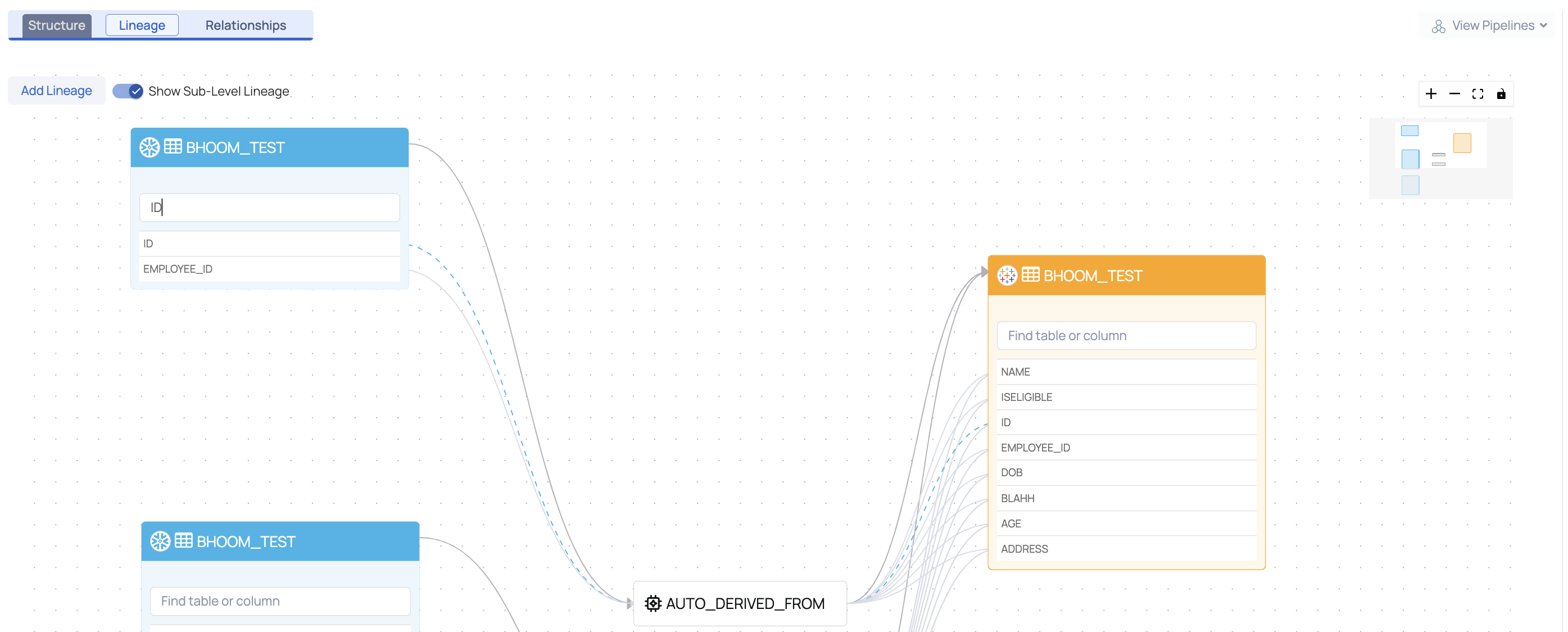
Lineage
The Lineage tab pictorially represents the dependency of an asset over another asset. It depicts the flow of data from one asset to another. This data flow diagram is known as Lineage. Lineage is currently examined at two levels, namely,
- Table Level Lineage
- Column Level Lineage
Lineage at Table Level
Lineage at the table level depicts the flow of data from one table to another through a process. This process is responsible for the flow of data from the source asset to the sink asset.
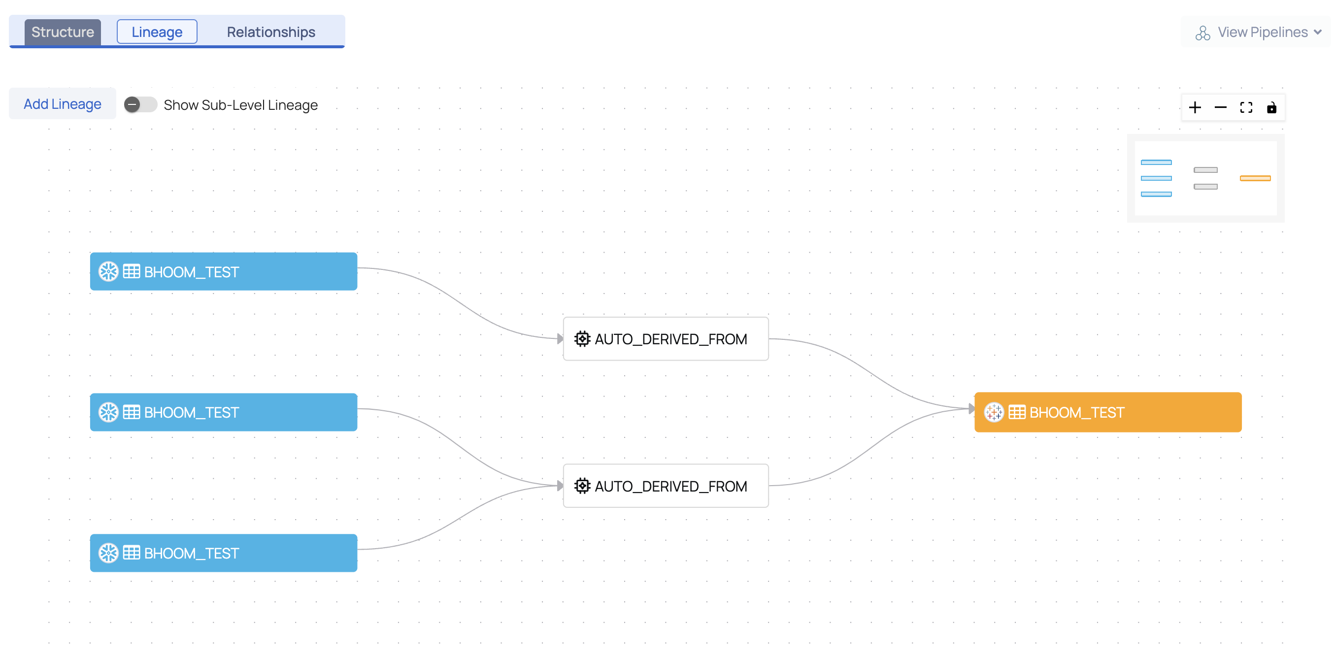
For more detailed information, toggle the Show Sub-Level Lineage button. The lineage at the column level is also displayed. Click on one of the columns to view the flow of data.
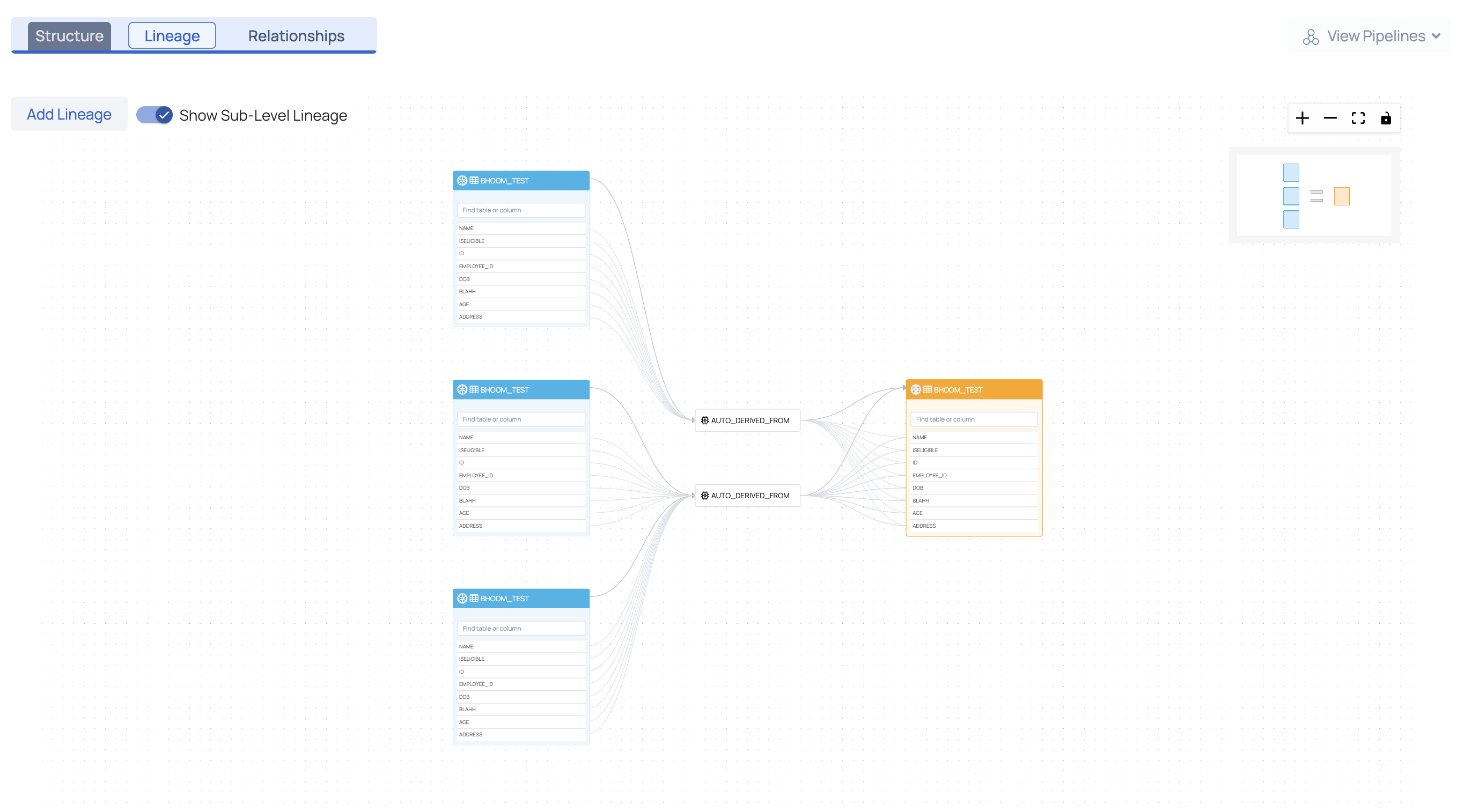
Lineage at Column Level
Lineage at the column level depicts the flow of data from one column to another through a process. The process is responsible for the flow of data from the source asset to the sink asset.
Users can search for a column by name within a table and trace its lineage through the dotted flow line.
Query Analyzer Service
The lineage information is extracted by the Query Analyzer Service. The Query Analyzer Service periodically (one hour intervals) fetches queries executed on a data source and stores them as query logs. It extracts information and lineage is inferred at both table level and column level.
The user can also add custom queries, to extract lineage information. To add custom queries, see here.
Add Lineage
An external pipeline or asset can be added to an existing lineage. To add an asset to a particular lineage, click on Add Lineage.
This Query Analyzer Service supports only Redshift and Snowflake data sources.
The Add Lineage modal window is displayed.
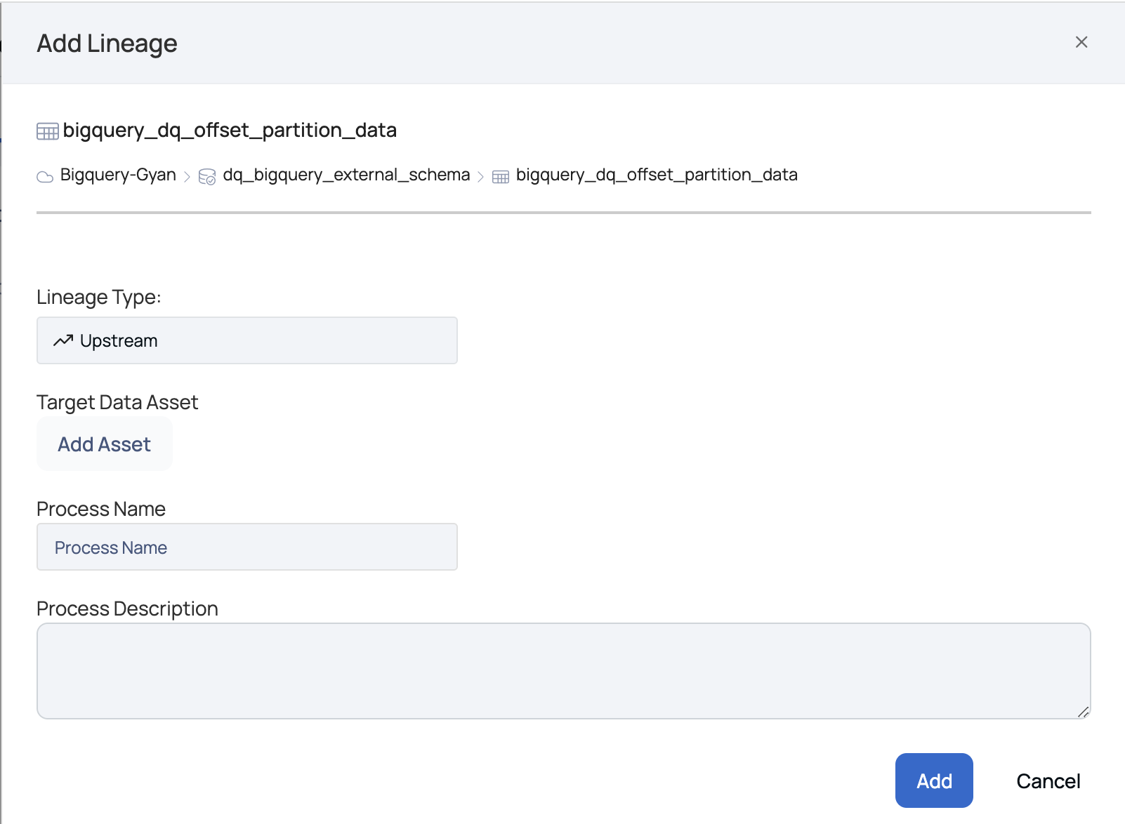
Add Lineage Window
The following section describes the parameters to be entered in the Add Lineage window:
Lineage Type: There are two types of lineage, namely:
- Upstream: The upstream lineage type indicates that data is flowing from the added asset to the selected table. On selecting upstream, the node is added before the table.
- Downstream: The downstream lineage type indicates that data is flowing from the selected table to the added asset. On selecting downstream, the node is added after the table.
Target Data Asset: To add a target data asset, click on Add Asset. The Data Asset Picker window pops-up. Select an asset from the data source list or search for an asset by its name in the search bar. Click the Select button.
Process Name: Define a name for the process. For example, Create Table.
Process Description: Description of the process i.e., flow of data from the source to the sink asset.
Click the Add button.
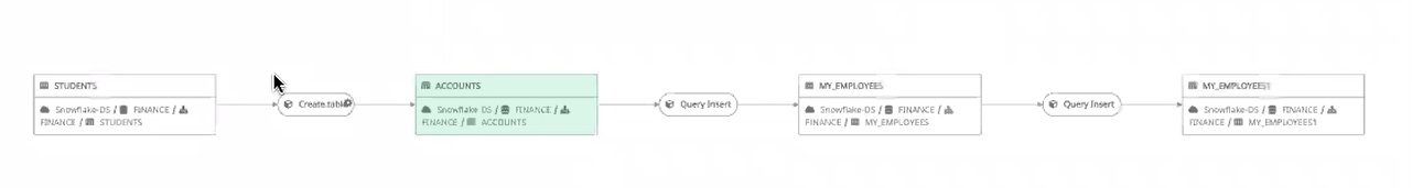
The STUDENTS table is now added as a node to the existing lineage.
Relationships
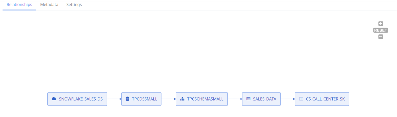
The Relationships tab displays assets related to the selected asset. It displays the hierarchy of the asset.
For example, the name of the selected table is SALES_DATA. The table is part of the schema named TPCSCHEMASMALL. This schema belongs to the database named TPCDSSMALL. This database belongs to the data source named SNOWFLAKE_SALES_DS.
The Relationships tab also displays the terms related the selected asset.
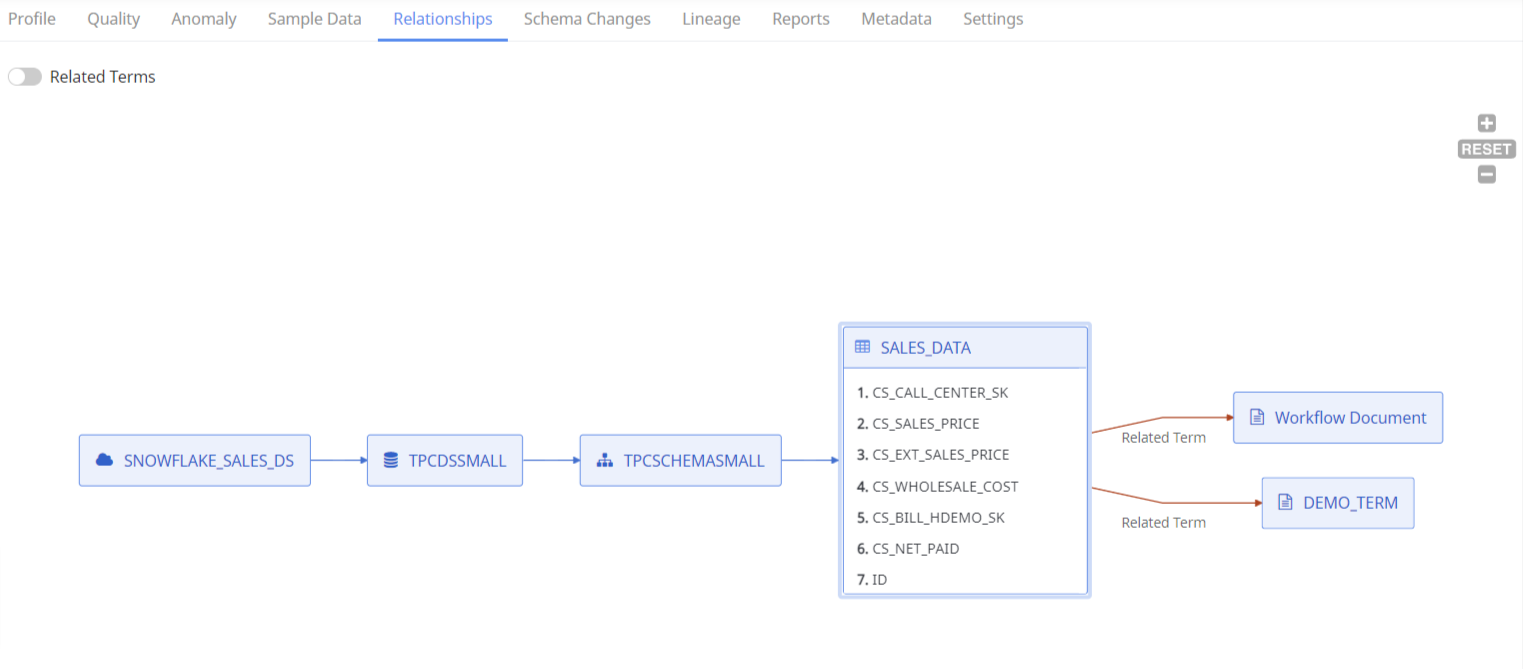
Select a column from the table, to view the column hierarchy.
Foreign Key Relationship
The Relationships tab displays the Foreign Key relationship between tables and columns as well.
Let's suppose, a table contains few columns and 1000s of rows of data. Each column is identified by an identifier known as the primary key. When this primary key is used to define another column of another table, then the second table is said to have a Foreign Key relationship with the first table.
The following image displays a single foreign key relationship:
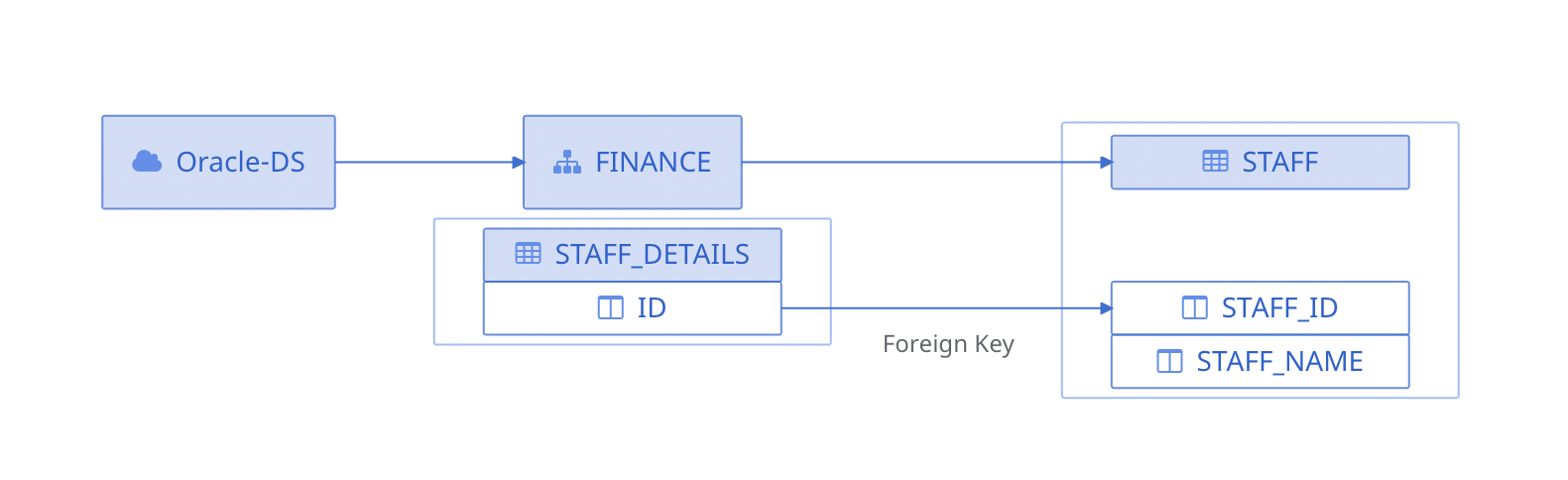
Single Foreign Key Relationship
The following image displays a composite foreign key relationship:
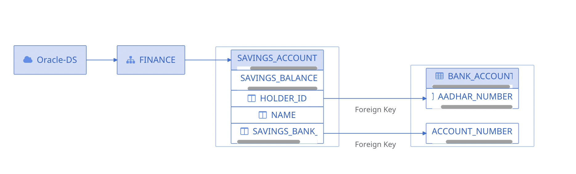
Composite Foreign Key Relationship
Schema Changes
The Schema Changes tab displays a panel with all the snapshots that are taken every time a crawler runs. Select exactly two snapshots for comparison.
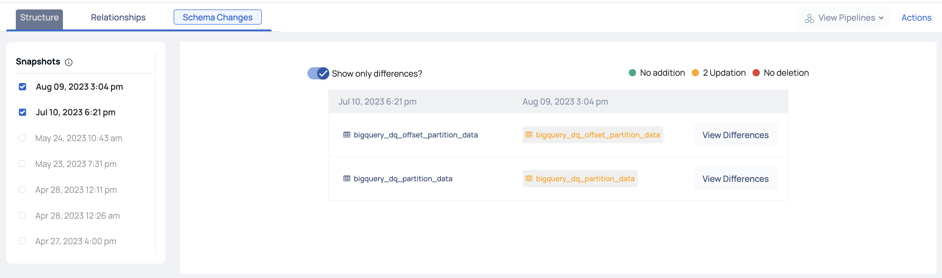
To show only the differences between the two executions, click the Show Only Differences? toggle icon. It displays the number of columns added and deleted. Also, displays any update in the table.