Databricks Cost
Overview
The Databricks Cost Overview page contains a complete breakdown of the expenses associated with Databricks operations and related cloud vendor services. This page is intended to provide users with a clear, visual depiction of their cost data over a certain time period, allowing for more effective expense monitoring and control.
Overview Tab
Filters
The Data Source Filter allows you to switch the Databricks data source. This enables you to view and analyze data across various sections based on the selected Databricks account or project, providing flexibility for monitoring and managing information across different data sources.
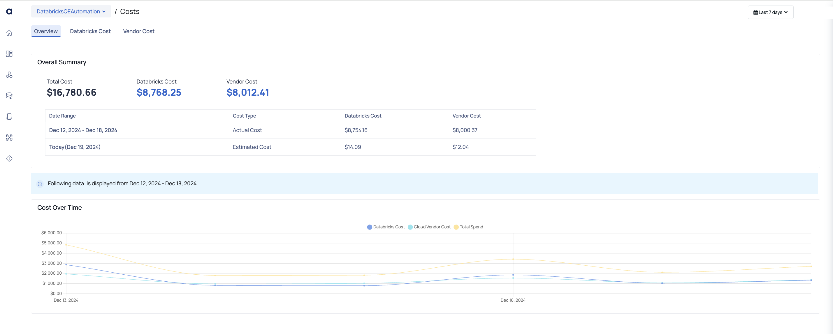
Overall Summary
The Overall Summary section at the top of the page provides a quick snapshot of your total costs, broken down into:
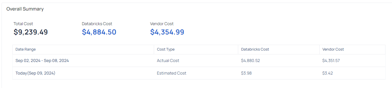
- Total Cost: The total cost incurred. This is the sum of Databricks cost and vendor cost.
- Databricks Cost: The cost incurred on Databricks resources.
- Cloud Provider Cost: The cost incurred on vendor resources.
Cost by Cluster Type
The Cost Over Time graph visualizes the cost trends for Databricks resources, cloud vendor resources, and the total spend over the selected time period.
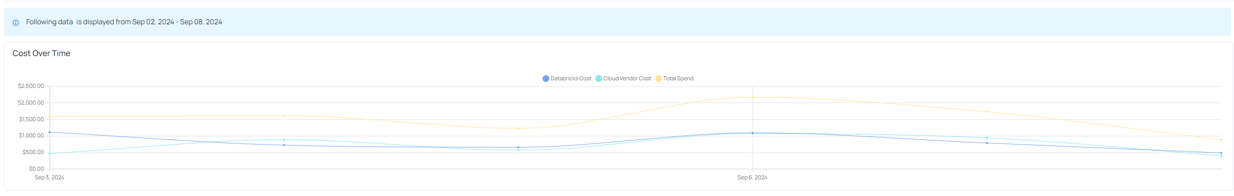
- Databricks Cost (Blue Line): Represents the cost associated with Databricks resources.
- Total Spend (Yellow Line): The cumulative cost combining both Databricks and cloud vendor costs
- Cloud Vendor Cost (Light Blue Line): Represents the cost associated with cloud vendor services used in conjunction with Databricks.
This visualization allows users to observe how their costs evolve over time, identify trends, and pinpoint specific days where costs may have spiked or dropped.
- Cost Management: By breaking down costs into Databricks and vendor categories, users can better understand where their budget is being allocated and identify opportunities for cost optimization.
- Trend Analysis: The Cost Over Time graph helps in recognizing patterns in spending, making it easier to forecast future costs and adjust resources accordingly.
Databricks Cost
The Databricks Cost page provides a detailed view of costs associated with different Databricks clusters. This page is structured to give users insights into cost distribution over time, by cluster type, and by specific clusters, enabling better financial management and resource optimization.
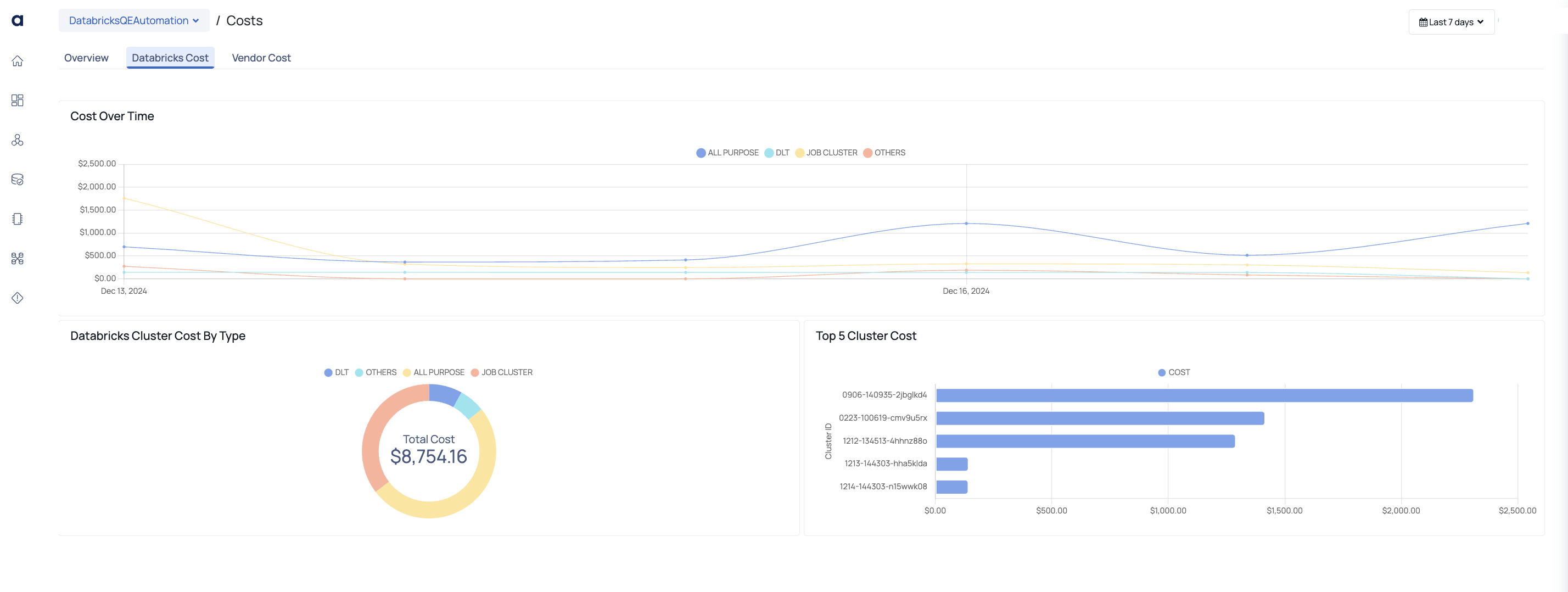
Cost Over Time
The Cost Over Time graph provides a visual representation of the costs incurred by different cluster types over the selected time period. This graph allows you to track the trend of costs for each cluster type on a daily basis.
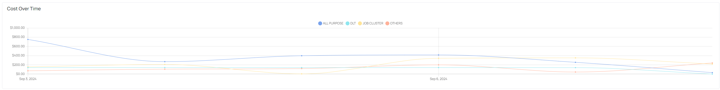
- All Purpose (Blue Line): Represents costs associated with all-purpose clusters.
- DLT (Green Line): Represents costs associated with Delta Live Tables (DLT) clusters.
- Job Cluster (Yellow Line): Represents costs associated with job clusters.
- Others (Red Line): Represents costs from other cluster types.
This component is useful for identifying trends in spending across different cluster types and pinpointing any significant changes over time.
Databricks Cluster Cost By Type
The Databricks Cluster Cost By Type section provides a donut chart that summarizes the total cost incurred for each cluster type. The chart is color-coded to match the lines in the Cost Over Time graph, ensuring consistency in data representation.
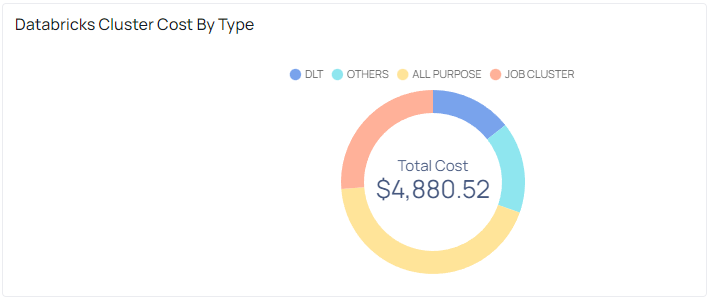
Total Cost: Displays the total cost incurred across all cluster types within the selected time period.
This section is critical for understanding the proportion of costs attributed to each cluster type, helping you quickly identify which types are contributing most to overall expenses.
Top 5 Cluster Cost
This component helps in quickly identifying the clusters that are driving the majority of costs, enabling targeted analysis and potential cost optimization efforts.
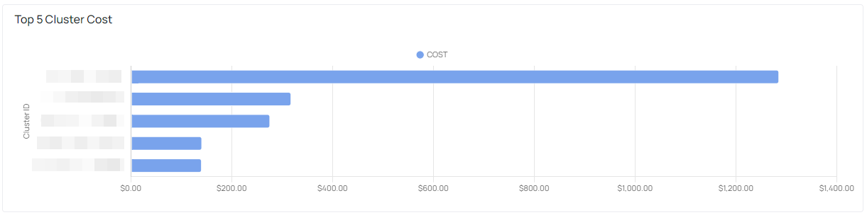
The Top 5 Cluster Cost bar chart lists the five most expensive clusters within the selected time period. Each bar represents a cluster, with its length proportional to the total cost incurred by that cluster.
Cluster ID: Each bar is labeled with the Cluster ID, allowing for easy identification of the high-cost clusters.
Trend Analysis: Use the Cost Over Time graph to monitor how costs for different cluster types evolve over the selected time period. This helps in identifying patterns, such as increases in cost associated with specific clusters, which may require further investigation or optimization.
Cost Distribution: The Databricks Cluster Cost By Type section provides a quick overview of how costs are distributed across different cluster types. This information can be used to assess whether resources are being allocated efficiently or if certain cluster types are disproportionately expensive.
High-Cost Cluster Identification: The Top 5 Cluster Cost chart allows for quick identification of the clusters that are contributing the most to overall costs. This enables focused efforts on optimizing these specific clusters to reduce expenses.
Vendor Cost
The Vendor Cost page in ADOC provides a detailed breakdown of the costs associated with cloud vendor services used in conjunction with your Databricks environment. This page is designed to help users analyze and monitor costs across different vendor services, including bandwidth, storage, virtual machines, and virtual networks.
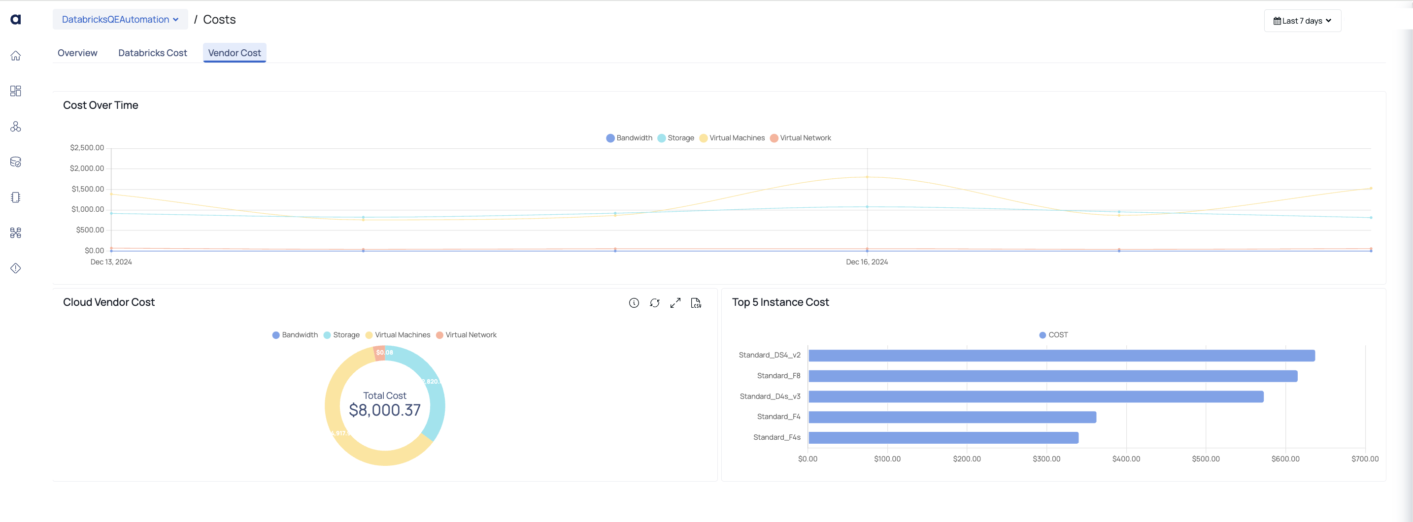
Cost Over Time
The Cost Over Time graph visualizes the total cost incurred from various cloud vendor services over the selected time period. This graph allows you to track how your vendor-related expenses evolve daily, providing insights into cost trends.
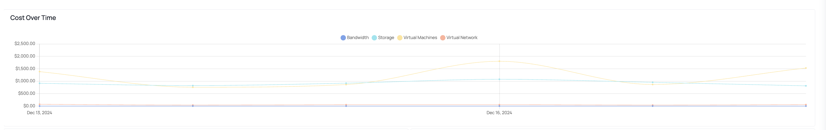
- Bandwidth (Blue Line): Represents the cost associated with bandwidth usage.
- Storage (Yellow Line): Represents the cost associated with data storage.
- Virtual Machines (Green Line): Represents the cost associated with virtual machine usage.
- Virtual Network (Red Line): Represents the cost associated with virtual network usage.
This component is essential for identifying trends in spending on specific vendor services, allowing for targeted cost management and optimization efforts.
Cloud Vendor Cost
The Cloud Vendor Cost section features a donut chart that breaks down the total vendor cost by service type. The chart is color-coded to match the lines in the Cost Over Time graph, providing a consistent visual representation.
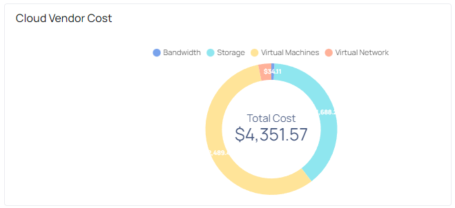
Total Cost: Displays the total vendor-related cost incurred within the selected time period.
This section helps in quickly assessing the proportion of costs attributed to each vendor service type, enabling you to understand the distribution of your expenses across different cloud services.
Top 5 Instance Cost
The Top 5 Instance Cost bar chart highlights the five most expensive instances based on their vendor-related costs. Each bar represents an instance type, with its length proportional to the total cost incurred by that instance.
Instance Type: Each bar is labeled with the instance type, allowing for easy identification of high-cost instances.
This component is useful for identifying which instances are driving the majority of vendor costs, enabling focused efforts on optimizing these specific instances to reduce expenses.
Vendor Service Cost Analysis: Use the Cost Over Time graph to monitor how costs for different vendor services evolve. This helps in identifying any spikes in usage that may need further investigation or adjustment to stay within budget.
Cost Distribution Assessment: The Cloud Vendor Cost donut chart provides a quick overview of how vendor costs are distributed across different services. This information is crucial for understanding where the bulk of your vendor-related expenses are coming from and whether there are opportunities for cost optimization.
High-Cost Instance Identification: The Top 5 Instance Cost chart allows you to quickly identify the instances that are contributing the most to your vendor costs. By focusing on these instances, you can take targeted actions to optimize resource usage and reduce overall expenses.
Azure Databricks Cost Retrieval Methods
This document outlines two primary methods for retrieving cost data related to Databricks and associated cloud vendor services on Azure: the API Method and the Data Export Method. Both methods allow you to obtain granular cost details, which are essential for monitoring, analyzing, and optimizing your cloud expenses.
- System Time Requirement: To ensure the cost data displayed in ADOC matches exactly with what is shown in the Azure Portal, you need to set your system time to UTC. This alignment is crucial for accurate cost comparison.
- Filter Facet Count Mismatch in Job Studio: You may notice a slight difference in the filter facet count between the Job Studio page in ADOC and the Databricks Job runs page. This discrepancy occurs because the update frequency for Databricks Job runs is different from that in ADOC.
- Cloud Vendor Cost Calculation Timing: There can be a slight mismatch (typically below 0.5%) between the Cloud Vendor cost shown in ADOC and the Azure Portal. This is because Azure's cost calculations can take 24-48 hours to fully update. It may take up to 48 hours to see the exact Cloud Vendor cost as reflected in the Azure Portal.
- Initial Data Availability After Enabling API Method: After you enable the API method for cost retrieval, it can take up to 24 hours to populate cost data for the last 30 days. This delay affects both Databricks and Cloud Vendor costs.
- Cost Display on All Purpose Cluster Page: The All Purpose Cluster page in ADOC displays costs on a daily basis. If you select a date range that is less than or equal to the last 24 hours, the cost data may not be visible. This is due to the way daily cost aggregation is handled in the system.