Overview Dashboard
Alert Overview Tab
The Alerts Overview tab displays a highlighted view of the incidents from data reliability, pipeline, and data compute sections. The data displayed in this page is filtered based on the timeline set in the Global Calendar. To view data specific to a timeline, you must select the required timeline in the global calendar.
To navigate to the Alerts Overview page, execute the following steps:
- Log in to your ADOC account.
- Select Compute from the left pane and click Alerts.
- Click Overview on the Dashboard.
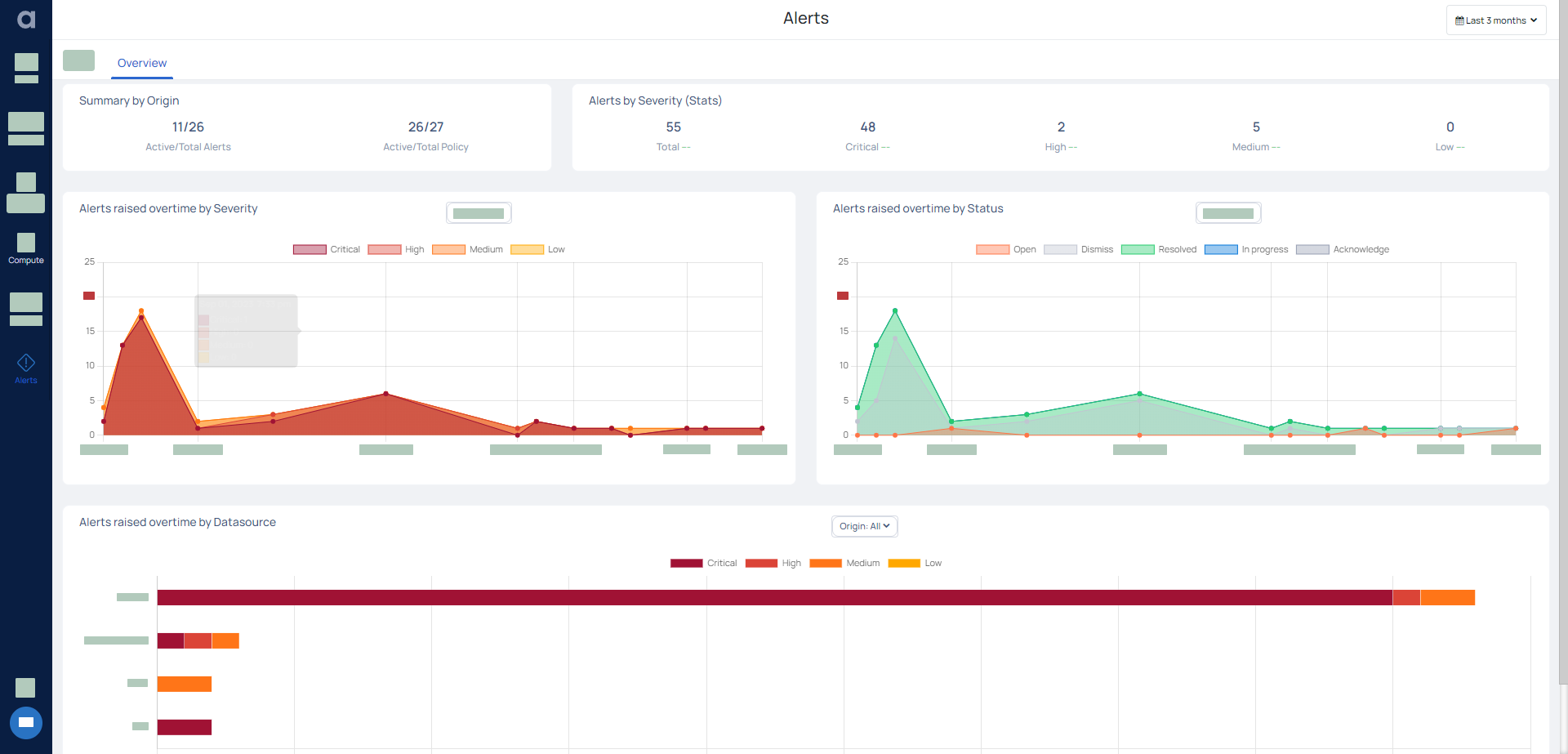
The various widgets and graphs displayed on this page are describes as follows.
Summary By Origin
This widget displays the following data.
- Active/Total Alerts: The total number of compute alerts that are active as compared to the total number of compute alerts created.
- Active/Total Policy: The total number of policy alerts that are active as compared to the total number of policy alerts created.
Alerts By Severity (Stats)
This widget displays the total number of alerts raised, which is the sum of number of alerts raised for each severity type.
This widget also displays a percentile difference value by comparing the current number of alerts with the equivalent preceding time period. For example, if you have selected the time period to be current month in the global calendar, you view the alerts raised this month for each severity type and the total number of alerts. The widget also compares the total number of alerts raised this month with that raised in the previous month and displays a percentile difference value. The percentage is positive if the number of alerts for the current month is higher than the previous month and negative if it's vice versa. This comparison is done for each severity type and also for total number of alerts raised.
Similarly, if you select last three months in the global calendar, the widget displays the number of alerts raised in the last three months (for example April, May, and June) and compares the same with preceding three months (January, February, and March) and displays the difference value in percentage.
Alerts raised overtime by Severity
This graph displays the alerts raised for various levels of severity, during the selected time period. The severity levels are Critical, High, Medium, and Low. You can hover on a date to view the alerts raised on that day. You can apply appropriate filters to view data only for Compute, Data Reliability, or both.
Alerts raised overtime by Status
This graph displays the status of the alerts raised, during the selected time period. The status levels are Raised, Canceled, and cleared. You can hover on a date to view the alerts by their status. You can apply appropriate filters to view data only for Compute, Data Reliability, or both.
Alerts raised overtime by Datasource
This graph displays the number of the alerts raised for each datasource, during the selected time period. The alerts are grouped according to their severity levels for each datasource.
