Understanding the Charts in Pulse
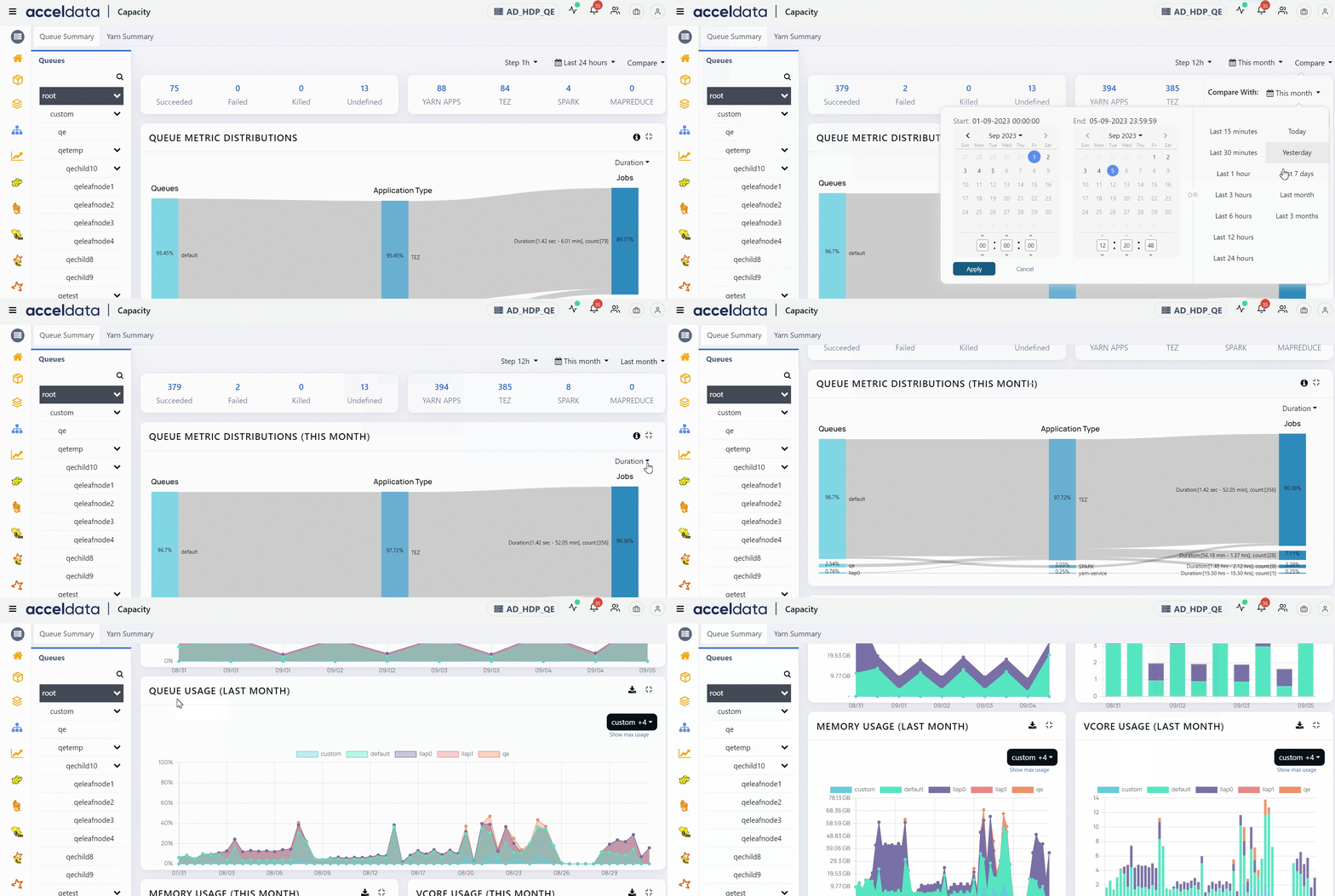
Each module integrated with Pulse has its dashboard. It is typically a collection of charts and other stand-alone metrics. In addition, Pulse ships with a set of predefined dashboards.
On a dashboard, the time filter is set to Last 24 hours by default. It denotes that all charts and stand-alone metrics are provided for the last 24 hours.
Types of Charts in the Pulse UI
The following types of charts are used in the Pulse UI:
- Bar Chart
- Histogram
- Time-series chart with a single metric
- Time-series chart with multiple metrics
- Heatmap
Bar Chart
A bar chart depicts data as vertical or horizontal bars. The name of the data point is displayed on the x-axis, and the quantity of data points is displayed on the y-axis, or vice versa, depending on whether the bar chart is vertical or horizontal.
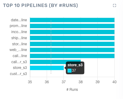
Sample Bar Chart
You can gather the following information from this horizontal bar chart.
- The pipeline store_s3 had 37 runs.
- There are seven pipelines had 40 runs each.
Histogram
A histogram is like a bar chart, except that the data is grouped into ranges instead of just one number. The ranges are displayed on the x-axis and data points are displayed on the y-axis.
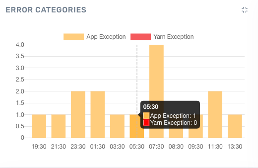
Sample Histogram
You can gather the following information from this histogram:
- There was 1 error of type App Exception between 5am and 6am.
- The largest number of errors is 4 and they occurred between 7am and 8am.
Time-series Charts with a Single Metric
A time-series chart is a list of data points mapped against time. The x-axis represents time - this is set to the time setting for the whole page. By default, the time selection is 24 hrs. If you change the time selection for the page, all charts display information for the selected time period.
The calculation in a time-series chart can be simple, so the chart depicts a time: metric pair only. Occasionally, the time-series chart may represent complex calculations such as aggregated values.
In Pulse, the following types of time-series charts are used:
1 . Time-series chart with a single metric
Here is an example of a time-series chart with a single metric.
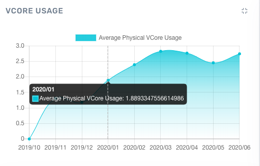
Time-series chart with one metric
2 . Time-series chart with multiple metrics
Here is an example of a time-series chart with multiple metrics. You can select or unselect metrics to view different plots individually. For example, in the sample chart, only one metric is selected.
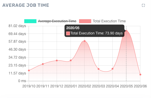
Time-series chart with multiple metrics
Heatmap
A heatmap is a color-coded chart that depicts the intensity or volume of a measure across time and across various items such as nodes.
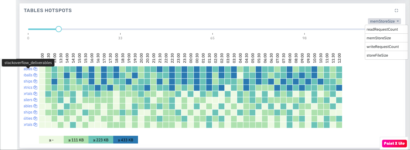
Heatmap
Downloading Pulse Chart Data
Some of the Pulse charts like YARN, MapReduce, Tez, LLAP, Spark, and so on allow you to download data. You can download data by clicking the download button on the chart.
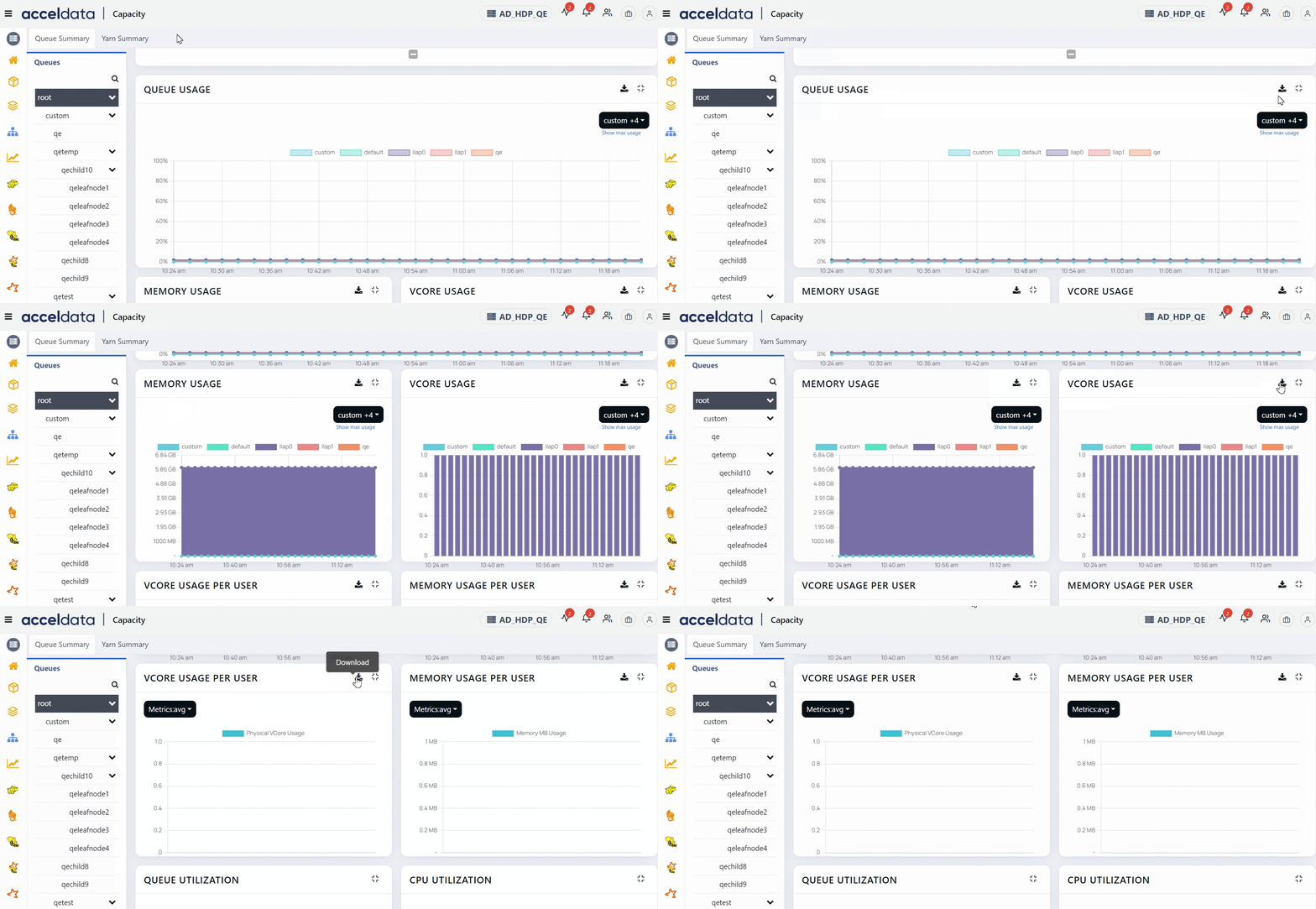
Pulse allows you to download the data either as a CSV file or an XLSX file. If you download the data as a CSV file the the file name is same as the chart name. If you download the data as an XLSX file, the file name is chartname_export<code>._ All the data is present in the file irrespective of the filters applied on the chart.
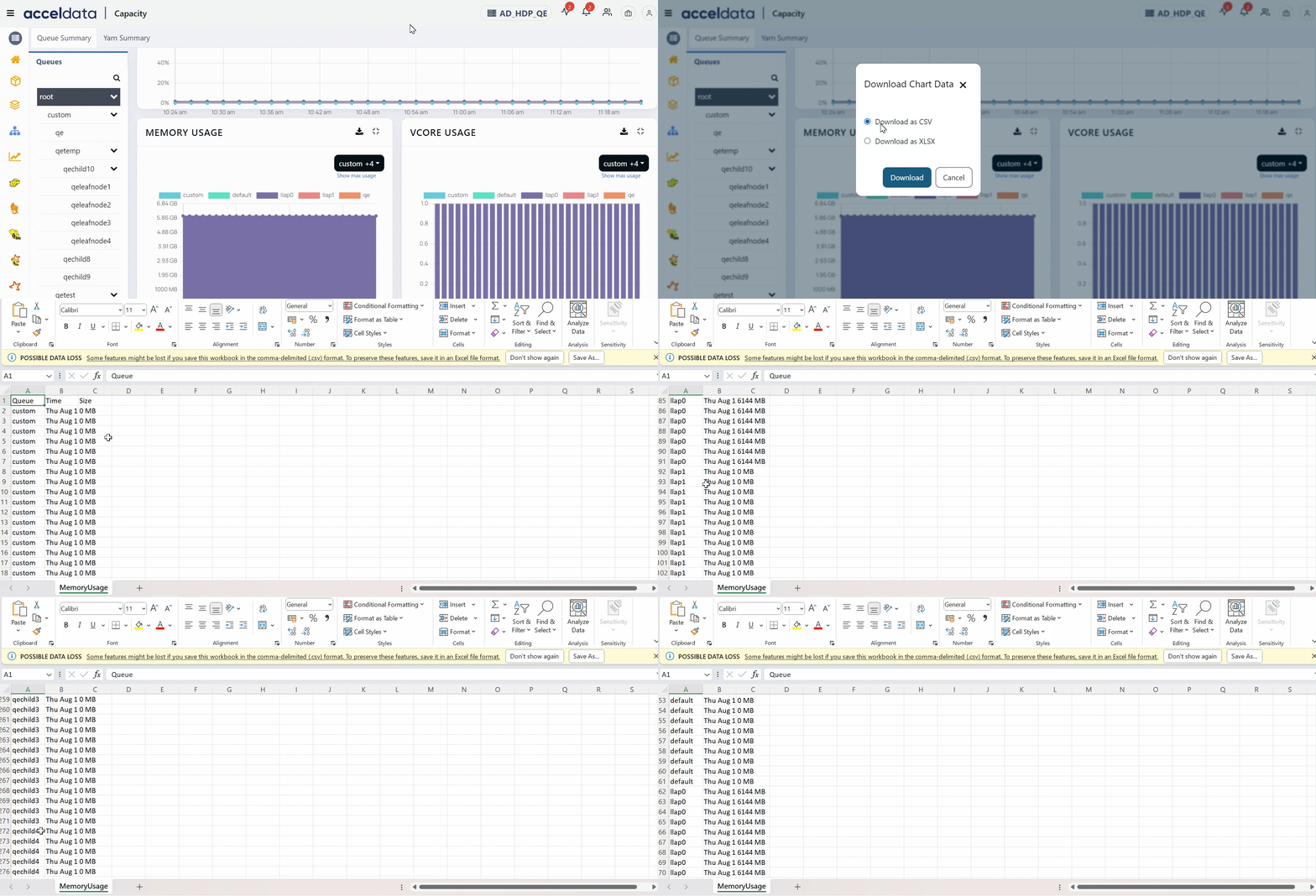
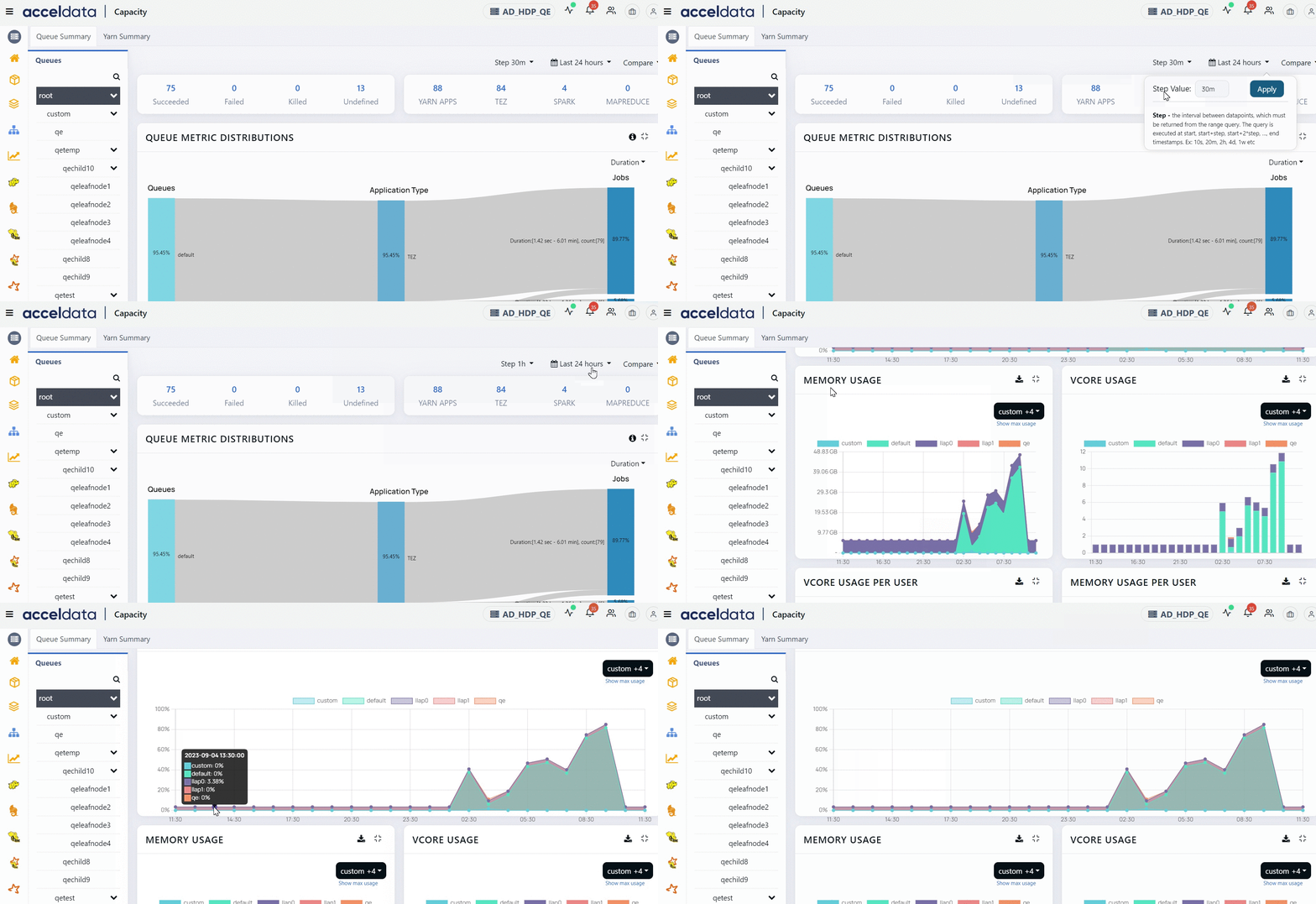
Set Step Interval
Pulse allows you to set step interval for time filter. This feature allows you to customize the data points for a selected time period.
For example, if you have set the time filter to be 24 hours, you can set the step interval to 1 hr. All the charts' data now has data points with an interval of 1 hour. You can change the step size to be 2 hours, 3 hours, and so on. Similarly, you can set the step size for various time periods.
Compare Chart Data
Pulse allows you to compare data for a chart with a previous time period. You can use the compare button and set the time period during which you wish to compare data.
