
Vizualization Dashboard
If you have already generated visualizations, you will find them under this tab. You may now gain insights into your data using several forms of visualizations.
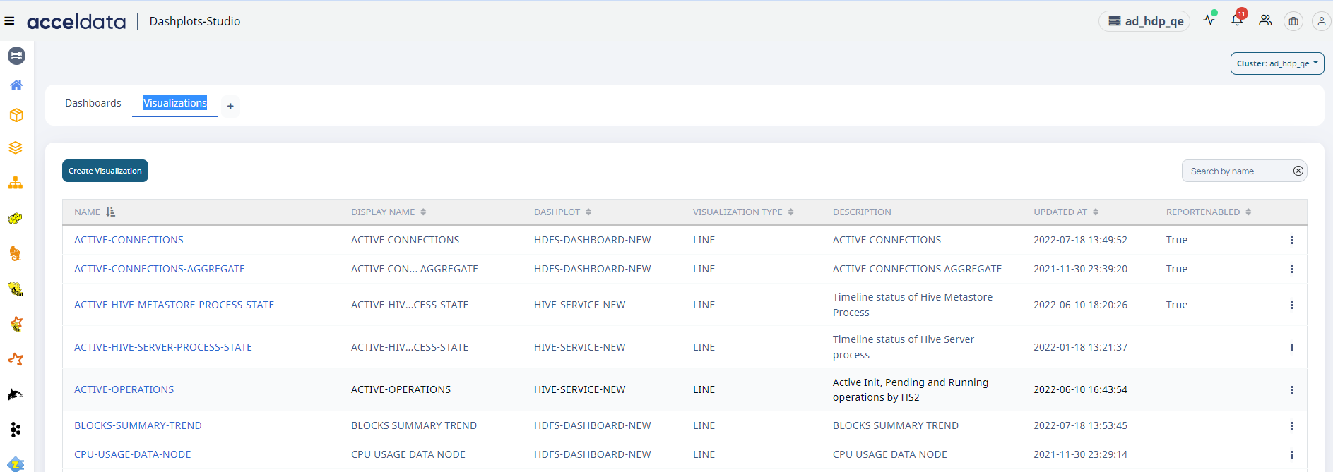
Visualization Dashboard
| Field | Description |
|---|---|
| Name | The visualization name is displayed. |
| Display Name | The name assigned to the visualization is displayed. |
| Dashplot | Displays the platform or feature for which the visualization was designed. |
| Visualization Type | Displays the type of visualization, such as a line or bar chart. |
| Description | A brief description of the visualization is provided. |
| Updated At | Displays the date and time when the visualization was last updated. |
| Report Enabled | Indicates whether the report capabilities are enabled. True: Reporting is enabled False: Reporting is not enabled. |
By clicking on the ellipsis

Report Enabled
| Field | Descriptions |
|---|---|
| Delete | You can delete the existing visualization with this option. |
| Clone | You can clone the visualization by selecting this option. A new tab appears on the right side.
|
| Add/Edit Report | By selecting this option, you can modify the visualization's reporting capabilities. |
Creating New Visualization
To create a new visualization:
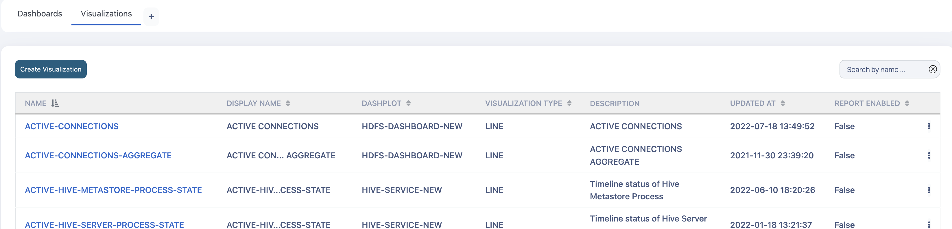
- Click on the + icon in the tabs beside visualizations to create the new scratchpad or go to visualization tab and click on Create Visualization buttone on top left.

- Select the Datasource from the Datasource dropdown on the left and then select Schema for the selected datasource.
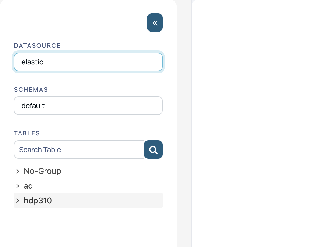
- Click on any table group in the left sidebar and select a table. It will open the editor on the right pane with a default query pre-populated.
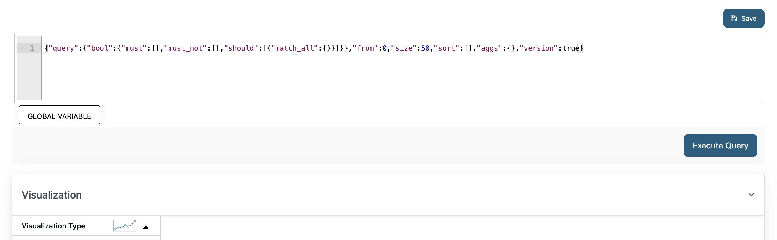
- You can edit the query as required and then click on Execute Query button to execute the query.
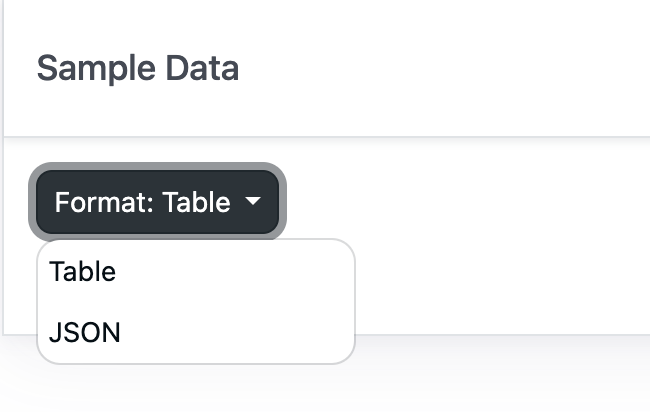
- A sample of the output records from the query will be shown in the sample data section at the bottom.
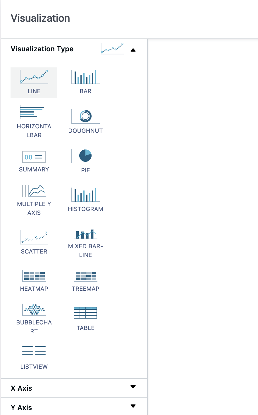
- Select the the type of visualization you want to create from the Visualization Type section.
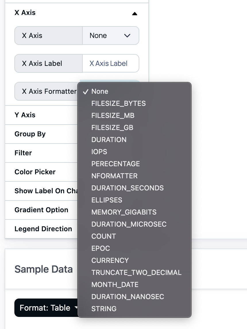
- Select the value to be plotted on the X axis from the dropdown in the X Axis section and give it a label and select a formatter for the value from the X Axis Formatter dropdown.
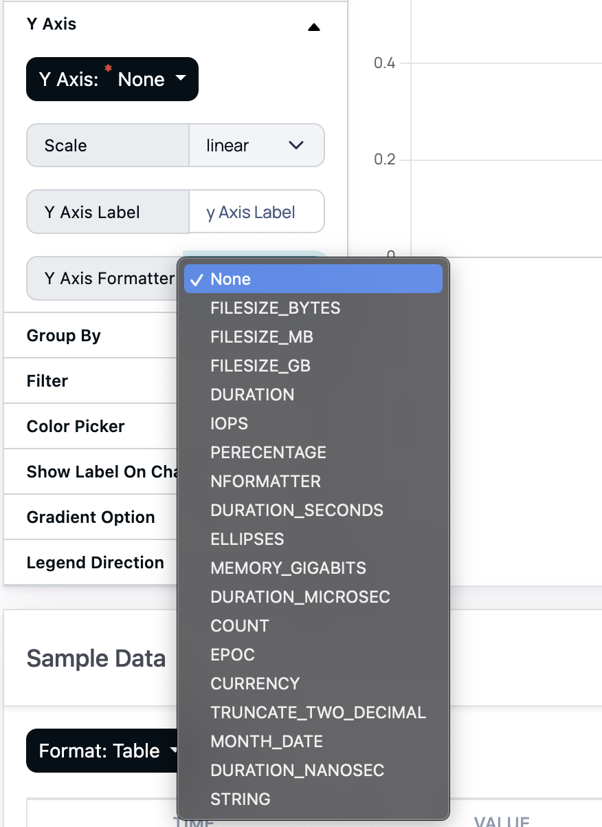
- Similarly select the field for the Y Axis and give it a label and apply the required formatter.
- If required select one or more fields in the Group By section to group be data by those fields. A dropdown will appear on the top right corner of the chart with all the unique combinations of the group fields selected and first five values selected by default. You can select more values by clicking on the group by dropdown.
- There is also an option to filter the data plotted by a particular field. Select the filter field from the Filter section and a dropdown will appear on the top right corner of the chart with all the unique values of that field and you can select the value from it to plot only data points corresponding to that value of the filter field. You can use the equals, not equals, and NOT IN operators to apply filters.
- Click on the Save button on the top right corner above the editor, a popup form will appear. Fill the required fields and save the visualization.
- is accepted in the name field.
- Click Save to save the Visualization. Once saved it can be added to any dashboard.
Creating a List View or Table Visualization
- Follow the steps 1 - 6 in the Creating New Visualization section and select List View or Table from the Visualization Type section.
- Select the field for the the List View/Table from the column dropdown, give it a name if required and apply the suitable formatter from the Formatter section.

- You can add more columns by clicking on the green + icon on the right end of the last column.
- Save the Visualization by clicking on the Save button on the top right corner above the editor and filling the required details.
- The new visualization can then be added to any dashboard.
Adding Grouped View to a List View
- Select the Group By option for the fields you want to group the data.
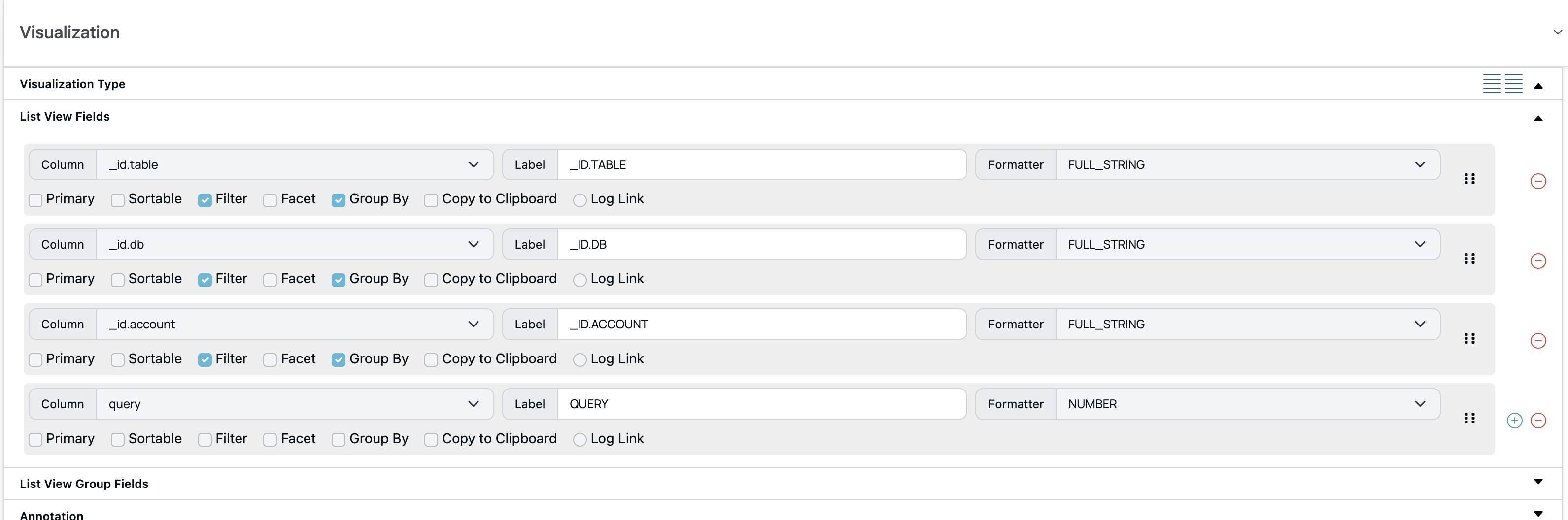
- Click on the Group Query tab in the Editor (appears only when the visualization type selected is list view).
- Add the Query for the group view in the Group Query tab.
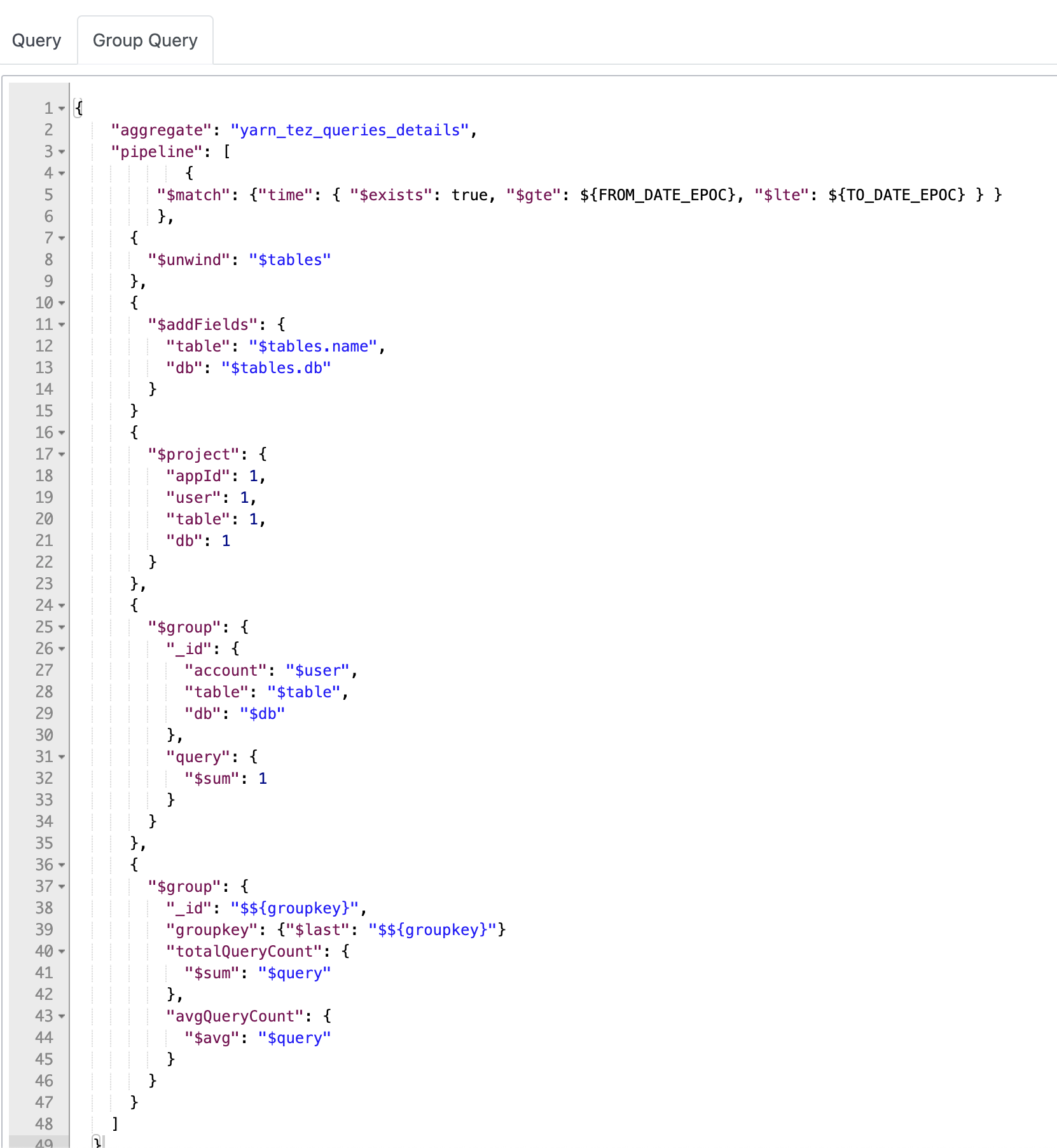
- Add the following $group stage at the end of the query pipeline.
xxxxxxxxxx{ "$group": { "_id": "$${groupkey}", "groupkey": {"$last": "$${groupkey}"} }}- You can add more fields as required to the last $group stage.
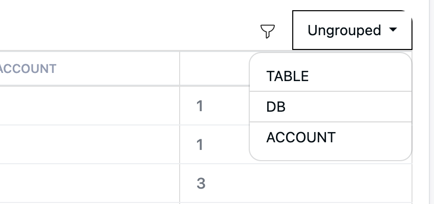
- Then select on of the group by fields from the group dropdown located at top right corner of the table and execute the group query.
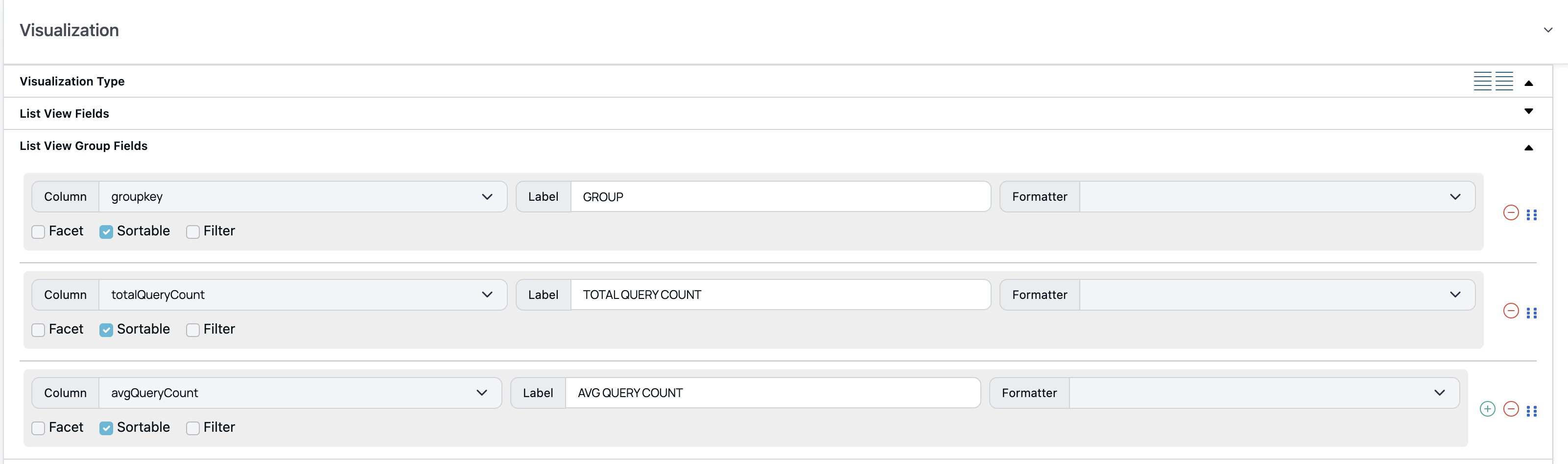
- Click on the List View Group Fields section to expand it and add the required columns for the group view.
- Save the Visualization and add it to a dashboard and the group view dropdown will be available on the top right corner of the table.