
The Nodes page displays all nodes linked to a selected cluster in the Manage Clusters page. This page provides real-time metrics to help you analyze node health and detect issues early.
Steps
In the Pulse UI, select Nodes from the left navigation bar > Summary.
Or, go to Pulse Home and click Overview.
On the Nodes page, set the time range and refresh the status:
Set time range – Select Today, Last 12 hours, Last 3 months, or choose a custom period. Then select Apply.
Refresh status – Select Play (⏵) to refresh the page automatically every 10 seconds. Select Pause (⏸) to stop auto-refresh.
On the Nodes page, you can analyze the following metrics for each node.
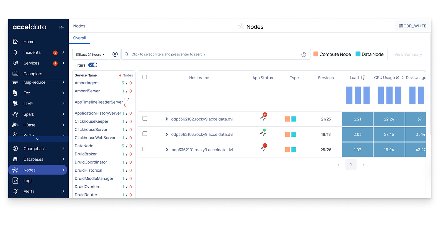
Node Details
Host name: Click to view detailed performance data for the node or host. For details, Visualize Node Details.
Host type: Identifies whether the node is a compute node or a data node.
Service Status
Application / Service status: Number of services currently down; click the status icon to view connected (up) or disconnected (Down) services.
Services Count: Running services compared to the total running on the node.
Resource Usage
System load: Average number of tasks waiting in the kernel run queue; helps detect overload.
CPU Usage (%): Percentage of CPU resources in use; useful for spotting high usage.
Memory Usage (%): Percentage of memory resources in use; helps identify bottlenecks.
Disk performance (read/write time): Total Time spent on disk read/write operations; indicates storage performance.
Workload Distribution
YARN containers: Number of active containers running on the node; helps track workload distribution.
Analyze with the Heatmap
On the Nodes page, you can monitor node resource usage and performance using the heatmap.
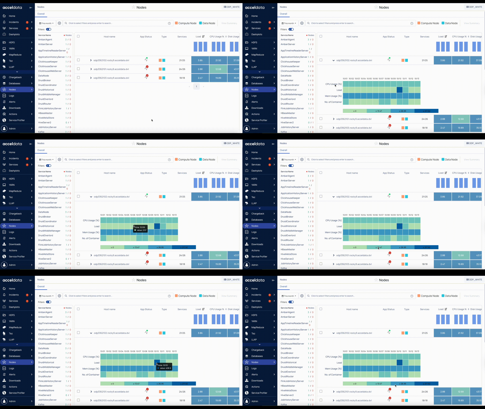
Expand a Node
The heatmap provides a visual overview of a node’s performance metrics over time. Each colored block represents a metric’s value during a specific time interval.
Color intensity: Darker shades indicate higher utilization or activity; lighter shades indicate lower values.
Time intervals: Hover over a block to see the exact value and timestamp for that metric.
Metrics Tracked in the Heatmap
CPU Usage (%): Shows the processing power used by the node. Darker blocks indicate higher CPU usage.
Load: Represents the system load (the number of processes waiting for CPU time). Darker shades indicate higher load.
Memory Usage (%): Shows the percentage of memory in use. Darker shades indicate higher memory utilization.
Number of Containers: Displays the number of YARN containers running.
How to Use the Heatmap
Spot Trends: Identify periods of high CPU, memory, or load.
Correlate Metrics: Link spikes in containers with CPU or memory usage.
Identify Anomalies: Detect sudden dark patches indicating unexpected load or resource pressure.