Capacity Dashboard
The Capacity dashboard provides you information about memory utilized by jobs of different application types in a selected queue for computing. To access YARN Capacity dashboard, click YARN -> Capacity in the left navigation pane.
The default time range is the Last 24 hrs and CST time zone. To view statistics from a custom date range, click the icon and select a time frame and zone.
Queue Summary
Summary Panel
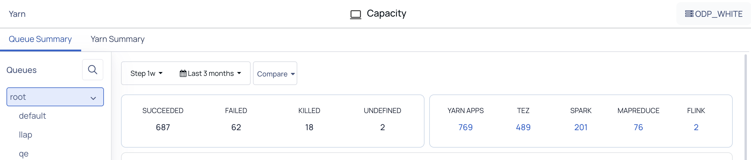
The top left panel of the YARN dashboard displays the following status of applications:
Status | Description |
|---|---|
Succeeded | The number of jobs that completed successfully. |
Failed | The number of jobs that failed. |
Killed | The number of jobs that were forcefully or unexpectedly terminated. |
Undefined | The number of jobs that have a state other than Finished. |
The top right panel of the YARN dashboard displays the number of jobs running in the queue by the following applications:

Hover and click the number on these metrics to see more information about it.
Application Type | Description |
|---|---|
YARN | The number of YARN applications submitted in the queue. |
Tez | The number of Tez applications submitted in the queue. |
Spark | The number of Spark applications submitted in the queue. |
MapReduce | The number of jobs running in MapReduce application in the queue. |
Queue Metric Distributions
The Query Metric Distributions is a Sankey chart that displays the flow of data values from Queues to Application Type to Jobs.
The following screenshot is an example of a Queue Metric Distributions Sankey chart displayed by Duration.
You can observe the following in Queues:
40 % of the time is spent by applications running on the
defaultqueue.50 % of the time is spent by applications running on the
llapqueue.5 % of the time is spent by applications running on the
qequeue.5 % of the time is spent by applications running on the
testqueue.
The applications in these queues are either of the following types:
Spark
MapReduce
Tez
Slider
You can observe the following based on the application types:
92.4% of jobs are done by Spark application.
3.33% of jobs are done by MapReduce application.
4.04% of jobs are done by Tez application.
0.24% of jobs are done by Slider jobs.
Out of the jobs submitted, you can observe the following:
99.05% of jobs were completed within an average time of 6.00 milliseconds to 1.85 hours.
The remaining jobs were completed within an average of 1.65 days to 3.13 days.
You can view the Sankey chart by the following distributions:
Duration
Duration Variance
VCore Seconds
Memory Seconds
Other Capacity Charts
The following table gives you an overview of the other metrics charts in the Capacity page.
Chart Name | Description |
|---|---|
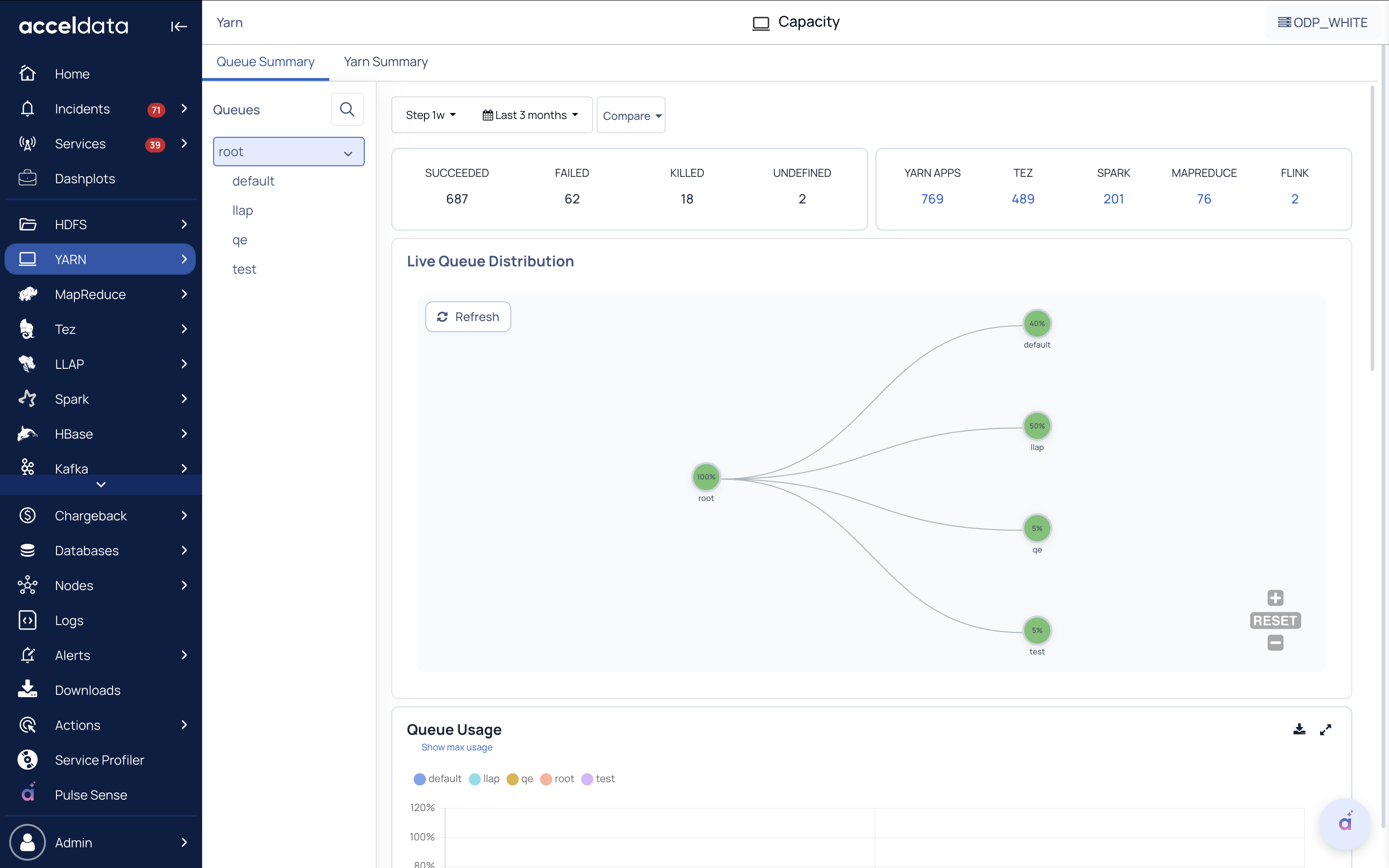
Live Queue Distribution | Displays the queue level resources and consumption in relation to the parent and root. The following parameters appear on the graph. Name: Displays the name of the distribution. Max Capacity: Displays the maximum capacity. Capacity: Displays the utilized capacity. Used Capacity relative to Parent: Capacity utilized in relation to the parent node. Used Capacity relative to Root: Capacity utilized in relation to the root. Resource Available: Displays the amount of resources available Resource Consumed: Displays the amount or resources consumed Num of Active Application: Total number of applications that are currently active Num of Pending Application: Count of applications that are still pending Note The metrics that are labeled as (Live) present real-time data. Based on the capacity used, the chart displays the following color: Red: If the used capacity of the queue exceeds 90%. Yellow: If the queue's used capacity is greater than 75% but less than 90%. Green: Indicates that less than 75% of the available capacity has been used. |
Queue Usage | Percentage of resource usage in a queue. The queue usage lets you identify when resources in a queue are consumed at peak. You can click on a data point at specific intervals to view key details, including:
|
Predicted Queue Usage | You can predict the percentage of resource usage in a queue by +1 and +2 days. The queue usage lets you identify when resources in a queue are consumed at peak. To predict the usage of queue by one day click +1, click +2 to view two days ahead and click Today to predict the usage for present day. |
Memory Usage | Amount of memory used within the queue in the cluster. |
VCore Usage | Number of virtual cores used within the queue in the cluster. |
VCore Usage Per User | Number of virtual cores used by a single user. min: Displays the lowest number of virtual cores used. avg: Displays the average number of virtual cores used by the users. max: Displays the maximum number of cores used by a single user. |
Memory Usage Per User | Amount of memory used per user. min: Displays the minimum memory that is currently being used. avg: Displays the average memory usage by users. max: Displays the maximum amount of memory used by users. |
Memory Utilization | Amount of memory utilized within the queue. You can monitor the following memory statistics: Peak mem utilization: The maximum amount of memory used by a queue in a timeframe. The peak memory lets you know when a queue is highly utilized. Avg mem utilization: The average amount of memory used by a queue in a timeframe. Max Capacity: The maximum amount of memory configured according to selected queue. Min Capacity: The maximum amount of memory defined by the administrator for a queue. |
No. of Containers | The number of containers allocated to run a single or multiple applications in a queue in a timeframe. The following metrics are used in monitoring the containers: Max containers allocated: The maximum number of containers allocated to a queue. Avg containers allocated: The average number of containers allocated to a queue. |
Download Chart Data
Pulse allows you to download data from various charts. You can choose to download data either in CSV format or XLSX format. The default name of the CSV file and XSLX file follows the syntax chart name_some _ value .csv. *The default name for a downloaded XLSX file is **chart name _ some value ***__export.xlsx. The downloaded file displays all the data irrespective of the filters applied on the chart. The following charts on YARN capacity page have download option.
Queue Usage
Memory Usage
VCore usage
VCore Usage Per User
Queue utilization
CPU Utilization
Memory Usage Per user
Memory Utilization
No. of Containers
Queues
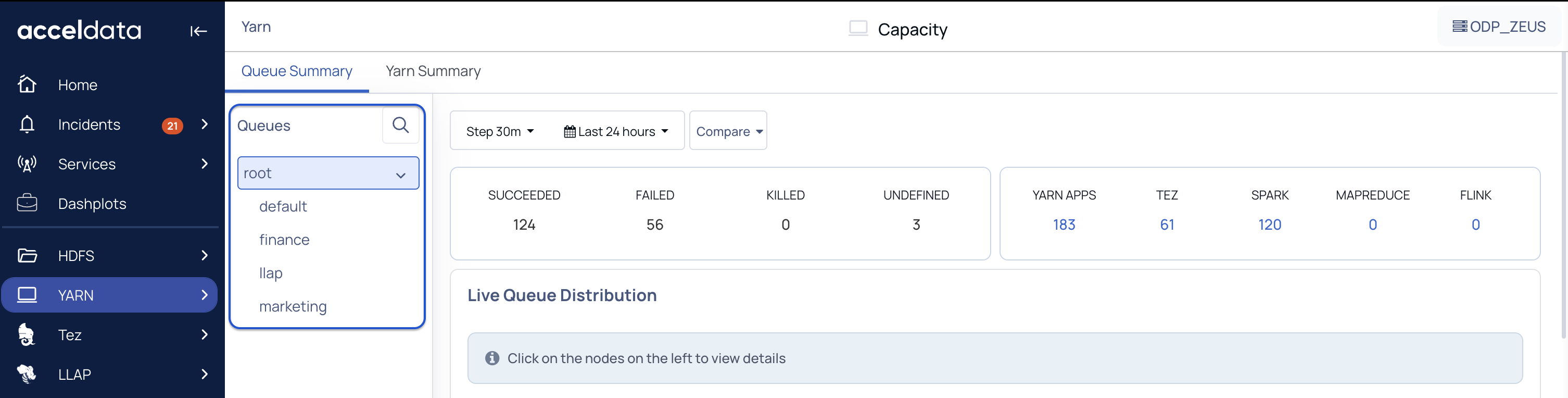
You can view data, specific to a queue. To view data on the dashboard for the particular queue, perform the following:
Click to view the list of queues. Click to hide the queues.
Click on the name of the queue. The data corresponding to the selected queue is displayed in the dashboard.
(Optional) You can search for the name of the queue by using the search box
Yarn Summary
The Yarn Summary page in the Pulse presents information in the form of a dashboard for the YARN services' task execution and resource utilization.
Summary Panel
The top panel of the YARN dashboard displays the following status of applications:

Application Status | Description |
|---|---|
Apps Submitted | Number of application submitted to the YARN cluster. |
Apps Pending | Number of applications that are waiting in YARN cluster |
Apps Running | Number of applications that are currently running in YARN |
Apps Completed | Number of completed applications in YARN cluster |
Containers Running | Displays the status of all operational containers |
Range of Resource Utilization | The minimum to maximum resource usage across queues. |
Overutilized Queues | The number of queues where the average utilization is more than 100 percent for 30 minutes. |
Under Utilized Queues | The number of queues where the average utilization is less than 10 percent for 30 minutes. |

Fields | Description |
|---|---|
Total Memory | Total amount of memory for YARN applications |
Allocated Memory | Memory currently being used by the YARN applications |
Available Memory | Remaining memory available after allocation |
Reserved Memory | Displays the memory reserved for the applications that cannot utilize it immediately. |

Fields | Description |
|---|---|
Total VCores | The total number of virtual cores available for YARN applications |
Allocated VCores | The total number of allocated virtual cores available for YARN applications |
Available VCores | The number of available virtual cores available for YARN applications |
Reserved VCores | Displays the Vcores reserved by Yarn for the applications that cannot utilize it immediately. |
Other Charts
The following table gives you an overview of the other metrics charts in the Capacity Yarn Summary page.
Chart Name | Description |
|---|---|
Nodes Statistics | Statistics on the node's status, health, indexing load, and related rejections. |
Cluster Utilization by Leaf Queues | Statistics on cluster usage based on Leaf queues. |
Resources Allocation Trend | Statistics and trends in resource allocation. The default statistic is Allocated Containers, you may also monitor trends on Allocated Memory GB, Allocated Vcores, Available Memory GB, and Available Vcores by selecting the choices on the left side of the graph. You can also view the aggregate trends of Resource Allocation by clicking on the Show Aggregate button on the right side of the graph. |
Container Allocation Trend | Statistics and trends in allocation of containers. The default statistic is Containers Completed, you may also monitor trends on Containers Completed, Containers Failed, Containers Killed, Containers Launched, and Containers Running by selecting the choices on the left side of the Graph. You can also view the aggregate trends of Resource Allocation by clicking on the Show Aggregate button on the right side of the graph. |
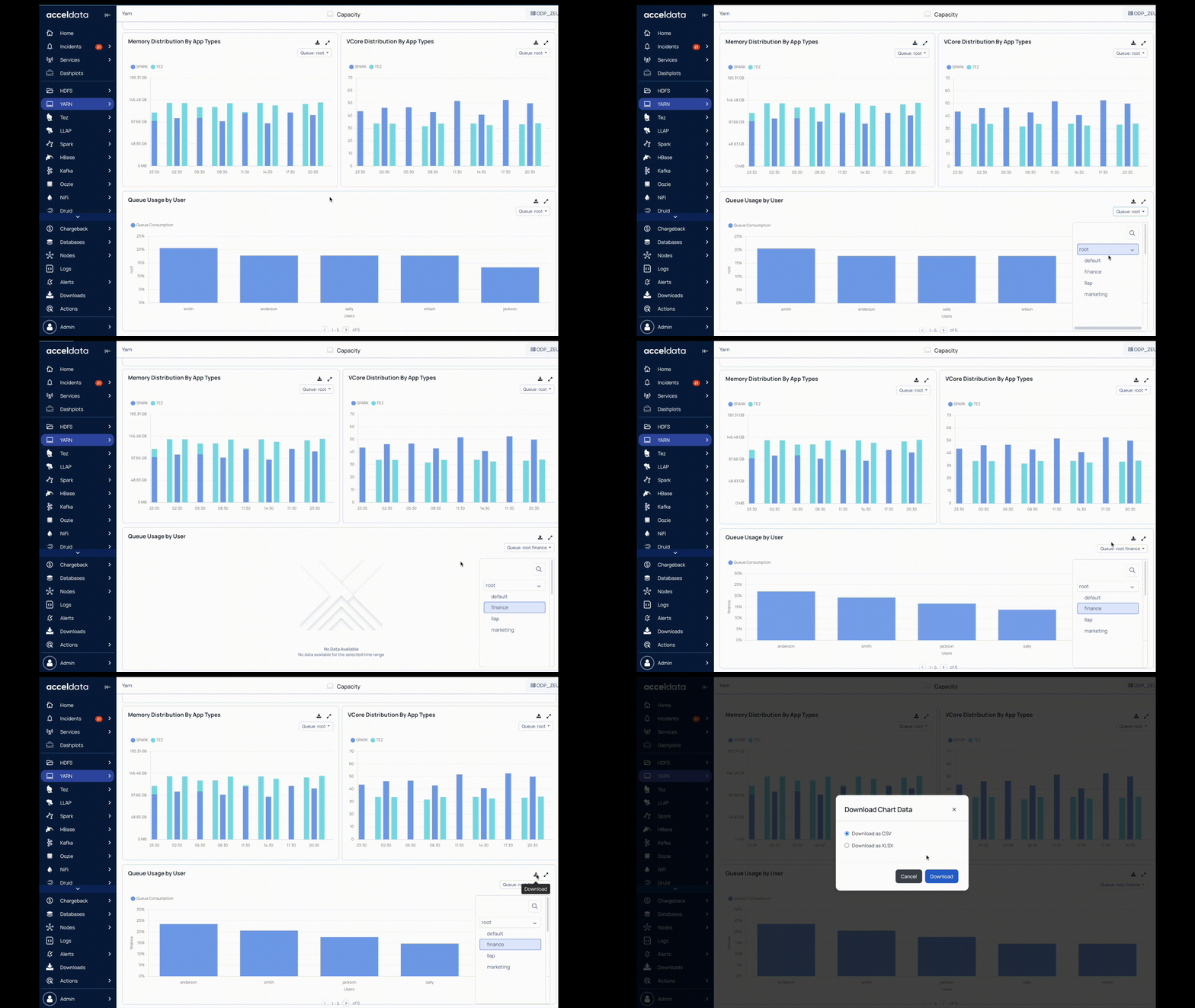
App Count Distribution by State | Statistics on the distribution of application counts by state such as Failed, Finished, or Running. You can also view the Queue by clicking and selecting the right side Queue button. |
Memory Distribution by App Types | Statistics on memory distribution based on application types. You can also view the Queue by clicking and selecting the right side Queue button. |
VCore Distribution by App Types | Statistics on virtual core distribution by application type. You may also view the Queue by clicking and selecting the Queue button on the right side. |
Queue Usage by User
This is a bar graph that shows the amount of queue consumed by each user. You can filter the data to view queue usage for the required queues. In this bar chart, each bar represents a user. When you hover over a bar, you can view the number of queries executed by that user and the percentage of the queue consumed by that user. You can filter the data and download it.