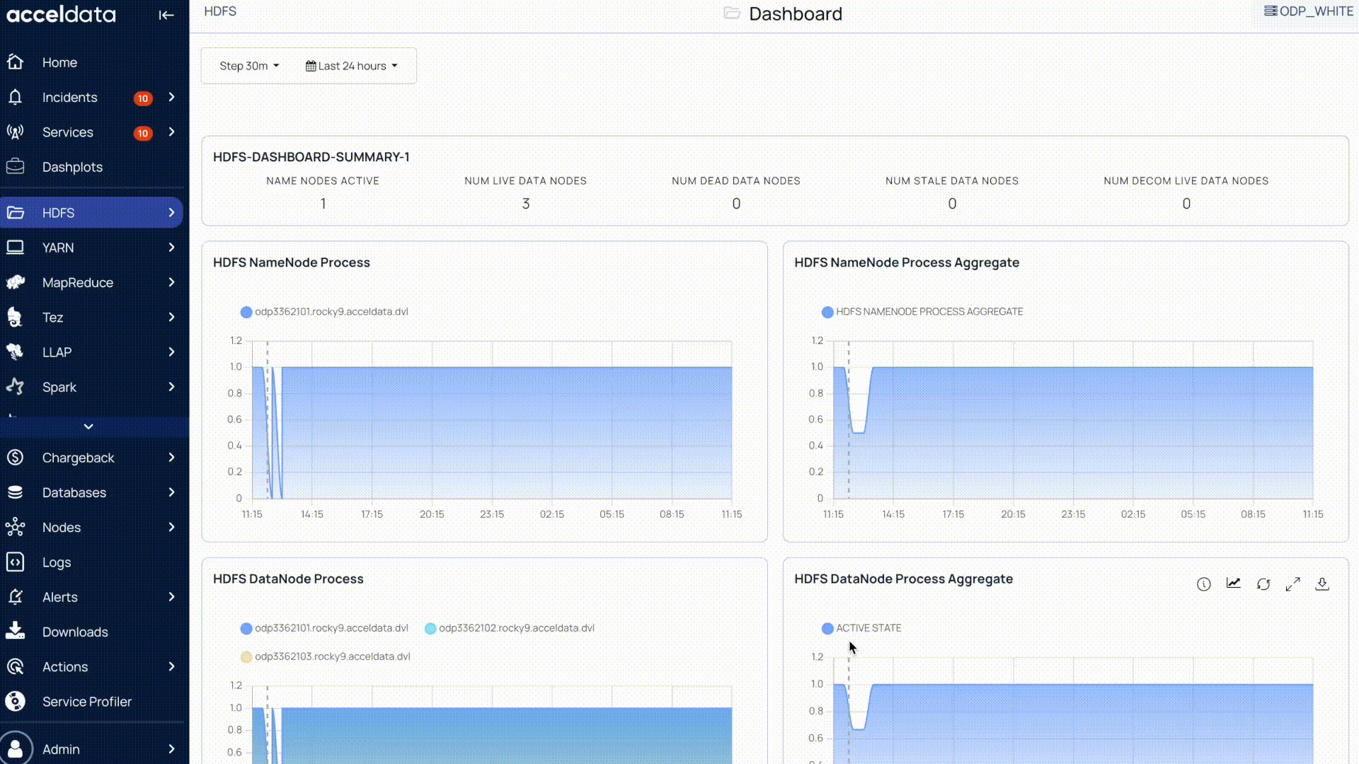
Each module or service integrated with Pulse has its own dashboard. It is typically a collection of charts and other stand-alone metrics. In addition, Pulse ships with a set of predefined dashboards.
On a dashboard, the time filter is set to Last 24 hours by default. It denotes that all charts and stand-alone metrics are provided for the last 24 hours.
Types of Charts in the Pulse UI
The following types of charts are used in the Pulse UI:
- Bar Chart
- Histogram
- Time-series chart with a single metric
- Time-series chart with multiple metrics
- Heatmap
Bar Chart
A bar chart represents data using vertical or horizontal bars, where the x-axis typically displays categories (such as table names) and the y-axis displays numerical values (such as query counts).
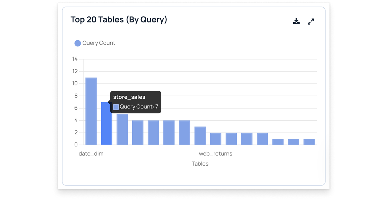
In this chart, titled Top 20 Tables (By query count), each bar shows how often a specific table is queried. For example, the table store_sales has a Query Count of 7, indicating it was accessed seven times.
This visualization helps you:
- Identify which tables are queried most frequently.
- Compare query activity across multiple tables.
- Analyze query distribution to optimize database performance.
Histogram
A histogram is similar to a bar chart but represents data distributions over time or value ranges. The x-axis displays time intervals or data ranges, and the y-axis shows the count or frequency of data points within each range.
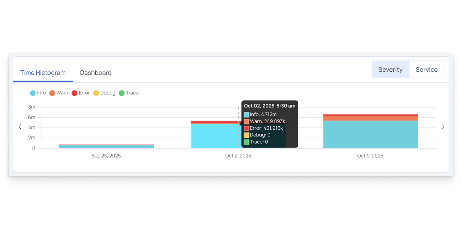
In this example, the Time Histogram visualizes log data by severity level—Info, Warn, Error, Debug, and Trace—across different dates. Each colored segment represents the number of logs of that severity during a specific time period.
For instance, on October 2, 2025, at 5:30 a.m., the system recorded approximately 4.7 million Info logs, 249.8 thousand Warnings, and 401.9 thousand Errors.
This visualization helps you:
- Identify trends in log volume over time.
- Detect spikes in specific log severities.
- Monitor system stability and performance changes across time intervals.
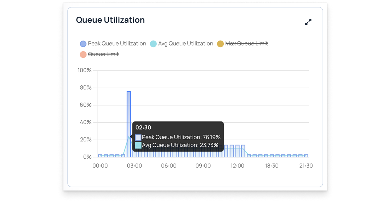
Time-series Chart
A time-series chart displays how a metric changes over time. Each data point on the chart represents a value at a specific time.
- The x-axis represents time, which is set according to the time range for the entire page.
- By default, the time range is 24 hours. When you change the time selection, all charts on the page update to reflect that period.
Time-series charts can show simple or aggregated values, depending on the metric being tracked.
Pulse uses two main types of time-series charts:
1. Time-Series Chart with a Single Metric
A single-metric chart shows one data series plotted against time.
Here is an example of a time-series chart with a single metric: Maximum Memory Usage.
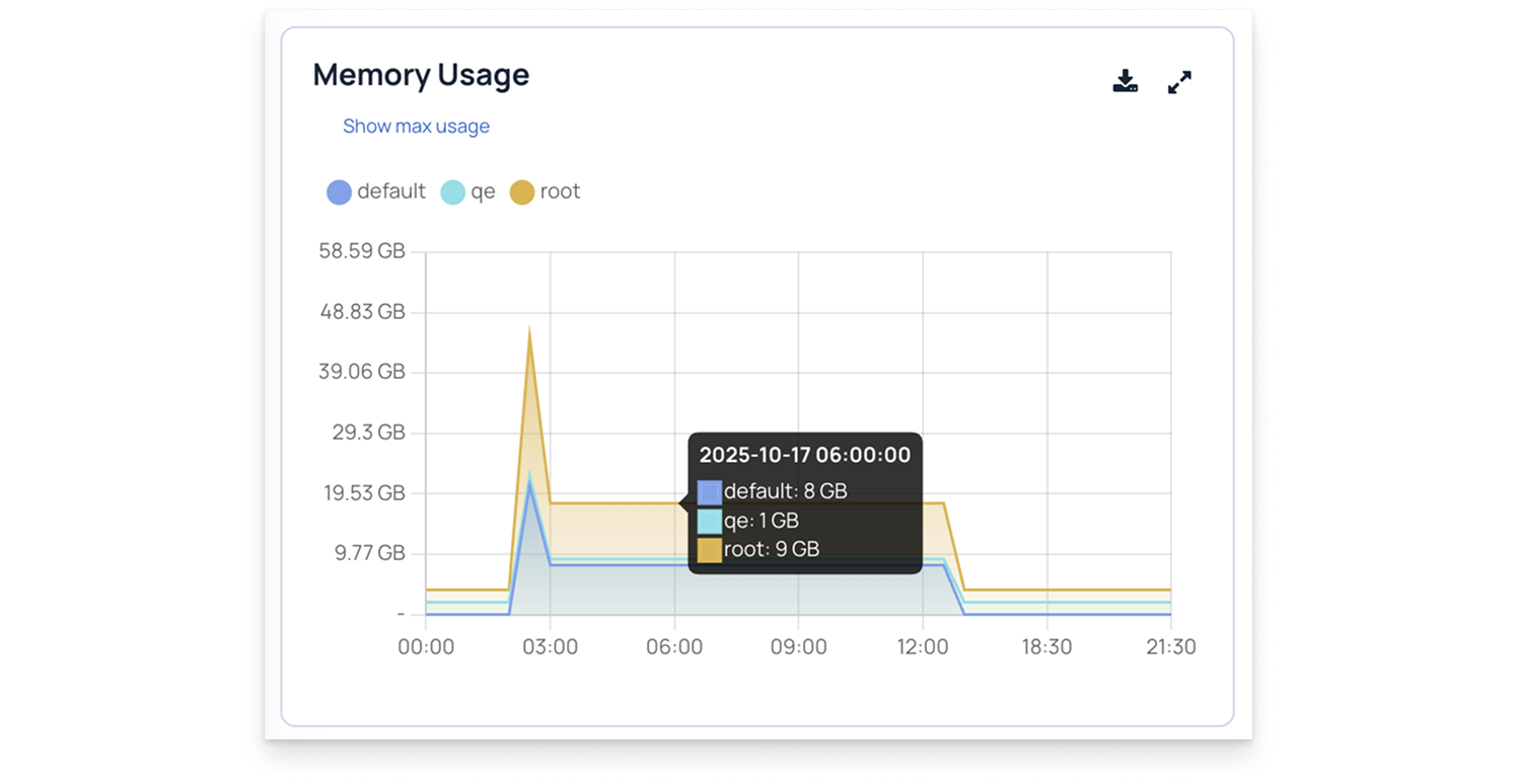
2. Time-Series Chart with Multiple Metrics
A multi-metric chart displays multiple metrics on the same timeline, allowing you to compare trends.
Here is an example of a time-series chart with multiple metrics. You can select or unselect metrics to view different plots individually. For example, in the sample chart, two metrics are selected.
Heatmap
A heatmap is a color-coded chart that visually represents the intensity or volume of a metric over time or across different items, such as nodes, services, or containers.
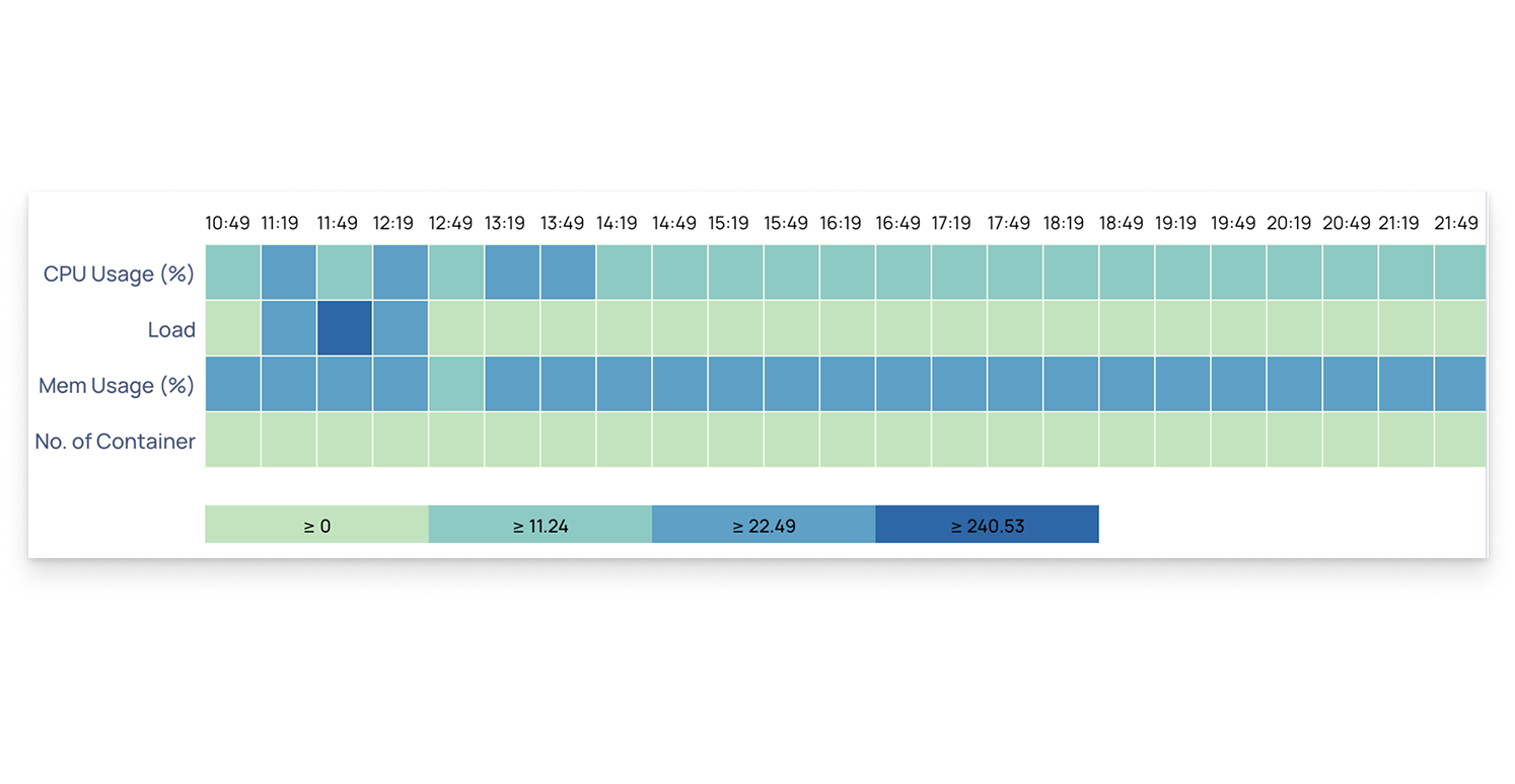
In this example, the heatmap displays metrics like CPU usage (%), memory usage (%), system load, and number of containers across different time intervals.
- Darker colors indicate higher values or utilization, while lighter colors represent lower activity.
- The color legend below the chart helps interpret value ranges, making it easier to identify spikes or performance trends.
This visualization helps you:
- Quickly spot time periods of high resource usage.
- Compare CPU, memory, and load patterns across multiple metrics.
- Detect potential bottlenecks or capacity issues in your environment.
Download Pulse Chart Data
All Pulse charts, including those for HDFS, YARN, MapReduce, Tez, LLAP, Spark, and others, allow you to download the chart data. You can download the data by selecting the Download option on the chart.
Pulse allows you to download chart data as either a CSV or XLSX file.
Set Step Interval
The step interval in Pulse determines how frequently charts are updated for the selected time period.
For example, if you set the time filter to 24 hours, the default step interval is 30 minutes. This means Pulse refreshes and displays data in 30-minute intervals.
You can change the step interval to 1 hour, 2 hours, or another value depending on how granular or aggregated you want the data to appear.
Choosing a smaller interval (such as 1s or 1m) provides more real-time visibility but may increase query load, while a larger interval (such as 1h or 2h) shows broader trends with fewer data points.
Compare Chart Data
Pulse allows you to compare chart data with data from a previous time period.
Use the Compare option to select the time period you want to compare against. Once set, the chart displays both the current data and the comparison data.
This helps you easily identify changes or trends between the two time ranges.