MapReduce
MapReduce Dashboard
MapReduce allows you to process huge amounts of data residing in clusters of hardware, easily and in a reliable manner. The algorithm used in MapReduce contains tasks of mapping and reducing where initially a set of data is broken down or processed into another set of data and the elements are broken into key and value pairs. The reduce task is performed right after a mapping task is done and uses the output of a map task as an input.
Using Acceldata MapReduce, you can monitor queries used in MapReduce operations.
Click MapReduce --> Dashboard in the left pane to access the MapReduce dashboard. The dashboard consists of summary panels, a Sankey Diagram, and charts that display information about queries and other related metrics.
Summary Panel
The summary tiles display several aggregated values. You can click the number on each field to view detailed information about that metric.
| Metric Name | Description |
|---|---|
| Users | The total number of users. |
| # of Queries | The number of queries being run during the selected timeframe. Click on the number to view details of the queries in the MapReduce Query Details page. |
| Avg CPU Allocated | The average of CPU time across all queries. |
| Avg Memory Allocated | The average amount of memory allocated across queries. |
| Succeeded | The number of queries executed successfully. Click on the number to view details of the queries in the MapReduce Query Details page. |
| Running | The number of queries that are in progress. Click on the number to view details of the queries in the MapReduce Query Details page. |
| Failed | The number of queries that failed to execute. Click on the number to view details of the queries in the MapReduce Query Details page. |
| Killed | The number of queries that were killed. Click on the number to view details of the queries in the MapReduce Query Details page. |
Context Metric Distributions
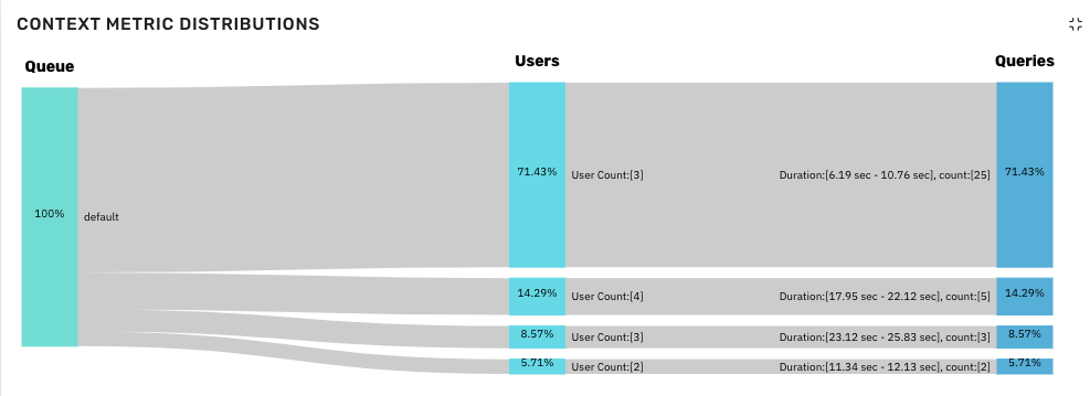
The Context Metric distributions panel displays the summary of jobs as a Sankey diagram. You can see the flow of the selected queue to users and to the queries.
The following screenshot is an example of a Context Metric Distributions Sankey chart of the last 24 hours displayed by Duration.

Sankey Diagram
You can gather the following information from the chart.
To see the distribution in numbers, hover over the Sankey chart.
You can observe the following in Queues.
- 100% of queries are running in
defaultqueue. - From Users category, you can gather the following.
- 71.43% of queries are run by 3 users.
- 14.29% of queries are run by 4 users.
- 8.57% of queries are run by 3 users.
- 5.71% of queries are run by 2 users.
- From Queries category, you can gather the following.
- 25 queries (71.43%) are executed within 6.19 seconds to 10.76 seconds.
- 5 queries (14.29%) are executed within 17.95 seconds to 22.12 seconds.
- 3 queries (8.57%) are executed within 23.12 seconds to 25.83 seconds.
- 2 queries (5.71%) are executed within 11.34 seconds to 12.13 seconds.
Viewing Sankey chart by distribution
You can view the Sankey chart by the following distributions:
| Distribution Metric | Description |
|---|---|
| Duration | The duration of the queries executed by users. |
| Mappers | The first phase of processing input data displaying a key value pair. |
| Reducers | The task of processing mapper output and displaying a key value pair. |
| GC Time | Time spent by the JVM in garbage collection while executing a query. |
| Reducer Time Avg | The average time taken to complete the reducer task. |
| Reducer Time Max | The maximum time taken to complete the reducer task. |
| Shuffle Time Avg | The average time taken to transfer the map output from Mapper to Reducer. |
| Shuffle Time Max | The maximum time taken to transfer the map output from Mapper to Reducer. |
| Sort Time Avg | The average time taken to sort out mapper output keys. |
| Sort Time Max | The maximum time taken to sort out mapper output keys. |
Other MapReduce Charts
The following charts are also displayed on the MapReduce Dashboard.
| Chart Name | Description |
|---|---|
| VCore Usage | The number of physical virtual cores used by a queue in the cluster. |
| Memory Usage | The amount of memory used by a queue in the cluster. |
| Query Execution Count | The number of queries executed within a timeframe. |
| Average Query Time | The average time taken to execute queries. This metric also displays the Total Execution Time. |
| Top 20 Users (By Query) | The top 20 users that executed the highest number of queries. |
| Top 20 Tables (By Query) | The top 20 tables that executed the highest number of queries. |
Queues
In Queues tab, you can see the root queue, default queue, and custom queue(s) defined by the cluster administrator.
root: This is a predefined queue that is a parent of the available queues in your cluster. This queue uses 100% of resources.
default: A designated queue defined by the administrator. This queue contains jobs that do not have a queue allocated.
To view memory capacity allocated to or used by resources on a queue, click the queue in the Queues tab.
To view data on the dashboard for the particular queue, perform the following:
- Click
to view the list of queues. Click to hide the queues. - Click on the name of the queue. The data corresponding to the selected queue is displayed in the dashboard.
- (Optional) You can search for the name of the queue by using the search box.