Snowflake Costs
This page describes the costs component of the Snowflake-ADOC integration. Acceldata suggests that you read this official Snowflake document to gain a basic knowledge of the Snowflake cost model.
The Snowflake SQL API is a RESTful API provided by Snowflake. This API allows users to interact with their Snowflake database programmatically using HTTP requests.
Cost Optimization: This refers to the practice of managing costs associated with using Snowflake. Snowflake, like many cloud services, charges users based on factors like storage, compute resources (such as warehouses), and the volume of data processed.
Optimizing costs involves efficiently managing these resources to minimize expenses while still meeting performance requirements.
Accessing Snowflake Metadata: Snowflake maintains metadata about various aspects of its service, including warehouses (compute clusters used for processing queries), queries (historical information about queries executed), users (information about users accessing the system), and cost/compute-related metrics (information about resource consumption and associated costs).
Users can gain insights into their Snowflake instance's utilization by accessing this metadata via the Snowflake SQL API. Users can use this data for cost optimization by identifying underutilized resources, optimizing query performance, managing user access and permissions, and monitoring costs associated with different workloads.
- POST /api/v2/statements
- GET /api/v2/statements/{statementHandle}
Read more about the Snowflake SQL API reference.
The Snowflake Costs page shows widgets for various costs incurred, such as compute cost, storage cost, and so forth.
All cost-related data on ADOC is displayed in US Dollars (USD) as the standard unit of measurement. Note that currency conversion is currently not supported.
For example: If your Azure account shows costs in (e.g., ₹110, or £110), ADOC will display the numerical value in USD (e.g., $110). This applies to all cost charts, including both actual and estimated costs, which are exclusively shown in USD.
The different tabs on this page include:
The Account, Compute, Storage, and Queries tabs provide cost information at the account level. The total cost of all Snowflake accounts used by your organization is displayed on the Organization page.
Some tabs on the Snowflake data section allow you to filter the data by using the Global Calendar. You can use the calendar to filter the data as per the required date and time. However, the global calendar is disabled on some tabs and you cannot view it. This is because the nature of data on these tabs do not require date and time filtering.
Filters
The Data Source Filter allows you to switch the Snowflake data source. This enables you to view and analyze data across various sections based on the selected Snowflake account or project, providing flexibility for monitoring and managing information across different data sources.

The ribbon menu has three different filters to choose from:

Clicking on the
Account
This tab provides you a highlights of your Snowflake costs. You get a bird's eye view of the Snowflake costs incurred on your account. This tab displays a widget highlighting some key information about your Snowflake costs, summary of costs incurred on various Snowflake services, and cost incurred on anomalies. The Global Calendar is disabled on this tab. However, some graphs of this tab have their own time filter.
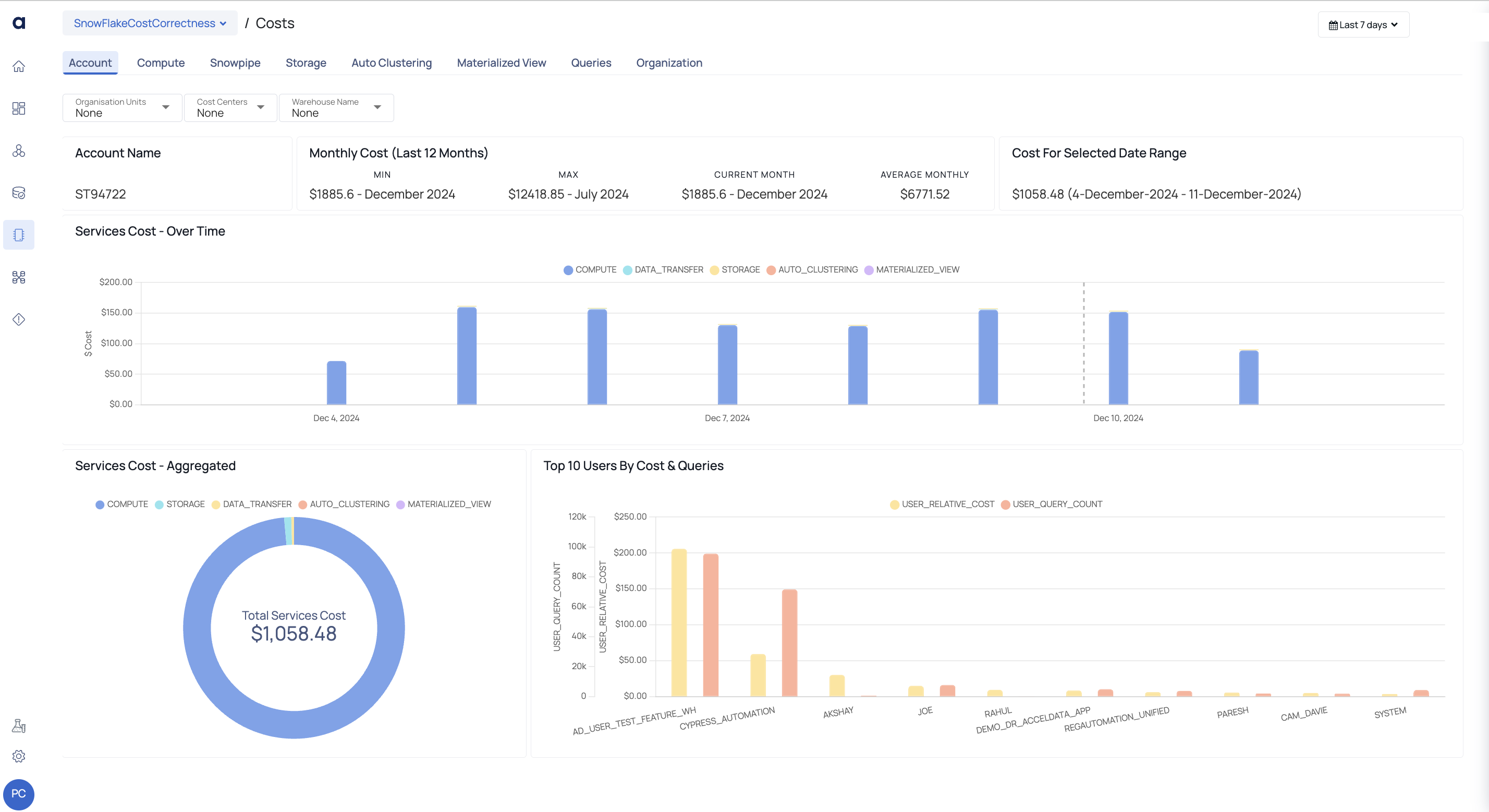
Account Tab
| Widget | Descriptions |
|---|---|
| Account Name | This widget displays the account name of the specified organization. |
| Monthly Cost | This widget displays a summary of costs for each month. When you add Snowflake as a Data source in ADOC, this widget uses historical snowflake data from the previous 12 months. This widget can save data for up to 12 months. As time passes, the previous 12 months' data is replaced by the most recent 12 months' data.
|
| Cost for Selected Data Range | This widget displays the total cost for a specific date range. Simply use the calendar in the upper right corner to select the desired range. |
| Services Cost - Over Time | The bar graph depicts the cost distribution of all services over time for the chosen date range. You can see the cost breakdown of the following services by hovering over any bar: Compute, Storage, Auto Clustering, Snowpipe, Material View, and Replication Usage. In the legends, each service is represented by a different color. When you click on a specific color on the graph for a specific date or time, it will take you to the corresponding service tab. |
| Services Cost - Aggregated | This pie chart depicts the total cost of each service throughout the specified time period. It depicts the cost distribution across services visually, allowing you to clearly understand the relative cost contributions of different services. Click the service to view its details in the related service tab. |
| Top 10 Users by Cost & Queries | This widget displays a bar graph of the Top 10 Users based on cost and inquiries. The x-axis shows the top ten users, while the y-axis shows the number of queries and the relative cost of each user. |
Compute
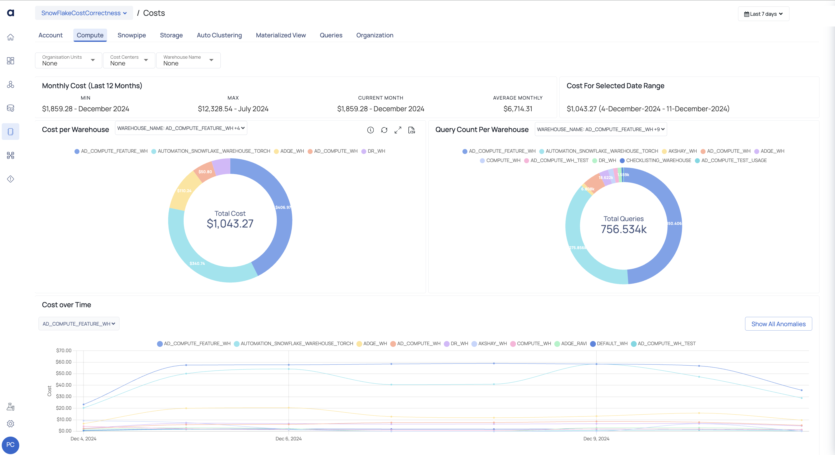
Compute Tab
This tab displays the computation cost incurred on your Snowflake account. Understanding your Snowflake account's calculation cost is critical for improving your data operations. It allows for informed decision-making and efficient resource allocation. Understanding the cost implications allows for more effective planning and helps to align computation needs with performance goals. This understanding is critical for maximizing Snowflake's potential while remaining cost-effective in your projects.
On this tab, you may set filters to view data just for specific warehouses. To display statistics for a certain time period, use the Global Calendar filter.
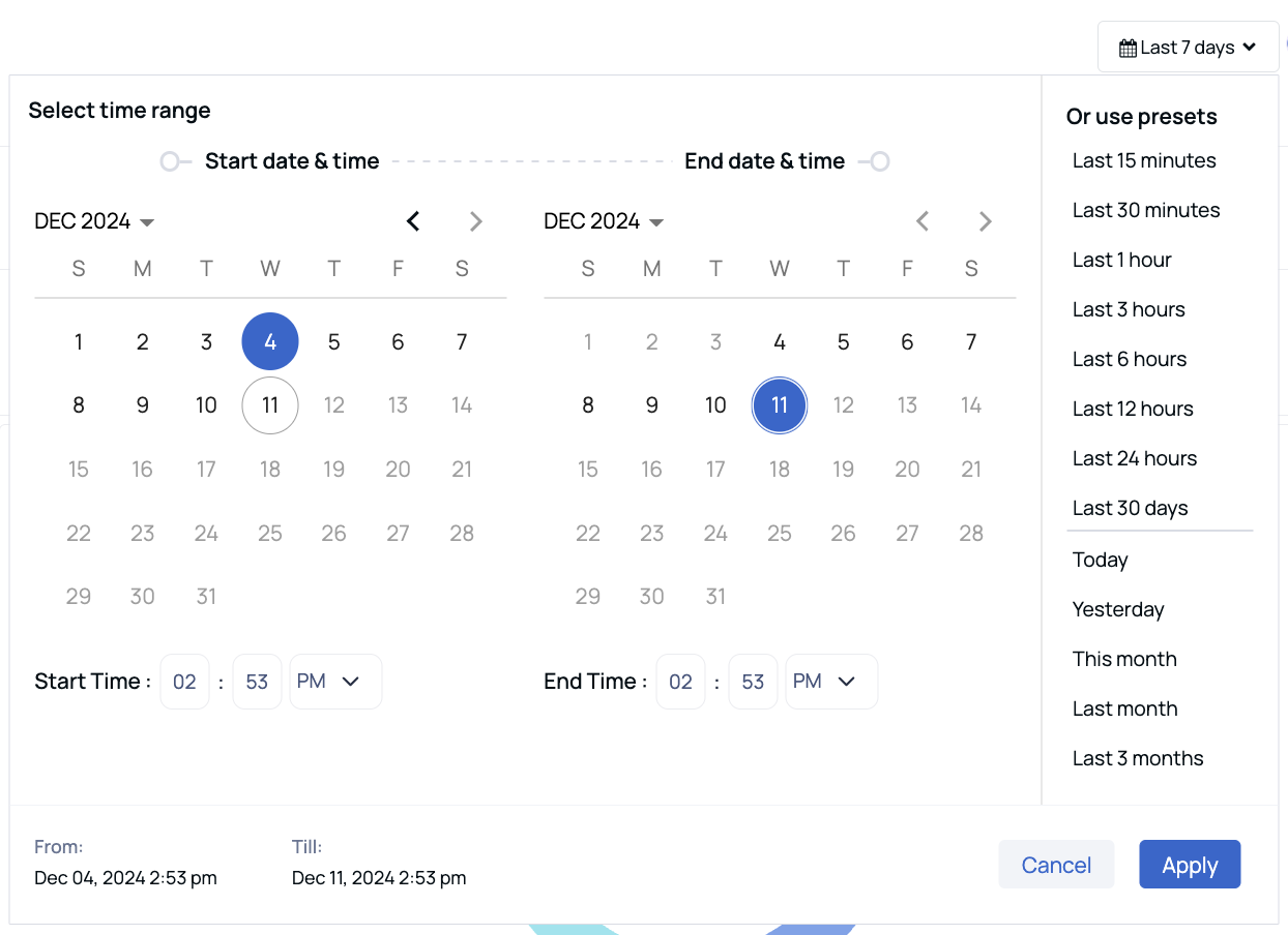
Global Calendar
| Widget | Description |
|---|---|
| Monthly Cost | This widget displays a summary of costs across different months. When you add Snowflake as a Data source in ADOC, your historical snowflake data for the past 12 months is used in this widget. This widget holds data for a maximum period of 12 months. As time passes, the historic data is replaced with the latest 12 months data.
|
| Cost For Selected Data Range | This widget displays the cost for a selected data range. You can change the data range by using the Global Calendar |
| Cost per Warehouse | This bar graph displays the cost incurred on each warehouse during the period selected in the Global Calendar. The x axis displays the list of warehouses and the y axis displays the cost. Each bar in this bar graph represents a warehouse. Each bar consist of multiple colors. Each color represents the cost incurred in a particular month. When you hover over a bar, you can see the Warehouse name and the incurred during various months on the Warehouse. You can drill down on any warehouse by clicking the respective section of the chart. You are navigated to the Performance Visualization page and the warehouse that you clicked is filtered. Here you can view all the data related to the filtered warehouse. |
| Query Count Per Warehouse | This widget represents a pie chart illustrating a filtered list of warehouses and their respective query counts for the selected time range. You can drill down on any warehouse by clicking the respective section of the pie chart. You are navigated to the auto$ page and the warehouse that you clicked is filtered. You can view all the data related to the filtered warehouse. |
| Cost over Time | This widget represents a bar graph illustrating the Top 10 Users by cost and queries. The x-axis displays the top 10 users, while the y-axis represents the user query count and user relative cost. |
| Daily and Cumulative Cost | This graph displays a comparative trend of cost incurred on warehouses, based on the time period selected in the Global Calendar. By clicking on the data points, you can drill down and access the cost Queries tab, where you can explore detailed information on various cost queries. From the Queries tab, click on a query type to further navigate to the Query Studio page, where a filter is already applied for the query type selected and this allows you to gain deeper insights on that particular query type. |
| Cost by Hour & Day | This detailed table displays the Cost incurred at each hour, on each day, of the previous week. You can also view the aggregated total cost for each day and at a particular hour every day. Each cost has a color in its background. When a cost at a particular hour or an aggregated cost is higher than normal, the shade of the background color turns darker. |
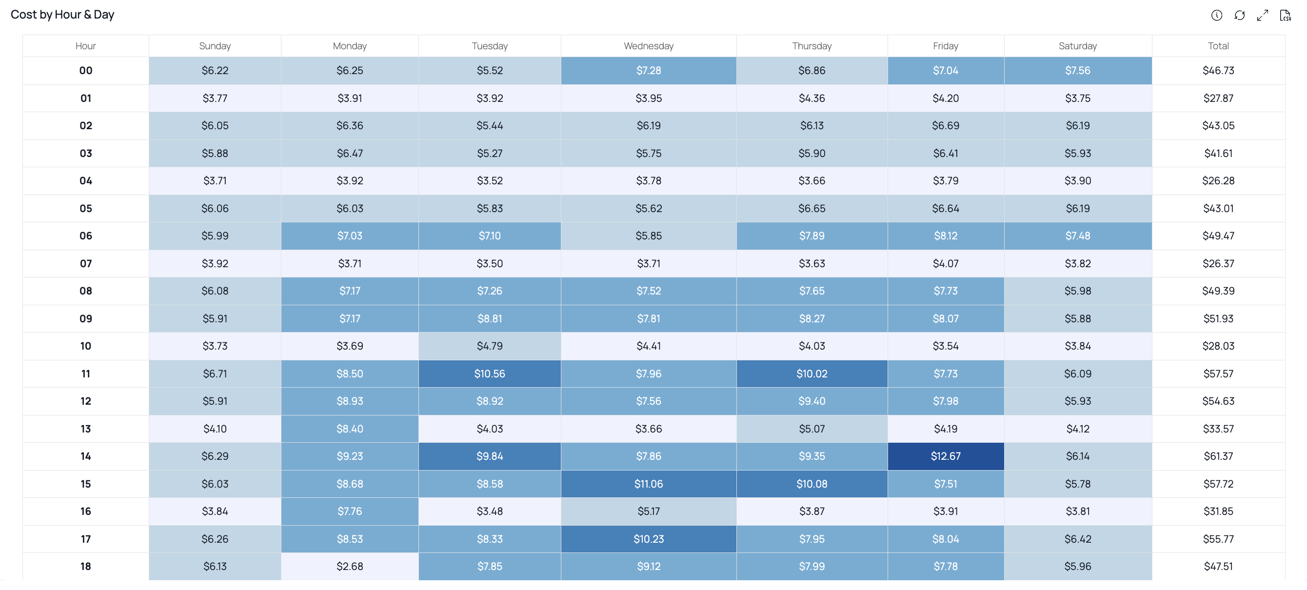
Cost by Hour and Day
The ADOC feature known as Daily and Cumulative Cost provides you a comprehensive understanding of cost trends over specific time periods. This feature allows you to assess cost patterns for each day over the past three months, as well as the cumulative cost trends for each individual month.
For instance, considering the present month of October, you can review the cost trend for each day during the preceding three months—July, August, and September. The cumulative cost trend is also graphically represented for each month, offering insights into overall expenditure patterns.
The computation of cumulative trends begins on the first day of each month. To illustrate, let's consider July: The cumulative trend value is determined from July 1st to July 31st. On July 1st, the cumulative cost comprises the entire cost incurred on that day. Subsequently, the cumulative cost on July 2nd includes the costs of both July 1st and July 2nd. This calculation continues until July 31st, summing the costs incurred on each respective day.
Similarly, the process repeats for the months of August and September. On August 1st, the cumulative cost resets and begins anew for the month of August. The cumulative cost on August 2nd includes the combined costs of both August 1st and August 2nd, extending this calculation until the end of August. The same iterative approach applies to September.
For enhanced clarity, the process can be represented in a table:
| Day | Cumulative Cost Calculation |
|---|---|
| July 1st | Cost of July 1st |
| July 2nd | Cost of July 1st + Cost of July 2nd |
| ... | ... |
| July 31st | Cost of July 1st + ... + Cost of July 31st |
| August 1st | Cumulative Cost for August 1st is the cost of August 1st |
| August 2nd | Cumulative Cost for August 2nd is Cost of August 1st + Cost of August 2nd |
| ... | ... |
| August 31st | Cumulative Cost for August 31st is Cost of August 1st + ... + Cost of August 31st |
| ... | ... |
| September 30th | Cumulative Cost for September 30th is the cumulative sum of September costs |
The Daily and Cumulative Cost feature empowers you with the ability to track both daily and cumulative cost trends, facilitating a comprehensive understanding of cost distribution and expenditure patterns across months. This feature is invaluable for making informed decisions and optimizing resources effectively.

Daily and Cumulative Monthly Cost
Snowpipe
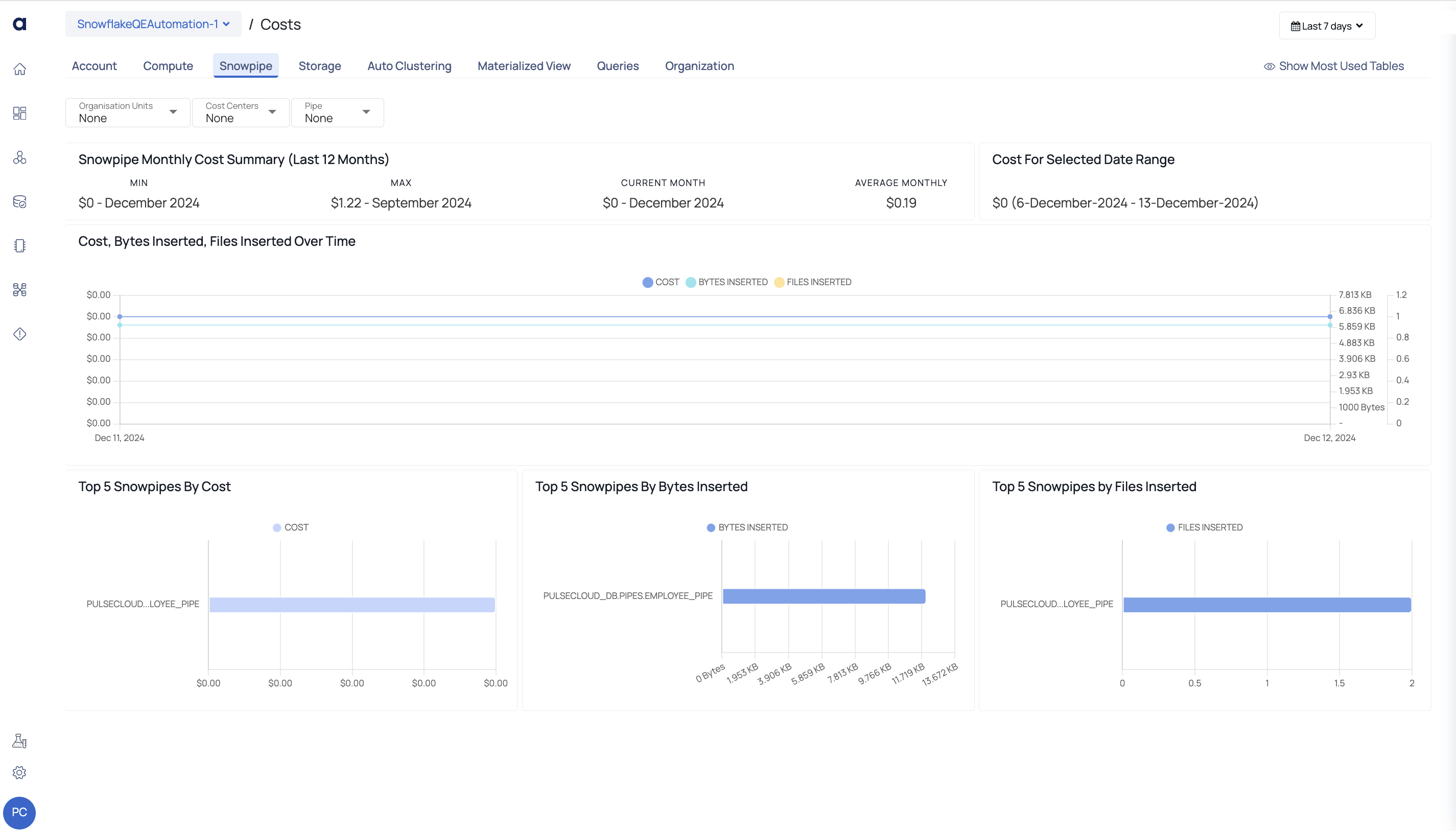
Snowpipe Tab
This page provides an overview of Snowpipe costs and activity metrics for the selected Snowflake account. It includes various charts and metrics to analyze costs, data insertion trends, and usage by Snowpipes over a specific date range.
| Widget | Description |
|---|---|
| Snowpipe Monthly Cost Summary (Last 12 Months) | Displays the minimum, maximum, current, and average monthly Snowpipe costs over the last year, offering insights into cost trends. |
| Cost for Selected Date Range | Shows the total Snowpipe cost incurred during the chosen date range. This helps track specific periods of usage and associated costs. |
| Cost, Bytes Inserted, Files Inserted Over Time | A line chart that tracks the cost, amount of data inserted (in bytes), and the number of files processed over time. It provides a temporal view of Snowpipe activity and associated costs. |
| Top 5 Snowpipes by Cost | A bar chart highlighting the Snowpipes that incurred the highest costs. This helps identify the most expensive Snowpipes for optimization. |
| Top 5 Snowpipes by Bytes Inserted | A bar chart showing the Snowpipes with the highest volume of data (in bytes) inserted. It provides insights into the data-heavy pipelines. |
| Top 5 Snowpipes by Files Inserted | A bar chart displaying the Snowpipes that inserted the most files, helping analyze activity levels across pipelines. |
Storage
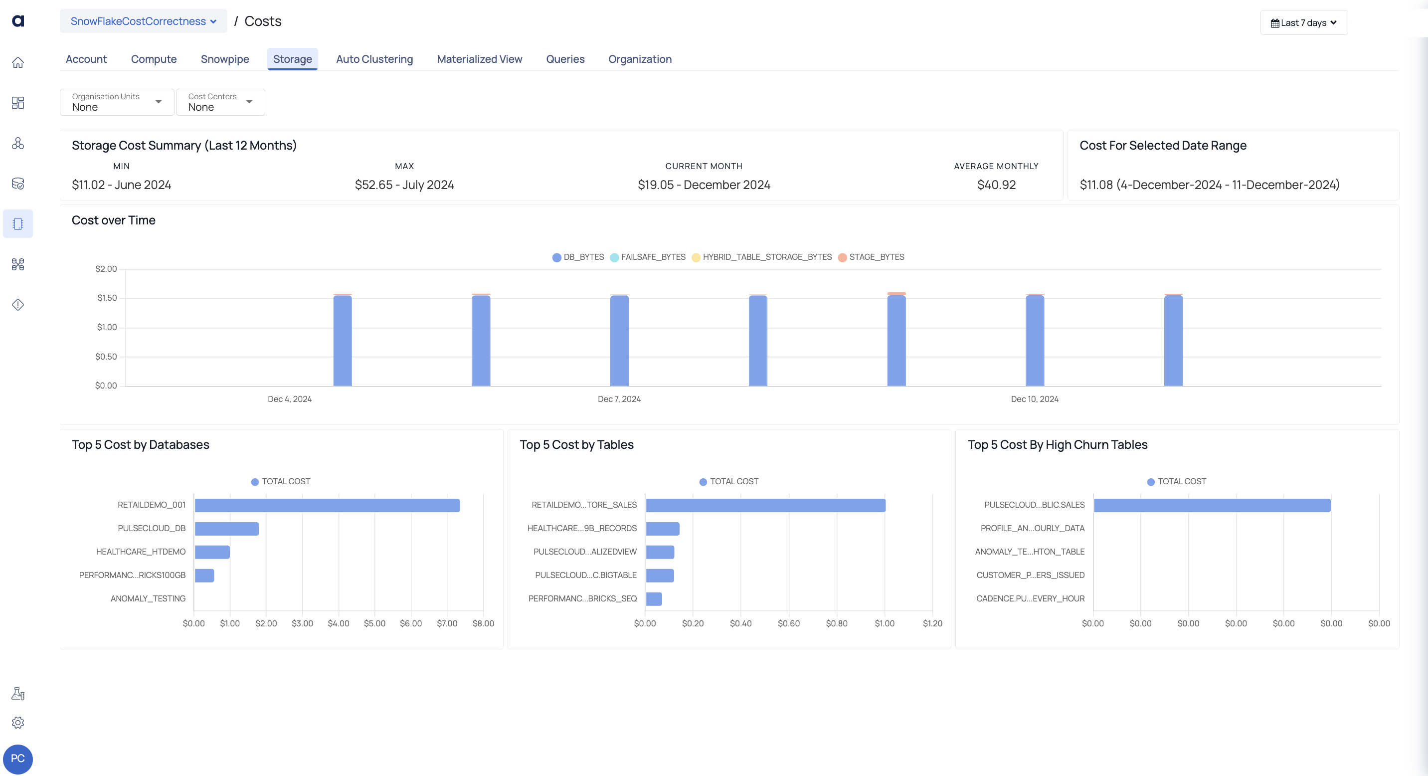
Storage Tab
This tab displays the storage cost incurred on your Snowflake account. The data displayed on this tab is as follows. The Global Calendar is disabled on this tab. However, some graphs of this tab have their own time filter.
| Widget | Description |
|---|---|
| Storage Cost Summary | This section has three widgets.
|
| Cost for Selected Date Range | This graph displays the total expenses incurred during the specified time period. |
| Cost Over Time | This graph displays the cost incurred on various storage services like storage cost with Snowflake, stage cost which includes cost of stages created within Snowflake, and fail safe costs. You can apply date filters to view data specific for a time period. The x axis displays the time period based on the filter applied. The y axis displays the cost. When you hover over a data point, you can view the DB, Failsafe, Time Travel and Stage Bytes cost for the date. · DB_BYTES: Db Bytes refers to the size of tables, views, and other database objects within Snowflake. · FAILSAFE_BYTES: Failsafe Bytes provides continuous data protection and allows for point-in-time recovery. · TIME___TRAVEL_BYTES: Time Travel Bytes enables the possibility to access data at any time throughout a specified time frame. · STAGE_BYTES: Stage Bytes displays the temporary data staging area. |
| Top 5 Costs by Databases | This vertical bar graph depicts the top five databases with the greatest storage costs over the last year. The x axis shows the cost, and the y axis shows the names of the five most expensive databases. |
| Top 5 Cost by Tables | This vertical bar graph displays the top 5 tables which incurred the highest amount of storage cost during the last 12 months. The x axis displays the cost nd the y axis displays the names of the five tables that incurred the highest cost. |
| Top 5 Cost By High Churn Tables | This vertical bar graph displays the top 5 churn tables which incurred the highest amount of storage cost. High churn is the ratio between fail safe and active bytes. The x axis displays the cost and the y axis displays the names of the five high churn tables. |
Auto Clustering
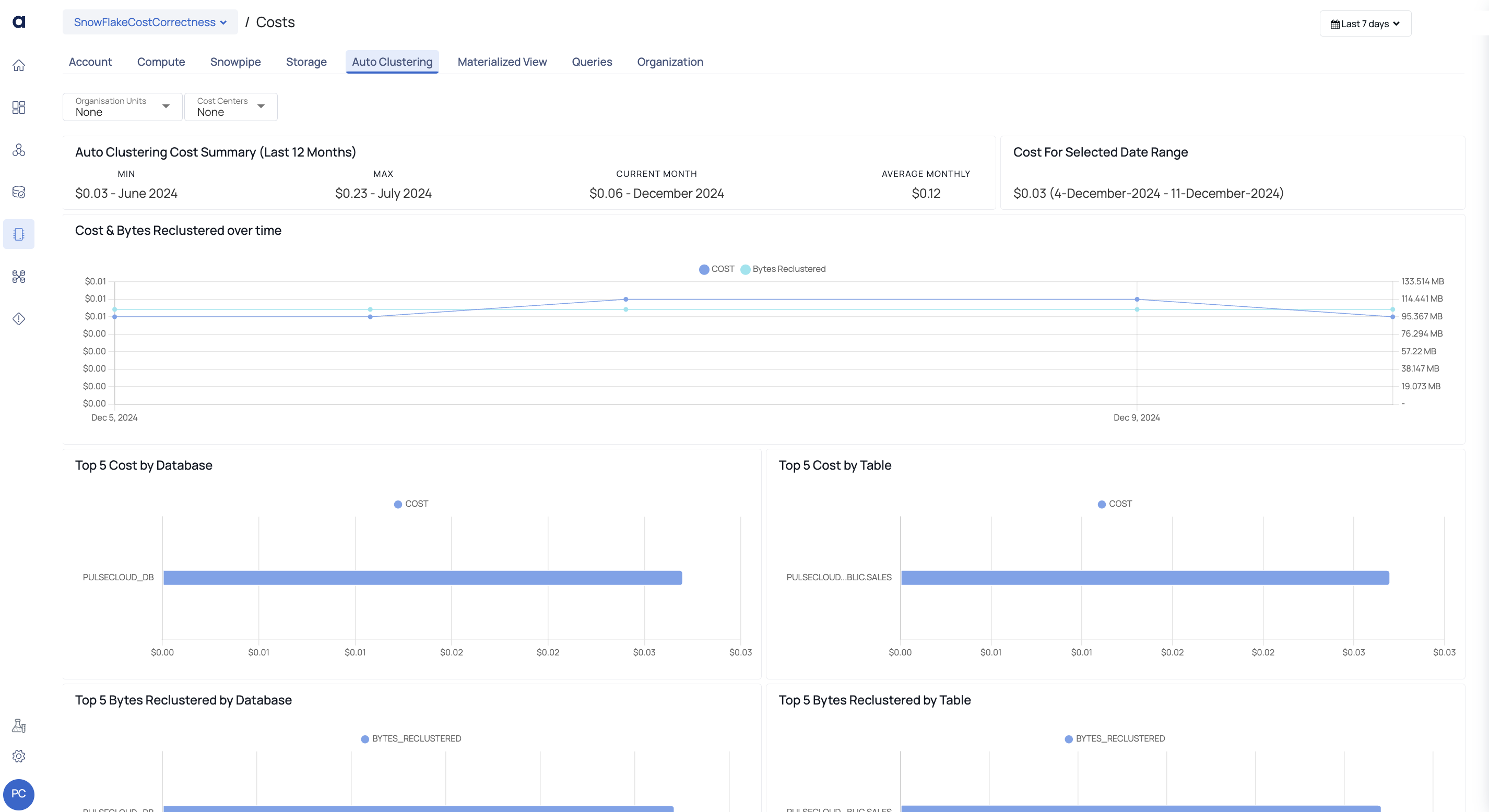
Auto Clustering Tab
The Auto Clustering tab groups and optimizes data stored in Snowflake automatically. It boosts query performance by eliminating the need for manual data arrangement. The prices provided on the Acceldata platform are based on publicly available cost data. Cost data for the previous 12 months is typically accessible beginning on the day the datasource was uploaded.
| Widget | Description |
|---|---|
| Cost Summary | This widget displays the following information:
|
| Cost for Selected Date Range | This widget displays the additional storage costs on enabling the auto cluster feature for your Snowflake data source for the selected data range or time period. |
| Cost & Byes Reclustered over time | The line graph shows the cost and bytes clustered over time when tables and views use auto clustering. It shows how clustering cost and data volume evolve over time. Re-clustering operations organize and cluster data in Snowflake tables and views to optimize storage costs and query speed. This graph shows its effectiveness. Hovering over a data point on the graph displays the cost and quantity of bytes for that date and time. By clicking on a data point, you may visit the Query Studio page for further insights for the specified date or time range, which helps you understand the clustering process and its effects. |
| Other Charts | Top 5 Cost by Database: The Top 5 Cost By Database visualization is a bar graph that displays the five databases with the highest Auto Clustering expenses. It focuses on the databases that contribute the most to overall Auto Clustering spending. Top 5 Cost By Table: A bar graph depicts the five tables with the greatest Auto Clustering expenses in the Top 5 Cost By Table visualization. It gives you insight into the tables that contribute the most to your overall Auto Clustering spending. Top 5 Bytes Reclustered by Database: The visualization displays a ranking of the five databases with the most bytes reclustered while the Auto-Clustering function was activated. It provides insight into the databases that have seen the most data reorganization via clustering, which helps to optimize storage and query speed. Top 5 Bytes Reclustered by Table: The visualization shows the top five tables that had the most bytes reclustered while the Auto-Clustering functionality was activated. It gives you insight into the specific tables that experienced considerable data restructuring via clustering, resulting in storage efficiency and increased query performance. |
Materialized View
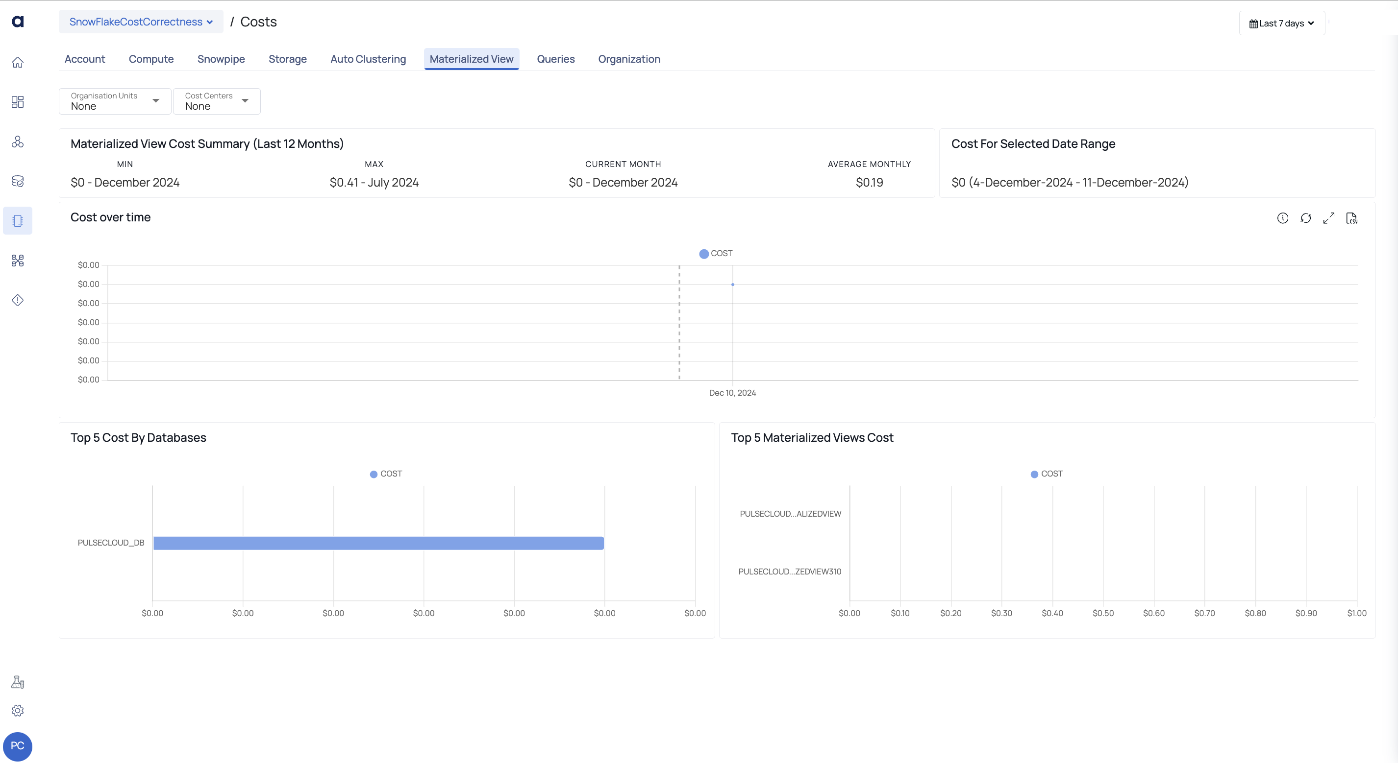
Materialized View Tab
In Snowflake, a materialized view is a database object that saves the results of a query in a precomputed and optimized form. It improves performance by allowing users to retrieve and evaluate data more rapidly without having to execute complex queries frequently. Materialized views are essentially a technique to save aggregated or altered data, eliminating the need to recompute the same results each time a query is conducted.
The ADOC page presents the previous 12 months' materialized view cost summary, cost for selected date range, graphical depiction of cost trends over time, top 5 database costs, and top 5 materialized view costs.
Queries
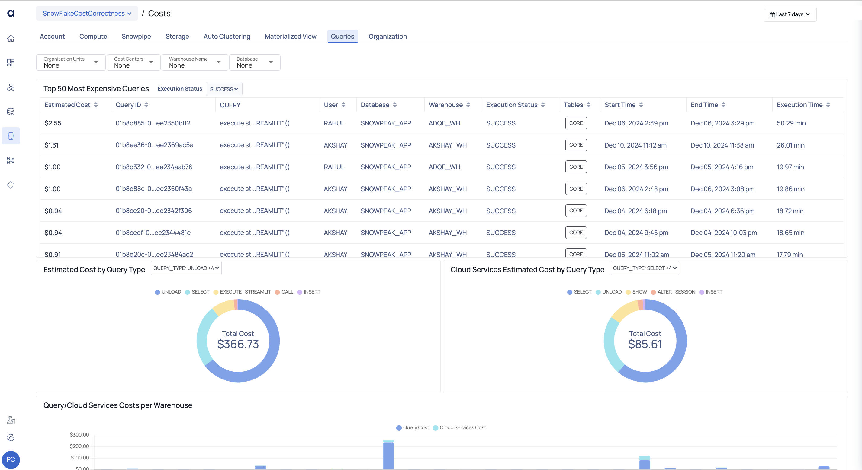
Queries Tab
This page shows the cost of running queries in your Snowflake account. To examine data exclusively for specific warehouses, utilize the Global calendar to apply filters.
In addition to the Global Calendar, you can utilize filters to display data relevant to a Database, Warehouse, or Execution Status.
| Widget | Description |
|---|---|
| Top 50 Most Expensive Queries | Estimated Cost: The potential cost of the inquiry, Query ID: The query's unique ID. This value can be copied. Query: The actual query being run. User: The user who executed the query. Database: The database in which the query is being executed. Warehouse: The warehouse where the query is being run. Execution Status: The query's execution status. The values of this column are determined by the filter set in this page's Queries filter. Tables: The query's scan of the tables. |
| Estimated Cost by Query Type | The anticipated cost for each query type is shown in this pie chart. This is determined by the size of the warehouse and the query execution time. In the center of the pie chart, you can also see the overall cost of all query types. The pie chart is separated into several query kinds, each of which has a cost. When you hover your mouse over the pie chart, you can see the cost of each query type. You can use filters to see only the costs spent by specific query types. You cannot view any data in the pie chart if you choose a query type in the filter and that query type has not incurred any costs. It is only visible in the pie chart legends, and it has a color assigned to it. |
| Cloud Services Estimated Cost by Query Type | This pie chart shows the anticipated costs for various cloud service query types. This is determined by the number of cloud service credits consumed for each query. In the center of the pie chart, you can also see the overall cost of all cloud services query types. The pie chart is separated into several cloud service query kinds, each of which has a fee. When you hover your mouse over the pie chart, you can see the cost of each cloud service query type. You can use filters to see only the costs spent by various cloud service query types. You cannot view any data in the pie chart if you choose a cloud service query type in the filter and that query type has not incurred any costs. It is only visible in the pie chart legends, and it has a color assigned to it. |
| Query/CS Costs per Warehouse | This bar graph compares the costs of queries and cloud services queries across all warehouses. The x axis shows the name of the warehouse, and the y axis shows the cost of warehouses. Each bar represents the cost of the facility. A bar represents the cost of searches and cloud service queries. Both charges are shown in separate colors. When you hover over a bar, you can see the warehouse's name, query cost, and cloud services query cost. |
Organization
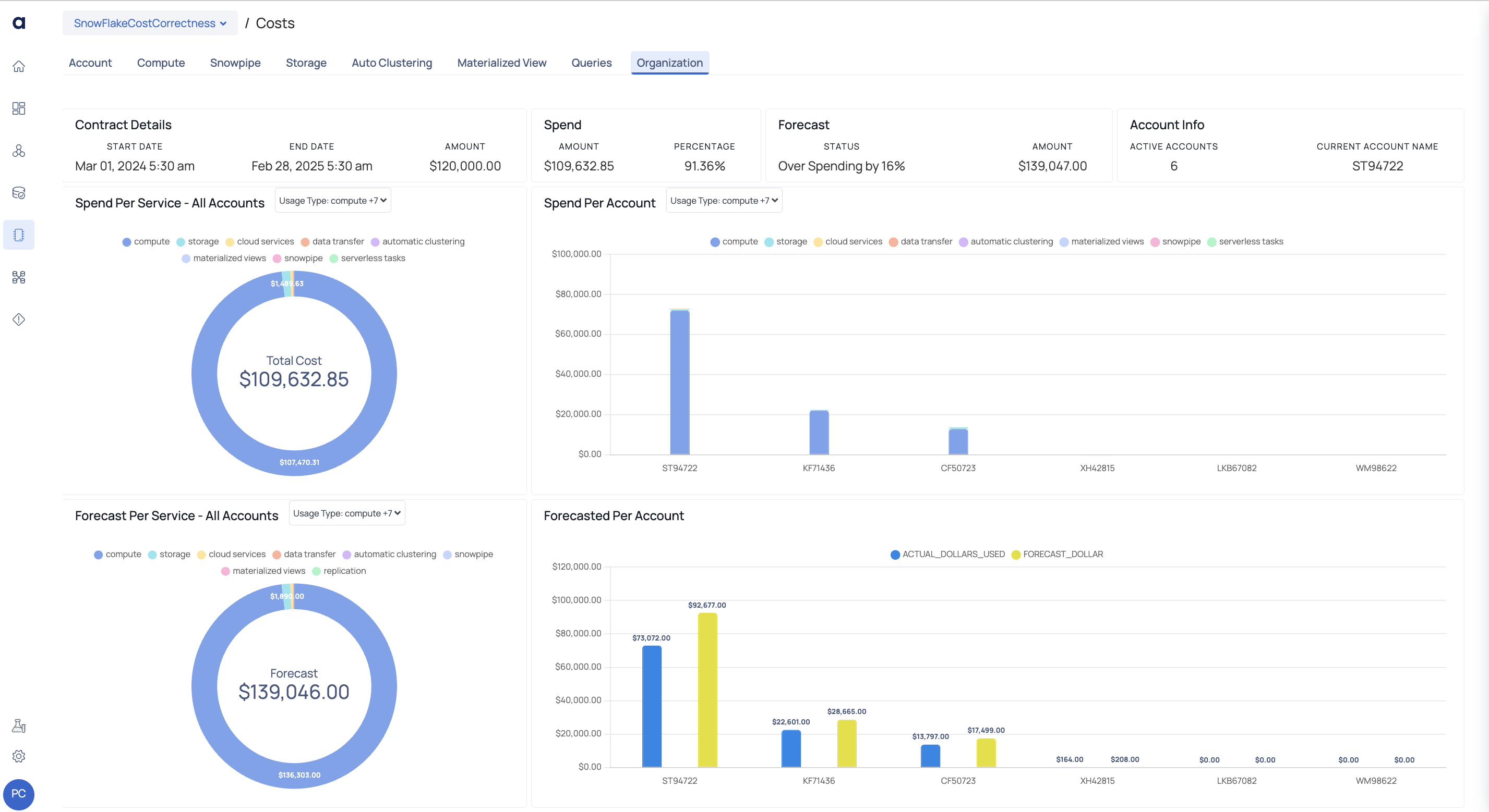
Organization Tab
The organization tab is the first tab that is displayed when you navigate to Costs page of any Snowflake account. This page displays visualizations and details of all your accounts integrated with ADOC.
The following widgets are displayed on this page:
| Widget Name | Description |
|---|---|
| Contract Details | This widget displays the following contract details:
|
| Spend | This widget provides insights into the expenditure in actual dollars and as a percentage based on the contract amount. |
| Forecast | This widget forecasts the potential over or underspending on the total contract amount. |
| Account Info | This widget displays the total count of organization accounts and the current account name. |
| Spend Per Service - All Accounts | This pie chart widget illustrates the distribution of costs per service across all Snowflake accounts within your organization. |
| Spend Per Account | This widget presents the cost incurred across different Snowflake accounts within your organization. By clicking on any bar in the chart, you can navigate to its respective account tab and view detailed information. |
| Forecast Per Service - All Account | This widget displays a pie chart showcasing the projected cost per service across all Snowflake accounts within your organization. |
| Forecasted Per Account | This widget presents a bar graph comparing the actual incurred cost with the forecasted cost across different Snowflake accounts in your organization. |
If your forecasted cost is $0 or negative, the displayed amount will match the actual dollars used.