Dashplots enables you to create custom visualizations and dashboards for monitoring operational, infrastructure, application, and business metrics across xObserve environments.
Dashplots provides a flexible query-driven visualization framework that allows users to build charts, organize them into dashboards, configure filters and variables, and share insights across teams.
Using Dashplots, you can:
Create custom visualizations from supported data sources.
Build dashboards using one or more visualizations.
Configure dashboard interactions and drilldowns.
Use variables to create dynamic and reusable queries.
Schedule and distribute dashboard reports.
Monitor metrics through multiple chart types and visualization options.
Navigation
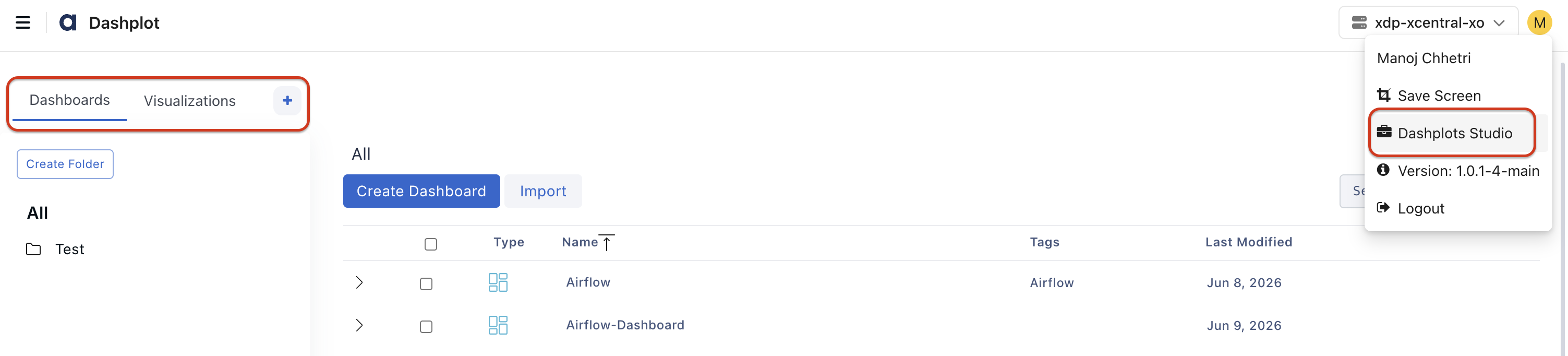
In the xObserve UI, go to the user icon in the top-right corner.
Navigate to Dashplots Studio from the user menu.
The Dashplots workspace opens with the following tabs:
Dashboards
Visualizations
+, to Create New Visualizations