Visualizations convert query results into charts and graphical representations.
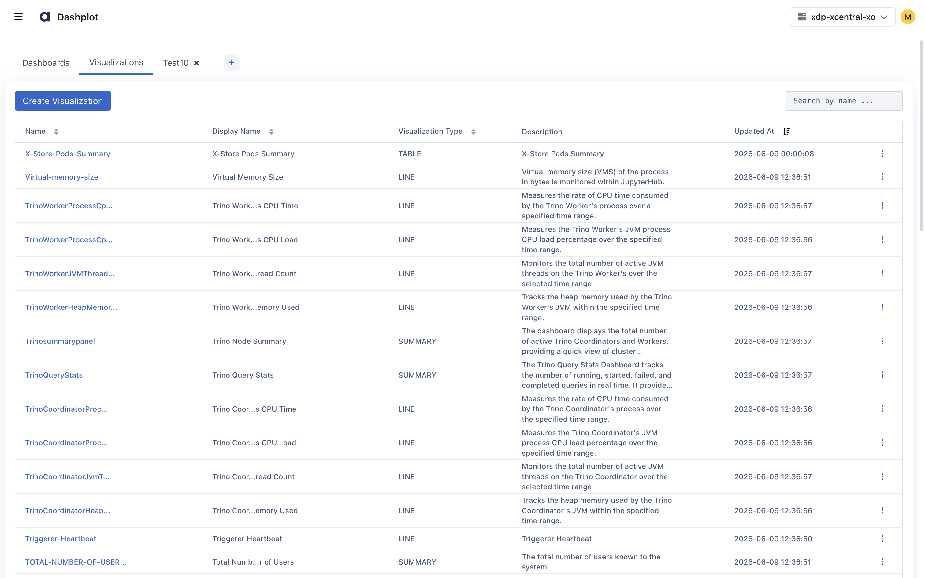
The Visualizations tab displays all saved visualizations.
Navigation
To access Dashplots Studio:
In the xObserve UI, click the User icon in the upper-right corner.
Select Dashplots Studio.
The Dashplots Studio workspace opens and provides the following tabs:
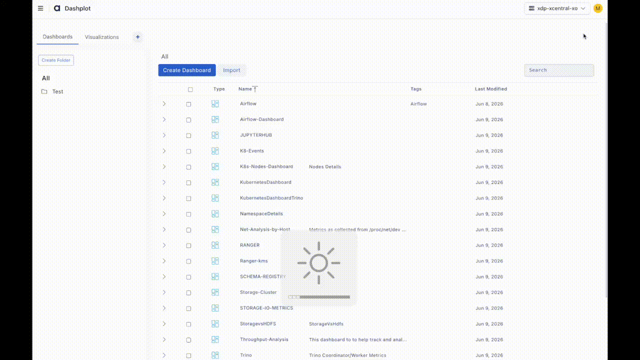
Dashboards – Create and manage dashboards.
Visualizations – Create and manage reusable visualizations.
+ - Create a new visualization.
For details about creating a visualization, see Creating a Visualization.
Visualization Library
The Visualization Library provides a centralized repository for managing reusable visualizations.
Name – Unique name of the visualization.
Display Name – Title displayed on dashboards.
Visualization Type – Type of chart or visualization (e.g., Bar, Line, Pie).
Description – Brief description of the visualization.
Updated At – Timestamp of the most recent update.
Visualizations can be reused across multiple dashboards.
Changes to a visualization automatically apply wherever that visualization is used.
Creating a Visualization
To create a visualization:
In the xObserve UI, go to the user icon in the top-right corner.
Select Dashplots Studio. The dashboard page appears on the screen.
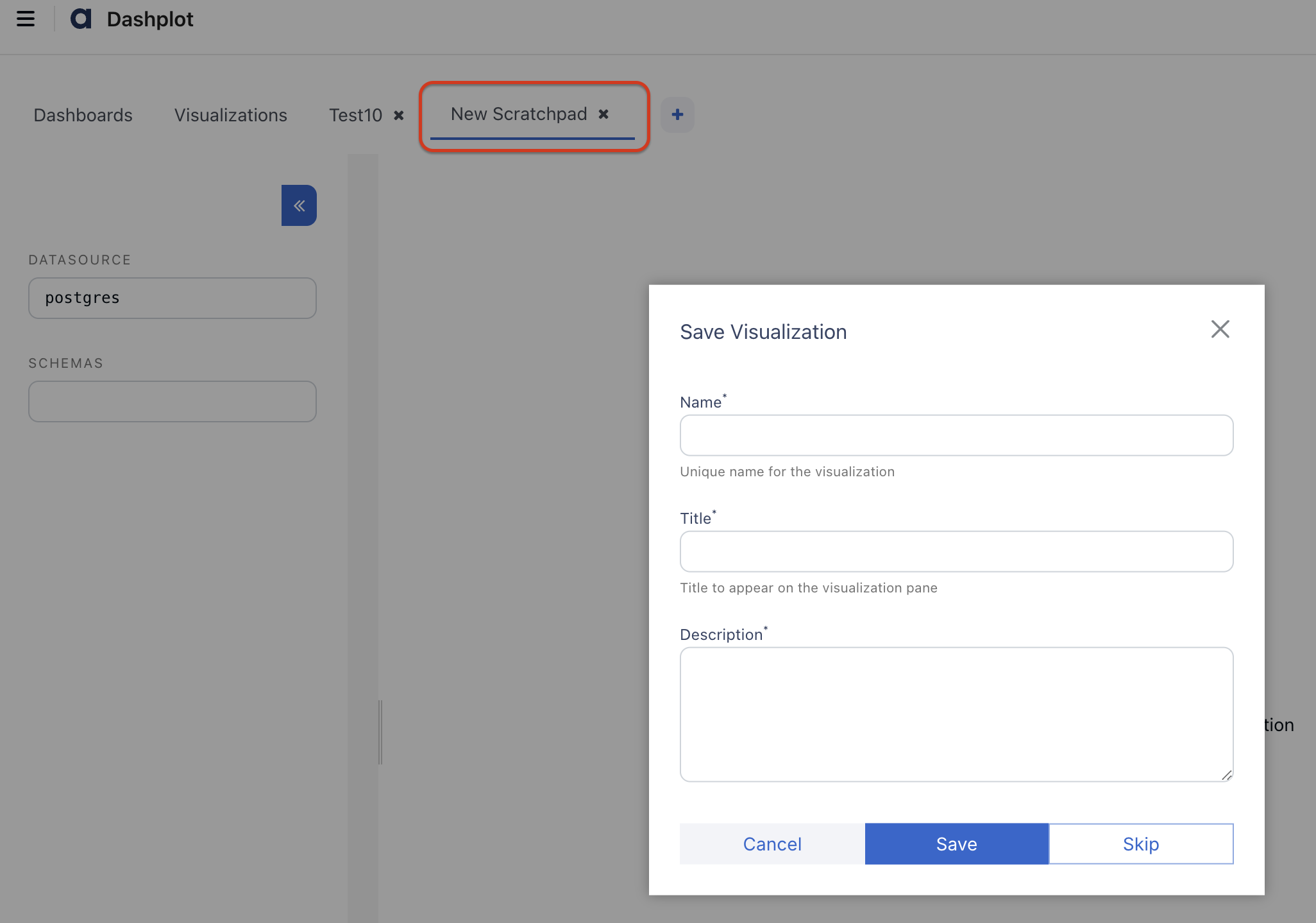
Go to the Visualization tab and click Create Visualization or click the + icon.
A new visualization scratchpad opens, asking for the visual name, title, and description.
Click Save.
Follow the steps below, such as selecting a data source, schema, metric, etc.
Select a Data Source
Choose a data source from the Datasource panel.
VictoriaMetrics: For time-series metrics
PostgreSQL: For configuration-related metrics.
Select a Schema
Choose the schema associated with the selected data source.
Select a Metric
From the Tables pane:
Browse available metrics.
Select a metric.
The metric is automatically added to the query editor.
Example:
spark.BlockManager_disk.diskSpaceUsed_MB
Execute Query
Click Execute Query.
The query result appears in the Sample Data section.
The sample data can be viewed as:
Table
JSON
Variables
Variables allow dynamic query generation and reusable visualizations.
Variables can be referenced within queries and modified without changing the query definition.
Variable Types
Global Variables:
Provided by the system.
Examples include:
from_date_epoch
to_date_epoch
Global variables cannot be modified.
Dashboard Variables
Dashboard variables are automatically promoted when the same variable is used across multiple visualizations.
Changes affect all linked visualizations.
Local Variables
Local variables affect only a single visualization.
Adding Variables
To add variables:
Place the cursor in the query editor.
Click Global Variable.
Select a variable.
Example:
${from_date_epoch}
Execute the query.
The selected value is substituted during execution.
Visualization Configuration
The Visualization panel is used to customize chart behavior and appearance.
Supported Visualization Types:
Line, Bar, Pie, Doughnut, Scatter, Heatmap, Table, Treemap, and other chart types.
Visualization Type | Select the chart type (Line, Bar, Pie, Scatter, Heatmap, Table, Treemap, etc.). |
X-Axis | Configure the X-axis field, label, and formatter. |
Y-Axis | Configure the Y-axis field, scale, label, and formatter. |
Scale | Choose the axis scale: Linear or Logarithmic. |
Group By | Group data using dimensions such as Host, Cluster, Application, or Namespace. |
Filters | Apply filters to limit the data displayed in the visualization. |
Color Picker | Select chart colors from predefined palettes. |
Show Labels | Enable or disable data value labels on the chart. |
Gradient Option | Apply gradient styling to supported chart types. |
Redirection | Configure navigation to another dashboard or external URL when a chart element is clicked. |
Drilldown | Configure interactive drilldowns using a target URL and query parameters. |
Query Parameters | Pass values such as X-Axis Value, Y-Axis Value, and Series Value during drilldown. |
Compare Option | Enable comparison mode. Comparison mode displays data from multiple time periods simultaneously. |
Annotation | Annotations provide additional operational context. Supported annotations include:
|
Sample Data
The executed query details appear in the table.
You can see the data in the table or JSON format.
Saving a Visualization
After configuring the chart:
Click Save.
Provide:
Name: Visualization identifier
Title: Display title
Description: Visualization description
Click Save.
The visualization is added to the Visualization Library.