Search
The Flink Dashboard in Pulse provides a real-time summary of Flink applications and visualizes resource utilization and execution performance across queues and users.
Use the Dashboard to:
- Monitor running, failed, finished, and killed applications.
- Analyze vCore and memory usage to assess resource consumption.
- Track the average elapsed time for jobs to identify slow executions.
- View top users by application count and usage.
- Compare application execution counts across queues or users.
Steps
- In the Pulse UI, go to Flink > Dashboard.
- On the Flink Dashboard page, review the Summary Panel for key Flink job statistics.
- Set a time range and refresh interval (for example, 10 s, 20 m, 2 h, 4 d, or 1 w) to ensure the charts display the latest data.
Pulse displays job, resource, and queue-level performance data in real time.
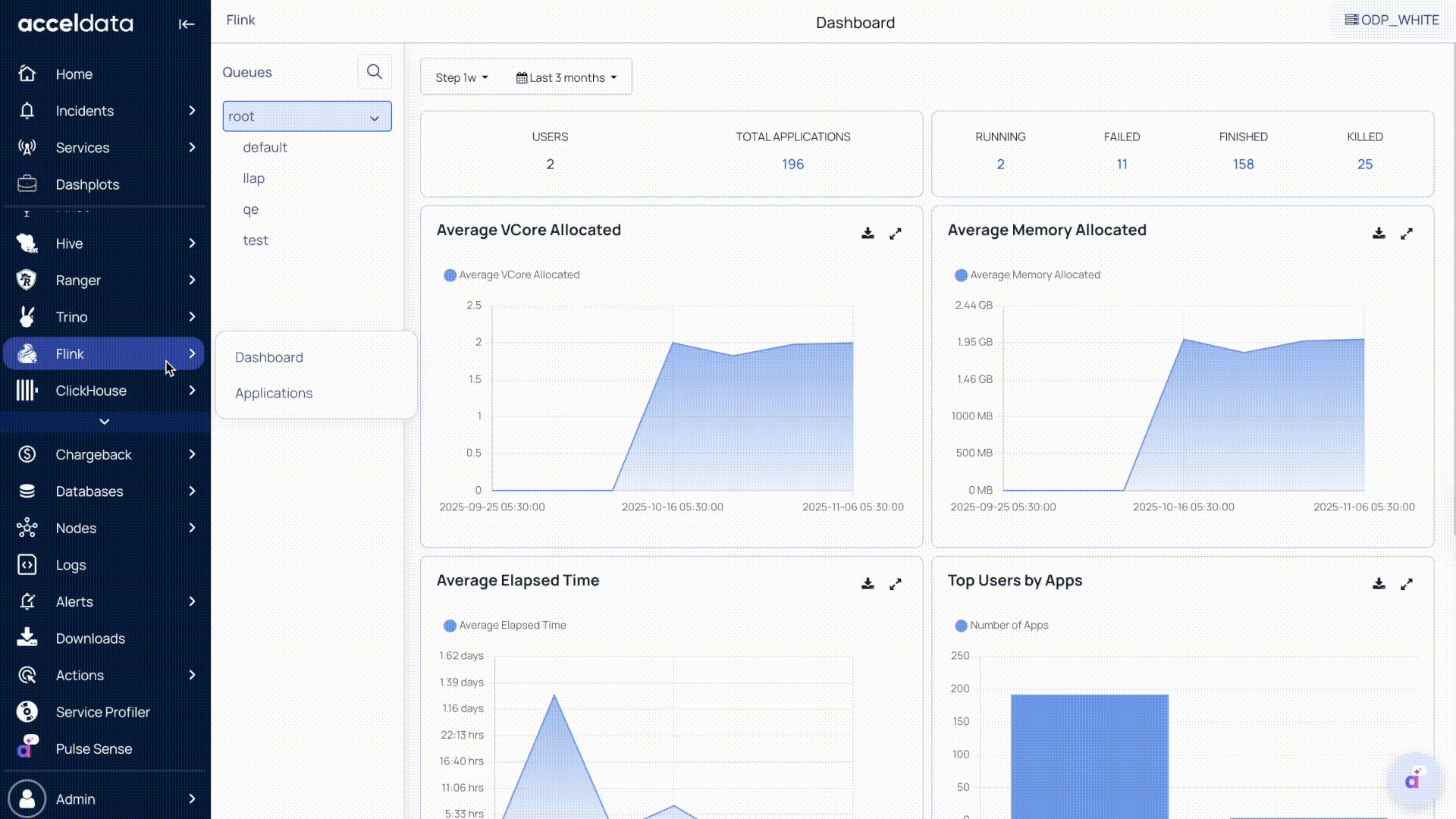
Summary Panel
The Summary Panel displays key metrics that summarize Flink activity.
These metrics provide a quick overview of Flink job execution status and overall cluster activity.
Cluster Overview
- Queues: Lists available Flink queues (for example, root, default, etc.).
- Users: Displays the total number of users currently running applications in the cluster.
- Total Applications: Shows the total number of Flink applications submitted to the cluster.
Application Status
- Running: Displays the number of currently running jobs.
- Failed: Indicates the number of failed jobs.
- Finished: Shows the number of completed jobs.
- Killed: Displays the number of jobs that were terminated before completion.
Charts
The Flink Dashboard includes charts that help you visualize resource usage trends and application performance.
These charts enable you to analyze performance trends, optimize resource allocation, and maintain cluster efficiency.
| Chart | Description |
|---|---|
| vCore Usage | Displays total CPU (vCore) utilization across running Flink jobs. Helps identify resource contention or under-utilization. |
| Memory Usage | Shows memory consumption across all running applications. Useful for detecting potential out-of-memory issues. |
| Average Elapsed Time | Tracks the average duration of job executions, helping identify performance regressions or long-running jobs. |
| Top Users by Apps | Lists users with the highest number of submitted applications, highlighting workload distribution. |
| App Execution Count | Displays the total number of application executions over time to help monitor workload trends. |
Key Features
Each chart includes the following options:
- Maximize: Expands charts to full page view.
- Download: Exports chart data in .xlsx or .csv format for offline analysis.
Was this page helpful?