
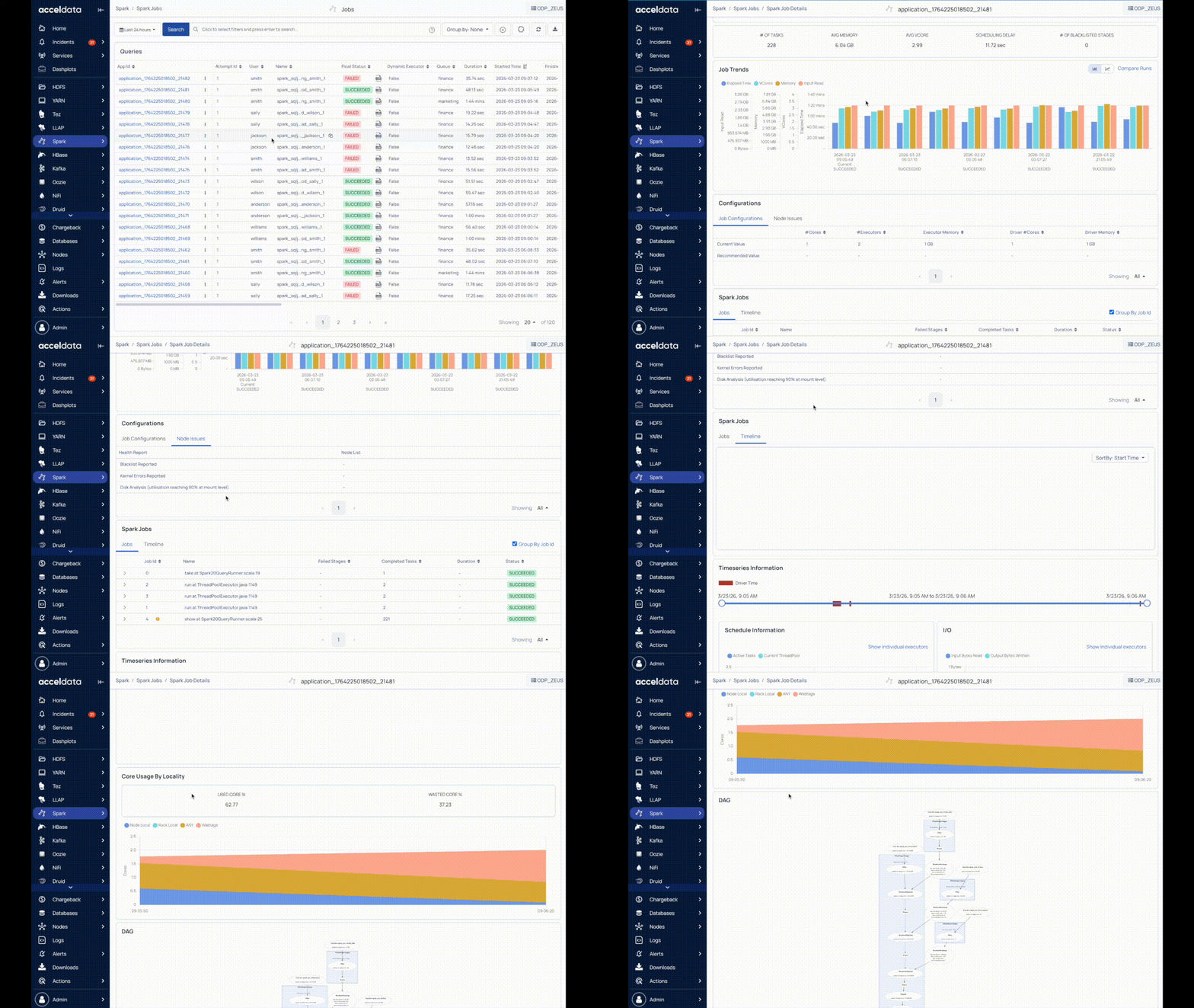
The Spark Job Details page contains the following panels:
Summary Panel
Job Trends
Configurations
Spark Stages
Time Series Information
Reports
Application Logs
Note
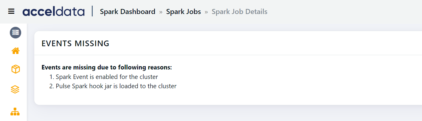
If you cannot view the Spark Jobs details page, you can view the instructions given on the page and follow them so that you can view the Spark job details.
Summary Panel
The top panel displays the following information:
Name | Description |
|---|---|
User | The name of the user that ran the job. |
Final Status | Status of the job. The state can be one of the following: Succeeded, Failed, Finished, Finishing, Killed, Running, Scheduled. Click on the status to view the list of the jobs. |
Start Time | The time at which the application started running. |
Duration | The time taken to run the query. |
# of Jobs | The number of jobs in the application. |
# of Stages | The number of stages of the Spark job. Click on the number to view the list of inefficient stages. |
# Inefficient Stages | The number of inefficient stages. Click on the number to view the list of inefficient stages. |
# of Tasks | The total number of tasks the stages are broken into. |
Avg Memory | The average memory used by the application of the selected user. |
Avg VCore | The average VCore used by the application of the selected user. |
Scheduling Delay | The time taken to start a task. |
Job Trends
The Job Trends panel displays a chart showing the pattern of jobs running at a particular time.
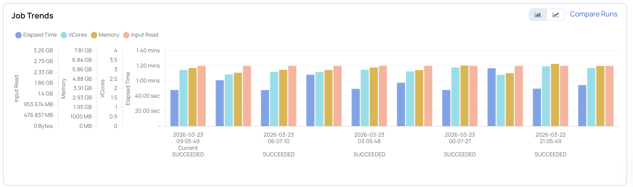
The x-axis denotes the time at which the User executed a job.
The following table provides description of the factors displayed in the Job Trends chart:
Name | Description |
|---|---|
Elapsed Time | The time taken to run the jobs at a particular time. |
VCores | The number of VCores used to run the job. |
Memory | The amount of memory used to run the job. |
Input Read | The size of the input dataset. |
Output Written | The size of the output written to a file format. |
You can choose the metrics displayed in the Job Trends chart. To choose the metrics, perform the following:
Click the Comparison metrics drop-down menu in the chart. The list of the metrics is displayed.
Select the metrics you choose to view. The data respective to the selected metrics is displayed in the chart.
(Optional) To add metrics, click and select the metrics from the list.
(Optional) To remove the selected metrics, click corresponding to the metrics you want to remove.
Switching Job Trends View
You can switch between bar chart view and line chart view.
Click , to view the Job Trends as a bar chart.
Click to view the Job Trends as a line chart.
Configuration Difference
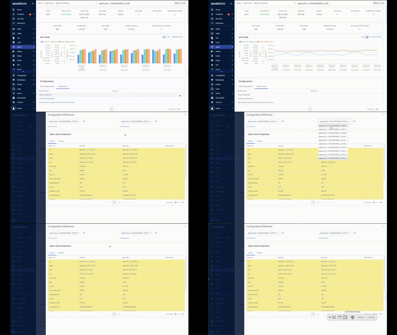
Click Compare Runs to compare different configuration of the job. Select the runs that you want to compare from the drop-down list. You can choose from up to 10 previous runs of the job. Apart from the previous 10 runs, you can also choose to compare an execution of the job with any other execution. You must click the Enter App ID button. You must enter the application ID, followed by an underscore and then the original attempt in the following format.
app.id_originalattempt
Configurations
With Configurations, you can view the Job Configurations and Anomalous hosts.
Job Configurations
Job Configurations displays the Current Value and the Recommended Value for the following parameters:
Metric | Description |
|---|---|
# Cores | The number of cores in the current job. |
# Executors | The number of executors in the current job. |
# Executor Memory | The amount of memory used by a job executor. |
Driver # Cores | The number of driver cores. |
Driver Memory | The amount of memory used by the driver. |
Node Issues
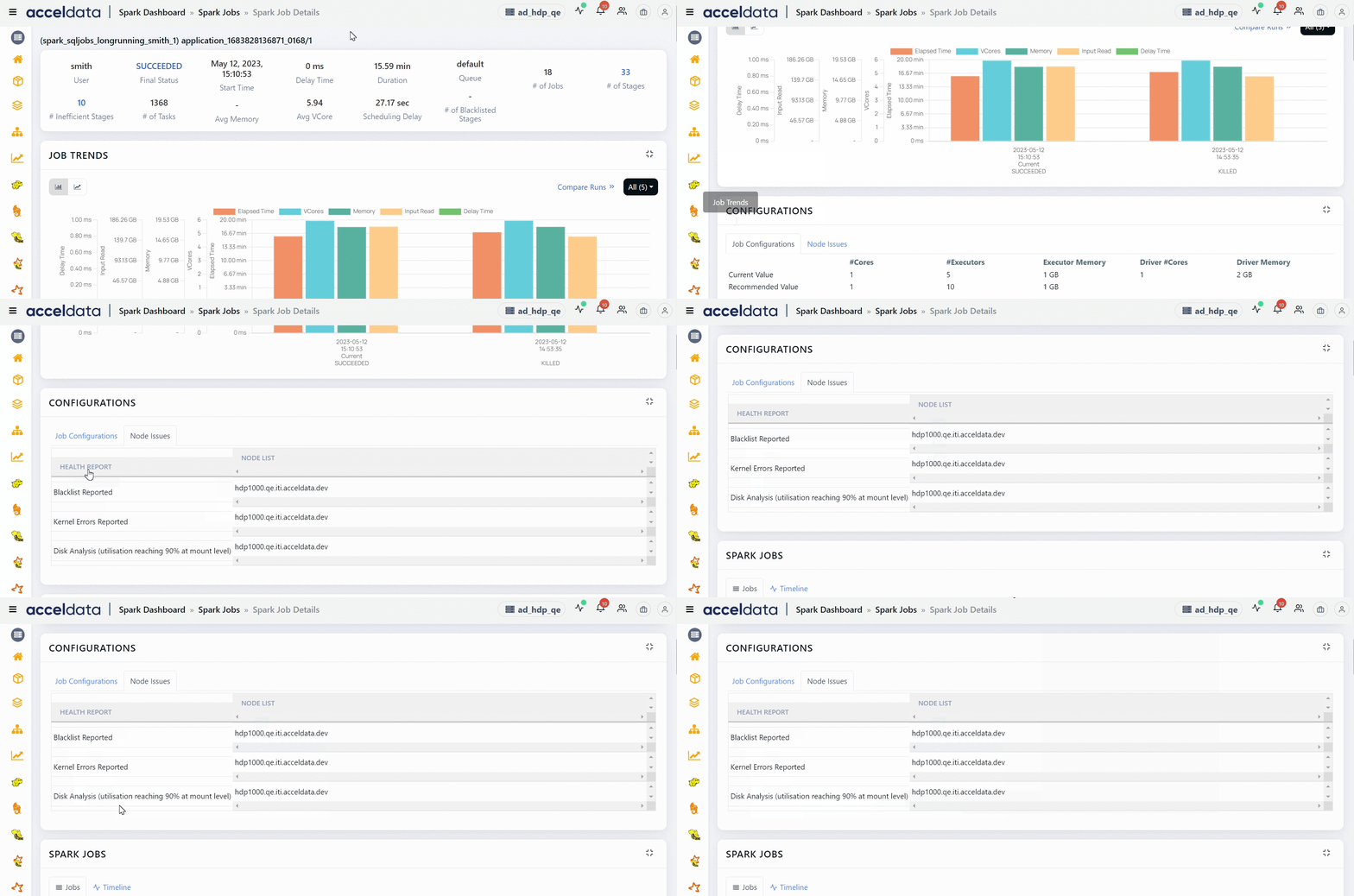
This section displays the unhealthy nodes of this Spark application. Blacklisted nodes, nodes on which Kernel errors are reported, nodes whose disk utilization is close to being full are some examples which make a node unhealthy. This section displays a table with two columns. The HEALTH REPORT column displays the reasons as to why a node is marked unhealthy and the NODE LIST column displays the list of nodes which are unhealthy.
Anomalies
Anomalies board displays system metrics for the host which is used by the Spark job within the duration of that job. The host can be impacted by the usage of CPU, Memory, Network, or Disk.
With Anomalous data, you can monitor the host performance and make predictions on memory, CPU, Network I/O, and disk usage.
To view more details about Anomalous hosts, click the host link in the Anomalies tab.
You can detect anomalies based on the following metrics.
If an anomaly exists, the associated chart is highlighted with the number of anomalies detected.
Metric | Description |
|---|---|
CPU Usage | The processor capacity usage of the job on the host. |
Memory Usage | The RAM usage of the job on the host. |
Network I/O | The network status of the job on the host displaying Sent Bytes and Received Bytes. |
Disk Usage | The host storage currently in use by the Spark job. The data is displayed in Write Bytes and Read Bytes. |
Error Details
The error information for the job that failed to complete is displayed. This panel is displayed for a job that has a final status of FAILED.
To copy the error details, perform the following:
Click the copy icon. A confirmation dialog-box appears.
Click Ok. The error details are copied to the clipboard.
Concurrent Running Apps
This table displays the list of applications which were running parallelly with the selected application. You can view the following details in this section.
Column Name | Description |
|---|---|
ID | The unique Id of the application that was running parallelly. You can click the ID of the application to drill down to the details page of that application. |
Original Attempt | The number of attempts made by the application to execute. |
Wait Time | The time for which application was waiting for resources. |
Time Taken | The time taken by the application to complete the execution. |
Queue | The queue to which the application belongs to. |
Memory | The total memory consumed. |
Spark Jobs
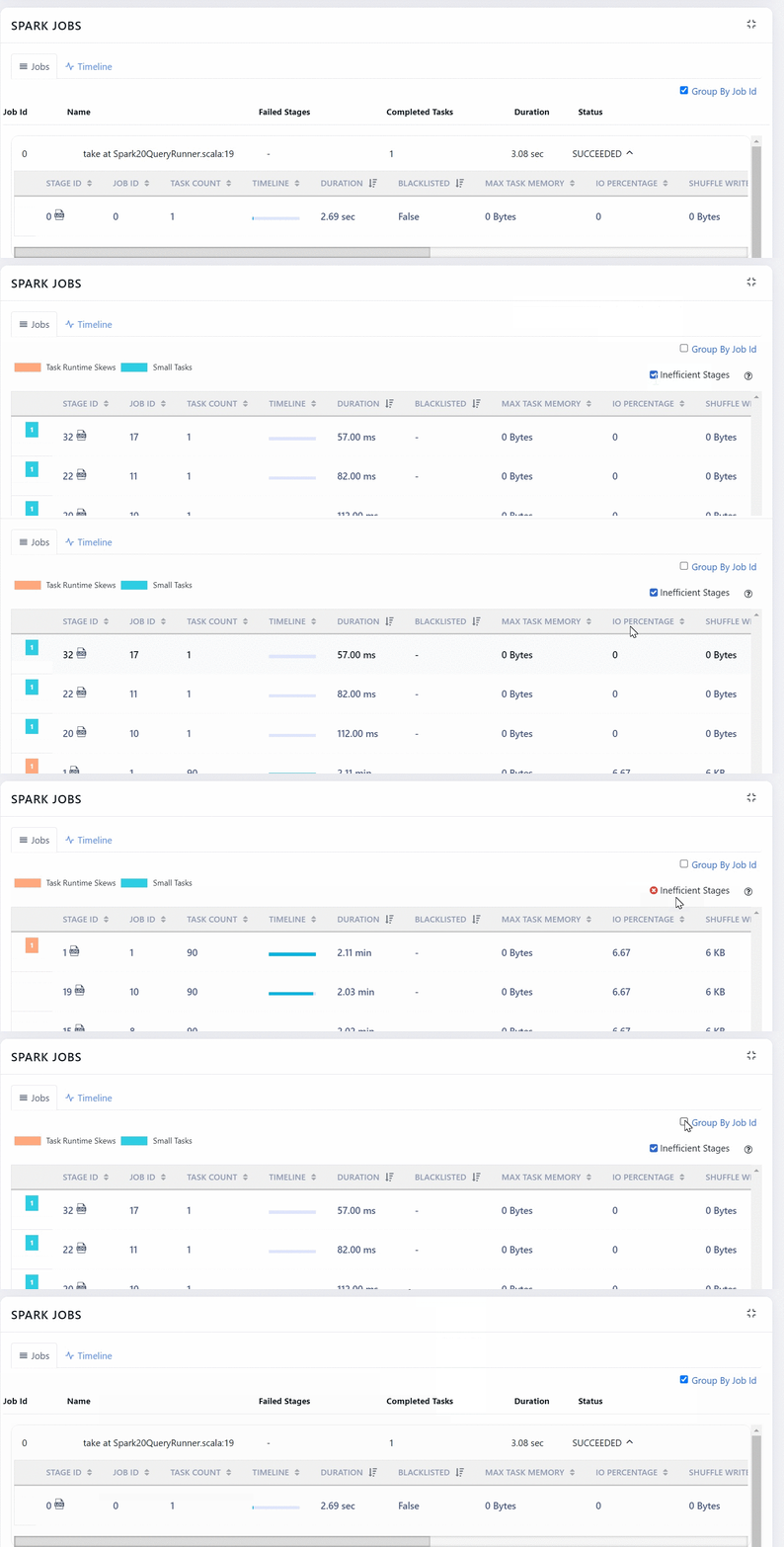
This section displays the complete hierarchy of Spark applications. A Spark application consists of Jobs. A job can further have many stages and each stage can have tasks. In this chart, you can view the jobs, stages and tasks of the application.
Each job has a job ID. You can expand a job to view its stages.
This section has the following columns.
Field | Description |
|---|---|
Stage ID | The ID of the stage. Click the log icon to view the logs of the job. |
Job ID | The ID of the Spark job. |
Task Count | The number of tasks in the stage. |
Timeline | The graphical representation of the duration of the tasks. |
Duration | The time taken to complete tasks in that stage. |
Blacklisted | Specifies if the Job is blacklisted or not. If this field displays True, then the job is blacklisted. |
Max Task Memory | The maximum memory occupied by tasks. |
IO Percentage | The rate of input/output operations (in %). |
Shuffle Write | Amount of shuffling data written. |
Shuffle Read | Amount of shuffling data read. |
PRatio | Ratio of parallelism in the stage. A higher PRatio is better. |
Task Skew | The value of task skewness which is less than -1 or greater than +1. (refer the dashboard). |
Failure Rate | The rate at which the tasks in the stage fail. |
Status | The status of the stage. |
Failure Reason | The reason for task failure, |
You can choose to group or ungroup the data by Job ID. To group, you must select the Group By job Id check box. Also, when you ungroup you can choose to filter out inefficient stages.
You can click more details button to view the tasks of a Stage.
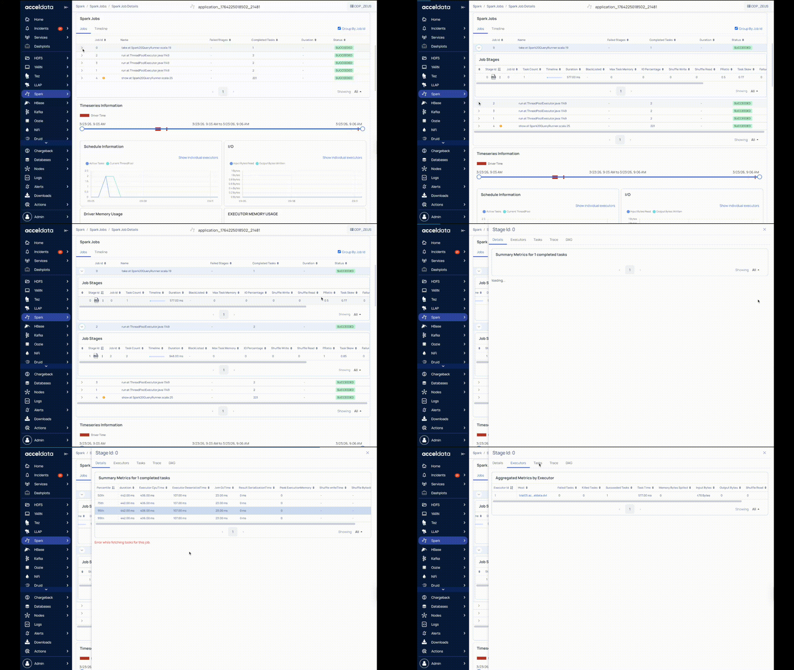
You can click the DAG tab to view the execution flow only for the specific task.
Spark Stages
Stages are units in which a job is divided into small tasks. You can view Spark Stages in the form of a List or a Timeline. Click More Details to view the details of a particular stage.
Timeline
The timeframe in which tasks in the stage executed. The timeline also includes the total driver execution time. You can sort the timeline of these tasks by Duration and Start Time other than the default view. To sort, perform the following:
Click SortBy in the chart. The drop-down menu is displayed.
Select the type of sort you want to apply. The data corresponding to the selected sort is displayed.
(Optional) Select None, to remove the applied sort.
Viewing Timeseries Information
By default, the Timeseries Information charts display information on all the stages. To view Timeseries Information of an individual stage, perform the following:
Select the job stage from the list. The Timeseries Information for the selected stage is displayed.
To view information of all the stages, select the Show all Stages checkbox. The Timeseries Information for all the stage is displayed.
Timeseries Information
Timeseries information displays timeseries metrics of the application you are currently viewing. Within the time duration, you can see the time spent by the drivers, denoted by a red box. The drivers help in running Spark applications as sets of processes on a cluster.
Note You can see the name of the application you are currently viewing, above the user name in the top panel.
Time Series Information Charts
The following table provides description of the Timeseries Information charts:
Info By moving the slider, you can specify the time range for driver execution. The data in the timeseries charts is displayed based on the range of time selected.
Chart Name | Description |
|---|---|
Schedule Information | The number of tasks running at a particular time and the number of tasks that were yet to be executed. |
IO | The chart describes the number of input bytes read and the number of output bytes written during the duration of the task. |
Driver Memory Usage | The amount of memory consumed by the driver. |
Executor Memory Usage | The amount of memory used by the executor. |
GC and CPU Distribution | The amount of garbage collection (in %) and amount of CPU used (in %) to execute jobs. |
Shuffle information | The chart describes the following shuffle information: Shuffle Bytes written, Shuffle local bytes read, Shuffle Remote bytes read, and Shuffle Remote Bytes Read to Disk. |
Storage Memory | The chart describes the amount of the following types of memory: Block Disk Space Used, Block Off Heap Memory User, Block On Heap Memory Used, Block Max Off Heap Memory, and Block Max On Heap Memory. |
HDFS Information | The chart describes number of HDFS read and written. |
By default all the charts displays the aggregated executors. To view individual executors, perform the following:
Click Show Individual Executors. A drop-down menu of the executors is displayed.
Select the executor from the drop-down menu. The data corresponding to the selected executor is displayed in the chart.
To view the aggregated executors, click Show Aggregated Executors.
Reports
The Reports tab has the following tabs:
Efficiency Statistics
Driver versus executor time spent determines how well the Spark program has been written and if the right amount of parallelism is achieved.
The following tables provides the description of the charts in the Efficiency Statistics panel:
Metrics | Description |
|---|---|
Driver Wallclock Time | Total time taken by driver to complete the execution. |
Executor Wallclock Time | Total time taken by all the executors to complete the execution. |
Total Wallclock time | Total time taken by all the driver and all the executors to complete the execution. |
Metrics | Description |
|---|---|
Critical Path Time | Displays the shortest amount of time the application will take for infinite number of executors. |
Ideal Application Time | Displays the shortest amount of time the application will take, assuming perfect parallelism and no data skews. |
Actual Run Time | Displays the total time taken by the Critical Path time and Ideal Application Time. |
One Core Compute Hour (OCCH) is derived from one core running for one hour in the executor. The following metrics are displayed in the chart.
OCCH wasted by driver.
OCCH wasted by executor.
Total OCCH wasted.
Total OCCH available.
Simulation
The Simulation chart displays the Estimated Wall Clock Time and Cluster Utilization (%) for the number of executors used. You can determines what should be the ideal number of executors on the Spark program and what would be the effect of such changes to the number of executors on the overall time and utilization.
YARN Diagnostics
The YARN Diagnostics displays the details of the YARN application that was running in that duration executed by the user. The following table provides description of the table in the YARN Diagnostics tab:
Field Name | Description |
|---|---|
Start Time | Displays the start time of the YARN application. |
End Time | Displays the end time of the YARN application. |
State | The state of the YARN application. The state can be one of the following: Created, Initialized, Compiled, Running,Finished,Exception, or Unknown. |
Message | The diagnostic message in the YARN application. |
Message Count | The number of diagnostic messages. |
To view more details, click on the row. The following table provides description of the table displayed:
Metric | Description |
|---|---|
Time | The start time of the application. |
Preempted MB | The amount of memory preempted for the application. |
Preempted VCores | The number of VCores preempted for the application. |
Allocated MB | The amount of memory allocated to the application. |
Allocated VCores | The number of VCores allocated to the application. |
Avg Mem | The average memory used by the application. |
Avg Vcores | The average VCore used by the application. |
Running Containers | The number of containers running in the application. |
Queue Usage % | The amount of queue usage (in %). |
Cluster Used % | The amount of cluster usage (in %). |
State | The state of the query using YARN application. The state can be one of the following: Created, Initialized, Compiled, Running,Finished,Exception, or Unknown. |
Message | The diagnostic message. |
Aggregate Metrics
The Aggregated Metrics tab displays the aggregated usage of different metrics in that application. The following table provides description of the metrics in the Aggregated Metrics tab:
Field Name | Description |
|---|---|
Name | Name of the metric. |
Sum | Displays the total sum corresponding to the metric. |
Min | Displays the minimum value corresponding to the metric. |
Max | Displays the maximum value corresponding to the metric. |
Mean | Displays the mean value corresponding to the metric. |
Description | Displays the definition of the metric. |
Core Usage By Locality
The panel provides the information for the core usage by locality processed by Spark application. The following metrics is displayed in the charts:
Process Local: The tasks in this locality are run within the same process as the source data
Node Local: The tasks in this locality are run on the same machine as the source data.
Wastage
The missing SparkTaskEnd events might cause discrepancies in the spark-core-usage calculation.
Gluten SQL/DataFrame
When Gluten acceleration is enabled for a Spark job, Pulse provides detailed visibility into how query execution is handled by Gluten.
This section helps you understand:
Which parts of the Spark physical plan were executed using Gluten
Which operators fell back to standard Spark execution
Why fallback occurred for specific plan nodes
Key Benefits
Using the Gluten SQL/DataFrame view, users can:
Validate whether Gluten acceleration is applied effectively
Identify fallback-heavy queries
Understand operator-level execution behavior
Improve performance tuning for Spark workloads
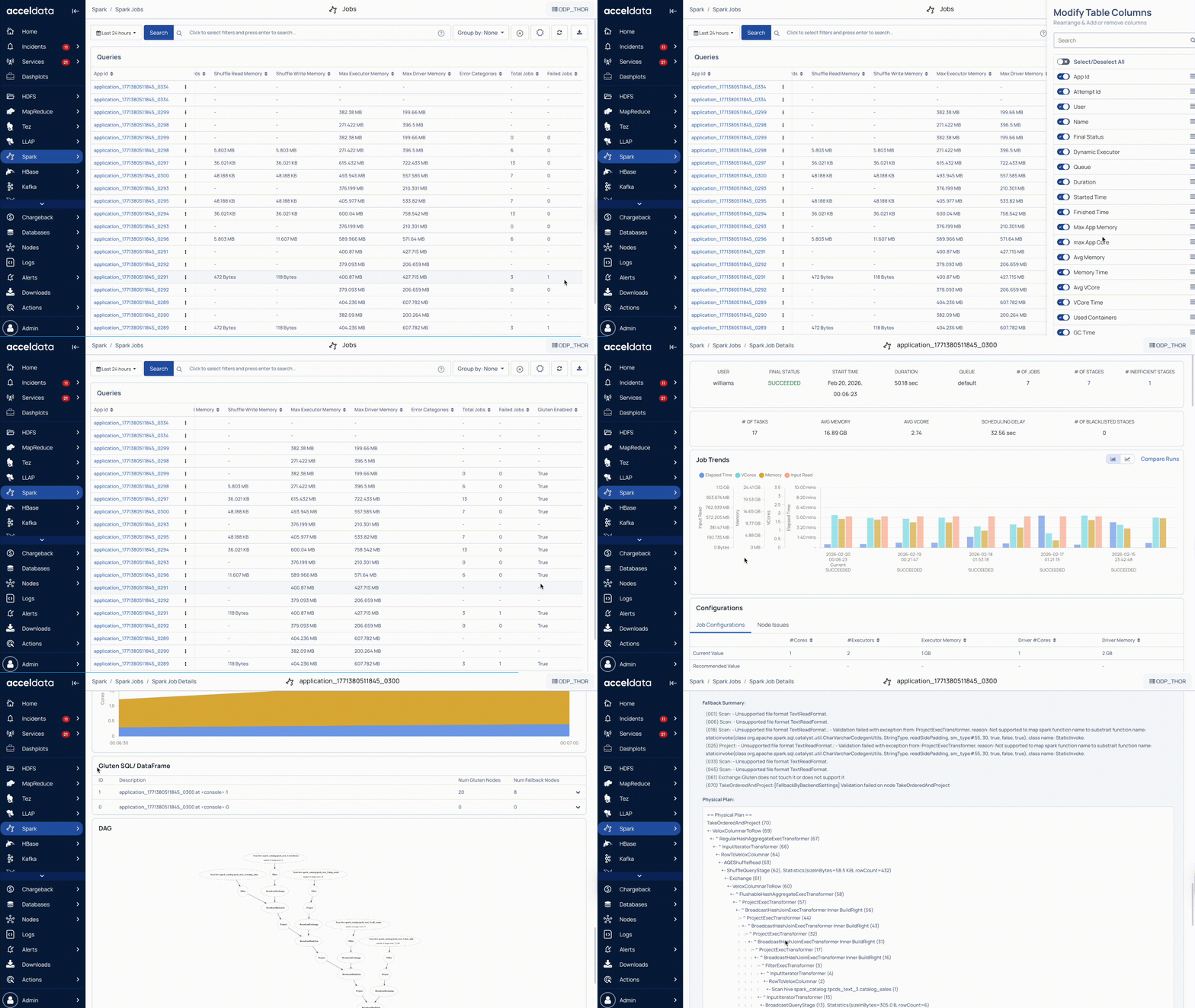
Gluten Nodes and Fallback Nodes
For each SQL/DataFrame query, Pulse displays:
Num Gluten Nodes: The number of physical plan operators successfully accelerated by Gluten.
Num Fallback Nodes: The number of operators that could not be executed using Gluten and were executed using Spark’s default engine instead.
Details
Click on a query to view the following:
Fallback Summary
The Fallback Summary explains, at the plan-node level, which operators were not supported by Gluten.
For each entry, Pulse shows the node ID, operator type (Scan, Project, Exchange, etc.), and a brief reason for fallback, such as unsupported file formats, Spark functions, backend validation failures, or unsupported operators.
This helps identify parts of the query that did not benefit from acceleration.
Physical Plan View
Pulse displays the full Spark Physical Plan with Gluten execution markers.
It highlights the operator hierarchy, Gluten-accelerated nodes (
ExecTransformer), fallback nodes executed in Spark row mode, and columnar-to-row transitions, providing end-to-end visibility into query execution.
Spark Environment Details
Spark Environment Details provides the runtime configuration and environment information for a Spark application.
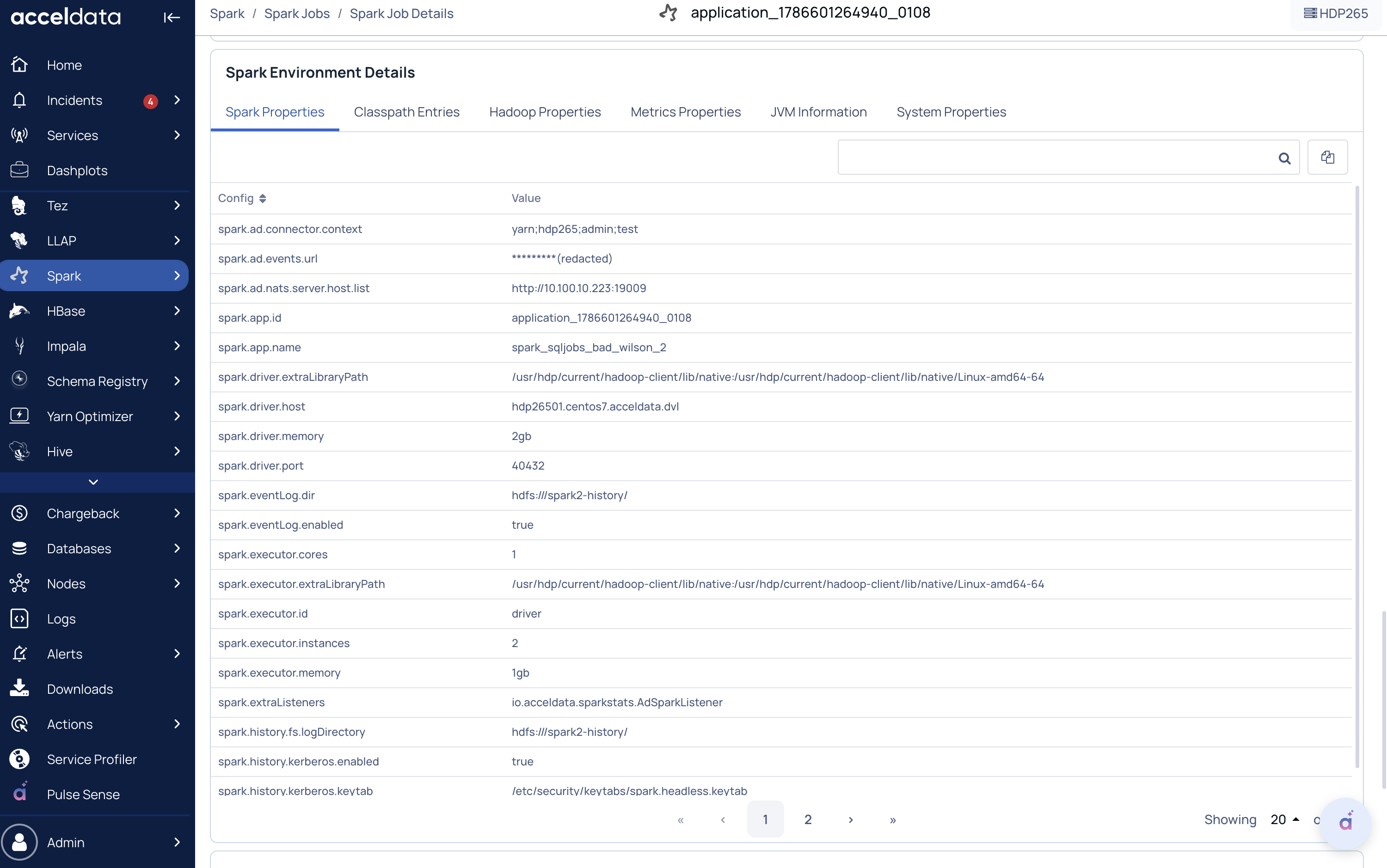
Spark Properties: Spark settings such as driver/executor memory, cores, event logs, and application details.
Classpath Entries: JARs, libraries, and configuration files loaded by Spark.
Hadoop Properties: Hadoop, YARN, and HDFS-related configurations.
Metrics Properties: Spark monitoring and metrics configurations.
JVM Information: Java and Scala versions used by the application.
System Properties: JVM and OS-level settings such as Java home, encoding, and HDP version.
DAG
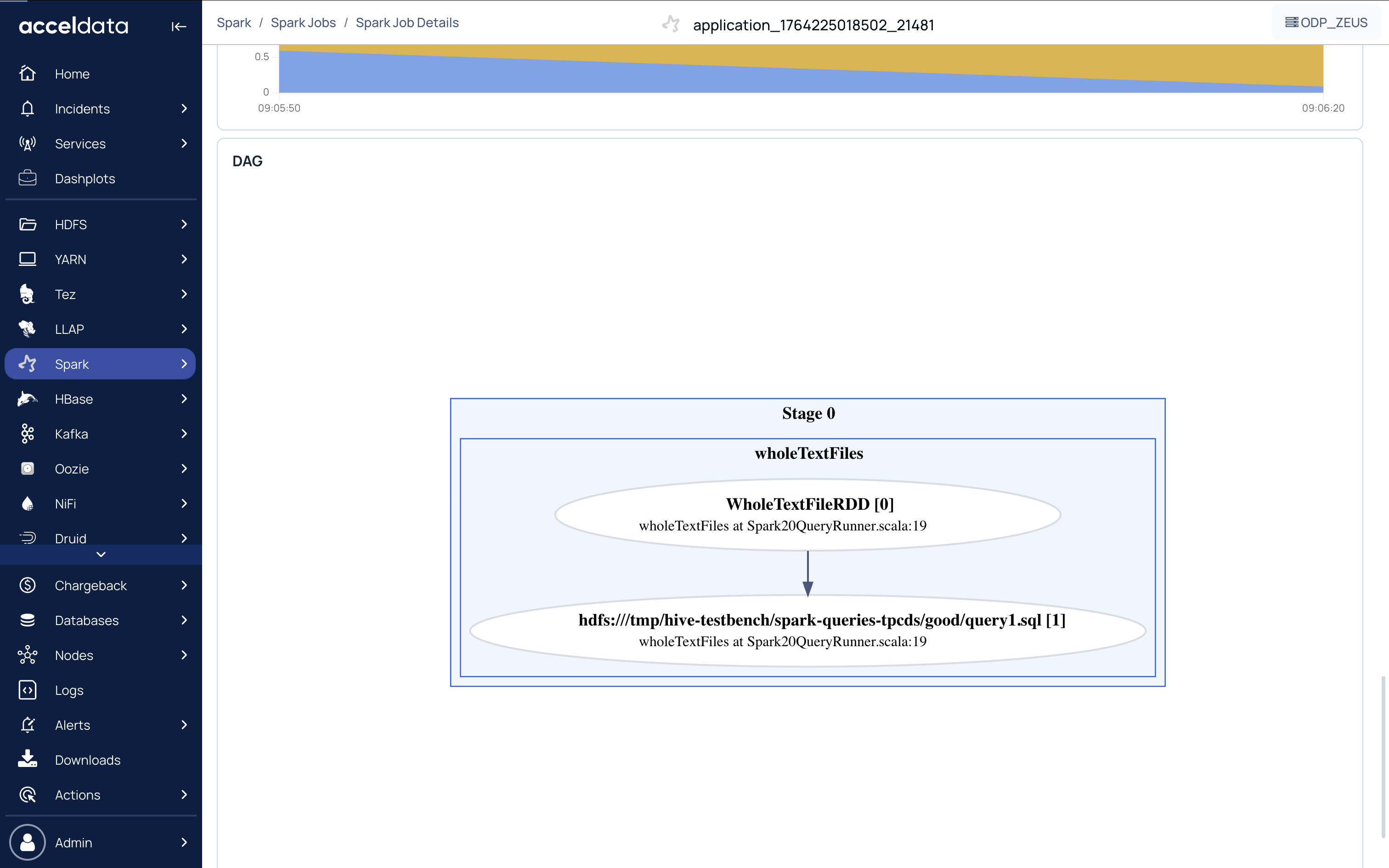
The DAG chart displays the exact flow of how each task has been executed. The DAG flow displayed on this section represents the entire application. You can view the flow in which all the tasks in the application are executed.
Why does the Spark UI take a long time to render long running for certain Spark applications?
In Spark applications where jobs run for an extended period and involve thousands of stages and tasks, the web page may become slow to render. The UI will eventually load, but it may take approximately one minute due to the large volume of data being processed and displayed.